The online manual has not been updated to the latest version of QElectroTech (v0.6 stable).
It means that the newest functionalities are neither exposed nor explained here.
However, if you are new to QElectroTech, this manual is a good help to make your first steps.
Online manual for QElectroTech 0.4
1. Introduction
| QElectroTech: | Home Project: http://www.qelectrotech.org |
|---|
| Authors: |
Management and Development: Laurent Trinques scorpio@qelectrotech.org Logo: Nuno Pinheiro nuno@nuno-icons.com Original idea: Benoit Ansieau benoit@qelectrotech.org Development: Joshua Claveau Joshua@qelectrotech.org DXF Import Development: Ronny Desmedt r.desmedt@live.be |
|---|
| Documentation: |
Documentation: Arun Kishore Eswara eswara.arun@gmail.com |
|---|
| Packages: |
Fedora / Redhat: Remi Collet remi@fedoraproject.org Mageia: Trem trem@mageia.org Debian: Laurent Trinques scorpio@qelectrotech.org Gentoo: Markos Chandras hwoarang@gentoo.org Mac OSX: Yoann Varenne yoann@tuxfamily.org |
|---|
| Contributors: |
Development: Cyril Frausty cyril@qelectrotech.org Development: Abhishek Bansal abhishek@qelectrotech.org |
|---|
| Documentation License: | |
|---|---|
| This work is licensed under the Creative Commons Attribution 3.0 base License http://creativecommons.org/licenses/by/3.0/deed.en |

1.1 About QElectroTech
QElectroTech is an application to create primarily, electrical, electronics, automation and control circuits. However, QElectroTech can be exploited to create mechanical objects to illustrate processes, instrumentation drawings among various creative possibilities. QElectroTech is a good professional quality drafting application for various drawings that form a project.
QElectroTech has a large collection of standard and custom symbols, referred to as elements, that describe most of the commonly used components in electrical, hydraulic, pneumatic, computer systems. These elements can be selected drag dropped with mouse on to a diagram editor and connected with lines to represent or describe a system. A large number of such diagrams can be drafted under a project. QElectroTech is easy to use professional software that is free to download, install, use and develop.
QElectroTech also consists of an inbuilt element editor that permits creation of newer elements that do not exist in the collection. Elements in the QET collection are not editable i.e read only. But, once the element is drag dropped into a diagram, it is automatically added to “imported” collection in a duplicate copy. This copy of the element will be available for editing to effect suitable changes to create customized symbols.
The finished diagrams can be exported to various formats like dxf, pdf, jpg, png etc.,. QElectroTech is available in many international languages. It is also possible to use multiple languages in the same drawing / project.
The elements in QElectoTech are saved in a xml format. The projects and diagrams can be saved as *.qet format for further editing.
QElectroTech is distributed as a Free Software released under the GNU / GPL license. As on the date, a stable version 0.4 is released for systems operating on MS Windows, GNU / Linux and MacOS. The present English documentation is developed for 0.4 version. However, this document can serve as a complete documentation for previous versions 0.3 as well.
1.2 Installation
You can download the latest version of QElectroTech from http://qelectrotech.org/download.html.
For GNU/Linux systems, source files can be downloaded and configured. Ready made packages for some Linux distros are also available for download.
For MS Windows systems, ready to use executable installation files (.exe) are available for download which are packed in a `zip’ folder.
- For installation in Fedora use:
sudo yum -y install qelectrotech
- For installation in debian use:
sudo apt-get install qelectrotech
For a nightly build devel version —
deb http://debian.qelectrotech.org/qet/debian/ stable mainfor stable Debian aka Jessie with Qt5 (Qt5 for nightly build devel version)
deb http://debian.qelectrotech.org/qet/debian/ unstable mainfor Qt5, nightly build devel version
1.4 About Using QElectroTech libraries
In the case of using all or part of the QElectroTech library for purposes other than to create wiring diagrams, you must abide by the terms of the Creative Commons-by license:
This work is licensed under the terms of the Creative License Commons Attribution 3.0. For a copy of the license please visit the website: http://creativecommons.org/licenses/by/3.0/
or send a letter to :
Creative Commons
171 Second Street, Suite 300
San Francisco
California, 94105, USA.
1.5 QElectroTech GUI application
1.5.1 Description of the Drawing window
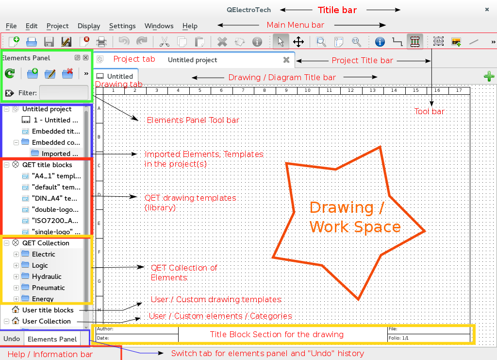
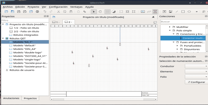
Fig.1 QElectroTech Main Window
1.5.2 Title bar
The title bar carries the name “QElectroTech” and has the options to “Close”, “Minimize” or “Maximize” the application. The options can vary in each installation corresponding to the theme settings. The snapshots provided in this documentation are for GNOME in Fedora 20 with default Adwaita theme. Only a “Close” option is available in the Fig.1 on title bar.
1.5.3 Main Menu bar
It is a standard menu bar, which allows user to access all the features of the application such as File, Edit, Project, Display, Settings, Windows and Help. Each of the tool button further contains a number of options to initiate an action. A brief description of each such option can be read from the help or information tool bar, located to the bottom left corner of the QElectroTech window by hovering over the option with the cursor. The following tables summarizes the available options from the main menu bar.
| Menu bar | Options | Function | Keyboard shortcut | Notes |
|---|---|---|---|---|
| File | Recently opened | Open a project from history (recently opened files) | ||
| New | Creates a new Project | Ctrl + n | Same as New on tool bar | |
| Open | Opens an existing project from the disk | Ctrl + o | Same as Open on tool bar | |
| Save | Saves the current changes to the project (overwrites) | Ctrl + s | Same as Save on tool bar | |
| Save as | Saves the current project as a different file on disk | Same as Save as on tool bar | ||
| Close | Closes the current project (prompts for saving changes) | Ctrl + w | Same as Close on tool bar | |
| Export | Opens a dialogue to export drawings from a project | Ctrl + Shift + x | For customization refer Export | |
| Opens a dialogue to print drawings from a project | Ctrl + p | Same as Print on tool bar | ||
| Quit | Quits the QElectroTech main window (prompts for saving changes) | Ctrl + q | Alt + F4 can also be used |
| Menu bar | Options | Function | Keyboard shortcut | Notes |
|---|---|---|---|---|
| Edit | Undo | Undo the last action in the active drawing (folio) | Ctrl + z | Same as Undo on tool bar |
| Redo | Repeat the last action in the active drawing (folio) | Ctrl + Shift + z | Same as Redo on tool bar | |
| Cut | Equivalent to copy + delete the object (active folio) | Ctrl + x | Same as Cut on tool bar | |
| Copy | Copies the object selected in the active drawing | Ctrl + c | Same as Copy on tool bar | |
| Paste | Pastes the object from last copy or cut (any folio) | Ctrl + v | Same as Paste on tool bar | |
| Select All | Selects all objects in the active drawing area | Ctrl + a | Refer to graphic Fig.20 | |
| Select none | Removes all current selections in the active folio | Ctrl + Shift + a | ||
| Invert selection | Inverts selection of objects in the active folio | Ctrl + i | ||
| Delete | Deletes the selected object in the active folio | Del | Same as Delete on tool bar | |
| Rotate | Rotates selected object(s) in the active folio | Space | ||
| Choose texts orientation | Rotates selected text field(s) in the active folio | Ctrl + Space | ||
| Find in the panel | Identifies the selected element in elements panel | Same as in tool bar | ||
| Edit the selected object | Opens properties window for the selected element | Ctrl + e | ||
| Reset conductors | Resets selected conductor(s) to a shortest path | Ctrl + k | Same as in tool bar | |
| Folio properties | Opens the properties window for the active drawing | Ctrl + l | Same as in tool bar | |
| Add a column | Adds an additional column to the active drawing | Same as in tool bar | ||
| Remove a column | Removes a column from the active drawing | Same as in tool bar | ||
| Add a row | Adds an additional row to the active drawing | Same as in tool bar | ||
| Remove a row | Removes a row from the active drawing | Same as in tool bar |
| Menu bar | Options | Function | Keyboard shortcut |
|---|---|---|---|
| Project | Project properties | Opens configure dialogue; refer Section.4 | |
| Add a folio | Adds a new drawing sheet to the active project. (Folio means drawing sheet) | Ctrl + t | |
| Delete this folio | Deletes the active drawing of the project | ||
| Clean project | Purges the active project of unused elements and empty categories and templates | ||
| Add a summary | Creates an index folio for the active project | ||
| Export a nomenclature | Generates a .csv file summary of all the list of elements used in the active project |
| Menu bar | Options | Function | Keyboard shortcut |
|---|---|---|---|
| Display | Display projects | Set preference for projects and folios appearance as either tabs (default) or windows | |
| Select | Use choose tool (default) to select individual elements, conductors in the workspace | ||
| Move | Use move tool to hold and drag the drawing sheet (folio) when zoomed in excess of display | ||
| Zoom In | Magnify the drawing for a closer view; (use move tool to drag the folio to view all parts) | Ctrl + + | |
| Zoom Out | Reduce magnification of the drawing; develops a distant view of the folio | Ctrl + — | |
| Zoom content | The window magnifies to a level that fits all the elements of the active folio to display | Ctrl + 8 | |
| Fit in view | Reset zoom levels to fit the active folio including grid and title block to display | Ctrl + 9 | |
| Reset zoom | Reset zoom levels to a default value (zoom level just less than that of fit in view) | Ctrl + 0 |
| Menu bar | Options | Function | Notes |
|---|---|---|---|
| Settings | Display | View or hide options in the QET main window | Hides or shows elements panel, tool bar etc., |
| Full screen mode | Spreads the window to fill the screen | Entire screen gets occupied by the window | |
| Configure QElectroTech | Opens the configure QElectroTech window | Same as described in Section.4 |
| Menu bar | Options | Function | Keyboard shortcut |
|---|---|---|---|
| Windows | Close | Opens configure dialogue; refer Section.4 | Ctrl + w |
| Tile | Adds a new drawing sheet to the active project. (Folio means drawing sheet) | ||
| Cascade | Deletes the active drawing of the project | ||
| Next Project | Purges the active project of unused elements and empty categories and templates | Ctrl + tab | |
| Previous Project | Creates an index folio for the active project | Ctrl + tab | |
| list available projects | Projects can be switched by selecting the project, active project is indicated by a . |
| Menu bar | Options | Function | Keyboard shortcut |
|---|---|---|---|
| Help | What is this ? | Enquires main menu options | Shift + F1 |
| About QElectroTech | Displays information about authors, contributors, translators and Licensing | ||
| About Qt | Displays information about Qt, a C++ toolkit for cross platform applications |
1.5.6 Control tabs
Two tabs are provided to the bottom left corner of the QElectroTech application main window, to switch between the elements panel and the Undo panel. Elements panel is default view in QElectroTech. Undo tab records each change to a diagram in the chronological order. The user, can at any point of time may wish to go back to any previous point in the diagram by selecting it in the undo tab. Each change that is effected by user’s action in the diagram are recorded vertically in the Undo window. Select a point in the history where he/she wishes to return to and switch back the tab to “elements panel”. The changes that were effected after the event will be undone. After the undone action, the user will find that the actions that were undone are highlighted in light pink color, under appropriate category in the elements panel. These actions are marked internally by QElectroTech as unused in the project. The tabs can be turned off or on from the tool bar settings and selecting the display. Unchecking the options will turn off the corresponding views tab or tools in the main window.
However, it should be understood that only actions that are related to drawing can be undone such as adding or deleting of elements, conductors etc.,.
1.5.7 Help bar
The help bar is the space below the control tabs, the bottom left most corner of the main window. It is very useful for beginners of QElectroTech in the way that it gives information about the field that is pointed by the cursor. A user can learn about a field by simply pointing it with the mouse and looking at the help bar.
1.5.8 Drawing and Project tabs
The drawing or diagram can be given a name in the diagram properties. Either click the diagram properties from the tool bar or double click the drawing tab. There are many other options that can be set in the diagram properties window. Once a name is given to the drawing, it gets displayed in the drawing tab.
The project is named by “Project XXXX” where XXXX is the name of the file (*.qet) as which it is saved. In QElectroTech each project is a different file. Individual drawings forming part of the project are displayed when a project is selected. It is possible to work with many projects in the same window.
By default, QElectroTech displays the project name as “untitled project” in the project title tab and “Untitled” in the diagram title tab. The user can save the project by giving it a name of his/her choice as a file. The project title tab displays the name of the project, which is saved as “*.qet” file on the computer. There is an option to close the project, by clicking at the top right corner of the project title bar. A new project can be opened in the same window, which opens as a new tab in the project title. User can switch from one project to the other by left clicking the tabs with the mouse or pressing control + tab key from keyboard. The project title can be changed from the main menu bar Project, then selecting the Project Properties and entering a name for the project in the project title field.
1.5.9 Workspace
The workspace is analogous to the drawing chart. The work space is directly affected by the template applied. By default, work space is divided into cells rows from `A’ to `H’ and columns `1’ to `17’. The rows and columns can be modified by adding or deleting rows and columns from the diagram properties window. The default size of each column is 60 pixels and that of each row is 80 pixels, both of them can be adjusted in the diagram properties. Workspace is the area where the diagram is prepared, by including elements, conductors, text and pictures. The title block section of the workspace contains information related to the drawing such as — `Author’, `date’, `Title’, `File’ and reference `Folio’ numbers.
2. Creating a New Project
A new project can be opened from the main menu bar by selecting File and clicking New or by clicking the shortcut icon  from the tool bar.
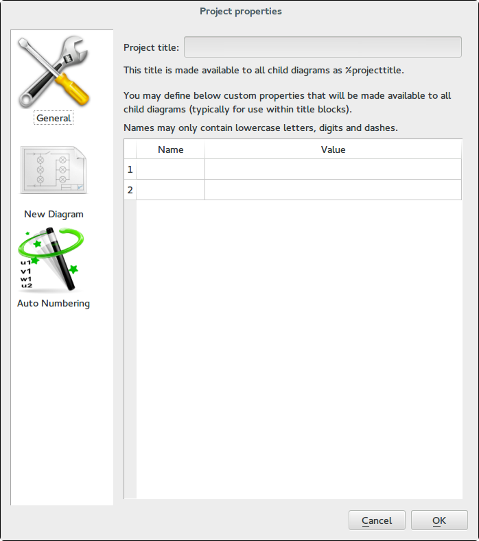
Fig.7 Project properties window [For more description go to `Project properties`_]
A “name” for the project created can be given in the Project Title field of Project properties. Click Projects from main menu to access these options. The project title tab now displays the project name as Project «name» [modified]. The project should now be saved as a file file_name.qet, the project title tab then displays project «name». A project can have this “name” different from the name of the file as which it is saved. Alternatively, a project which acquires its name from the file name can be overwritten by this action. The Project properties window has several options to be set. Such options are applied to all subsequent drawings added to the project. The present drawing properties should be set from the Diagram properties option in the tool bar or by double left clicking the drawing tab. Project properties window is further explained under `Project properties`_.
3. Creating a new diagram
By default, QElectroTech opens an Untitled diagram under an Untitled project when a new project is created (refer Section.2). A new diagram can also be created by pressing Control + t keys from keyboard or by clicking the add a diagram button  located rightmost on the diagram title bar or by selecting the add a diagram from the Project option on the main menu bar. The drawing name and other properties can be set by invoking Diagram properties button from the tool bar. The Diagram properties can also be launched from the menu bar Edit and selecting the Diagram properties or by pressing Control + L keys from the key board. The diagram properties window has options to assign a name to the diagram, author’s name, date, changing the dimensions of the work area by adjusting number and dimensions of rows and columns, or selecting a standard template for the drawing etc.,. There is a custom tab provided for user defined keys.
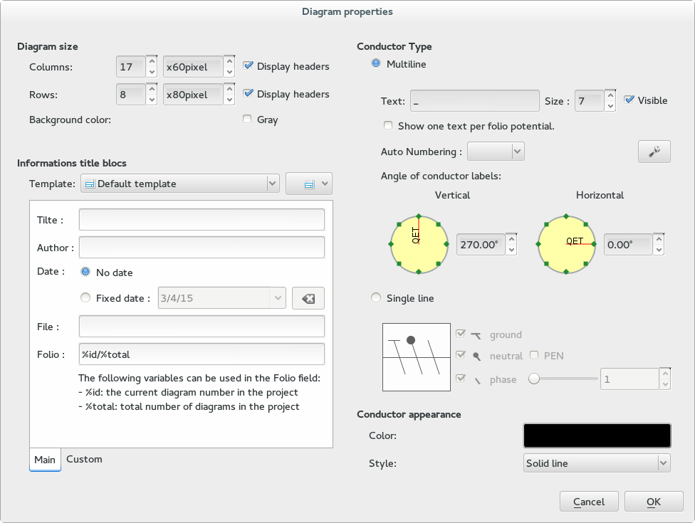
Fig.8 Diagram properties [For more description go to `Diagram properties`_]
The Diagram properties window is explained further in the section on `Diagram properties`_ to describe most of the features it houses.
4. Configuring QElectroTech
QElectroTech permits customizations through configure option. To open the “configure window” click Settings from the main menu bar and select Configure QElectroTech. The customizations can be effected to
- Configuring General window
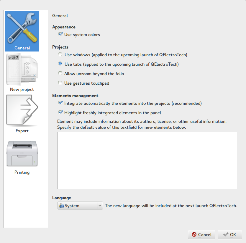
Fig.9 Configuring General window
- General window has the following customizations permitted in QElectroTech:
-
- Appearance: (Default value is System colors)
- Checking the option for `Use system colors’ will make QElectroTech to pick up the same color profiles that are applied to the Operating System environment, like MS Windows or Debian Linux etc.,.
- Uncheking the option will make QElectroTech appear with a default appearance, which will be immune to the Operating System Environment color profiles.
- Projects: (Describes how projects appear in the main window, default value is Tabs.) These options require restarting the QElectroTech application to effect the changes.
- Tabs: Checking the option will make projects appear as tabs in the QElectroTech window. Projects that are added subsequently will appear as tabs in the Project Title bar.
- Windows: Checking the option will make projects appear as individual windows with its own set of diagrams. Newer projects added subsequently will also behave as new windows. The Minimize, Restore and Close options for the windows appear to the right most on the “main menu bar”.
- Use gestures touchpad: Use the option for touchpad control of projects tabs in QElectroTech.
- Elements Management: (Default value is both options selected).
- Integrate automatically the elements in to the projects: The option is reponsible to automatically import the elements added to the drawing into the Imported elements under Embedded collection of the project in the elements panel. In QElectroTech, the elements that are provided with the installations (in QET Collection) are not editable. However, once they are imported to the Imported elements of the project, they are available for editing in the element’s editor. They can be modified and reused in the drawing. The choice is therefore recommended. Refer to the section on `Elements editor`_ to learn to use the elements editor. You may gain quick overview by watching the animation in Fig.20 under `Section 10`_.
- Highlight freshly integrated elements in the panel: The choice will generate highlighting colors over the elements imported in the Imported elements.
- Yellow color flashes over the parent element and the element imported to the Imported elements at the time of importing.
- If the elements that are imported to the project under Imported elements are subsequently deleted from the drawing(s), then these elements will be permanently highlighted in light pink color indicating that they are unutilized in the project. The highlight is however only displayed under the project in the elements panel and will disappear if they included again in any of the drawings under the project.
- Language: (Default value is System ) QElectroTech comes with many languages and the default language can be selected here. The language option can be set from the combo box next to language settings. You can either choose a fixed language in the QElectroTech application by opting your choice or leave it to the System option. In which case, QElectroTech automatically starts with the Operating System Environment language preference. Changing the system language would automatically change (update) the language for QElectroTech application.
- Appearance: (Default value is System colors)
- New project
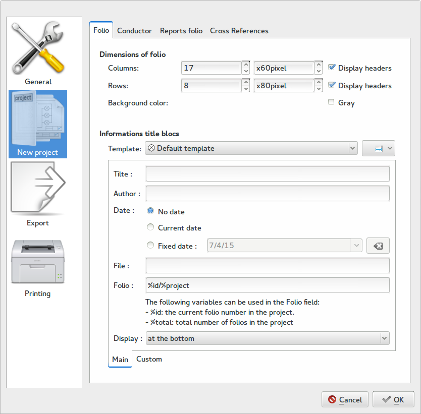
Fig.10 Configuring New Project — Diagram
(2.1) Diagram (Folio): Some of the workspace settings are provided here. The customizable options include:
- Diagram size (Dimensions of folio):
- Number of columns and rows for the grid.
- Size of each column and row.
- The headers for the columns and rows can be turned on / off. Headers are the `A’, `B’, `C’ etc., for rows and `1’,`2’,`3’ etc., for columns.
- Option to fill gray color in the back ground.
- Information title block: The template drop down box contains six options (drawing templates) to be set as default for new drawings or projects. The specific terms (fields) that are used here will be explained together with their use. The fields provided will be applied by default to all subsequent projects / diagrams as the case may be. The information title block comes with two tabs Main and Custom. The Custom tab is discussed under template editor in Section.11 .
- Title provides the default name of the diagram that will open with each of the subsequent projects. Title name is usually given to describe the drawing for example, like a power generation system, distribution system etc.,
- Author provides field to enter the name (or a pseudo name) of the person creating the diagrams in the project.
- Date field has options to :
- Not specify a date for the drawings
- Apply today’s date i.e. the computer systems date will be applied to all subsequent diagrams. The value is dynamic changes with each passing day.
- To set a default date (fixed) to every subsequent drawing. The value is fixed and do not change.
- File name applies to the top right field (cell) in the drawing / diagram title block. The file name can be for example the name of the system in a project. A system can have its drawing spread over several drawing sheets and all carry the same system name i.e. file name.
- Folio name is an additional field to specify the drawing in a file. Folio names are usually provided to specify the current diagram in a sequence of files across which a file is named (system is specified). The field is by default set as %id/%total, which is a dynamic nomenclature. When a new diagram is added in the same project it is updated as “the number of the current drawing” / “total number of drawings created”.
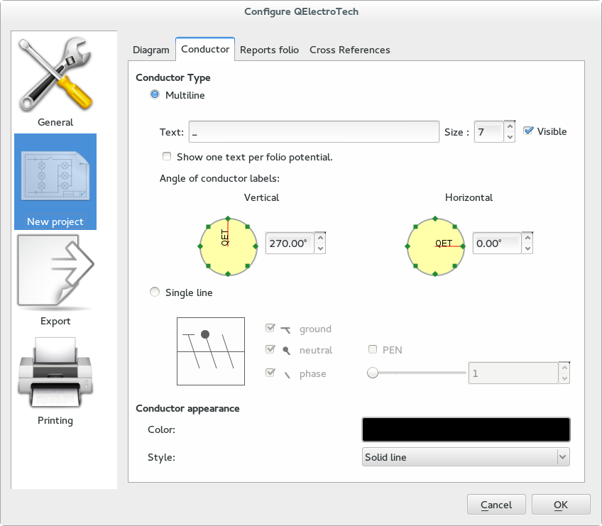
Fig.11 Configuring New Project — Conductor
(2.2) Conductor: Conductor is basically the line that connects two elements in the drawing. The customization window has options to tweak conductor type and conductor appearance.
Conductor type: The options that are provided to customize the conductor type and its text appearance as:
Multiline: The optional default text that should appear with each conductor can be entered in the Text field. The size of the font can be specified in the adjacent Size field. On the otherhand, the text field can be made invisible by “Unchecking” the Visible option i.e. no text will be displayed across the conductors, when they are created. Note: The Show one text per folio potential option is still under development.
Angle of conductor labels: The option to set an angle to the text that appears together with each conductor created can be set here. The options are provided under two categories, namely —
- Vertical: The vertical option is to set the default angle to the text that appears in the vertical direction. The angle can be set in eight specified intervals with the graphic interaction tool. Click the green squares on the yellow circle to set the specified angle. Also, a finer control over the angle precision can be achieved upto two decimal places in the adjacent combo box in degrees, by keying the value from the key board. Clicking the up or down keys in the combo box increments or decrements the angle by one degree only.
- Horizontal: The horizontal option is to set the default angle to the text that appears in the horizontal direction. The angle can be set in eight specified intervals with the graphic interaction tool. Click the green squares on the yellow circle to set the specified angle. Also, a finer control over the angle precision can be achieved upto two decimal places in the adjacent combo box in degrees, by keying the value from the key board. Clicking the up or down keys in the combo box increments or decrements the angle by one degree only.
Single line: The single line formatting provision is strictly included for the electrical diagrams. The provision shortens the representation of conductor(s) between two or more elements by including added information over the conductors, to convey a more meaning. In a typical domestic AC circuits we use a phase, a ground and a neutral wire. A drawing for such a circuit will require adding three conductors running parallel between the elements. This may clutter drawing and an alternate way exists to specify that a single line shown in the drawings represents a phase, a neutral and a ground cable. This is possible by choosing the Single line radio button and checking out the options (default) ground, neutral and phase. The neutral option has additional option called PEN to specify that the neutral cable is a specific Protected Earth Neutral. It is therefore logical to have a requirement for PEN to be active, that both ground and neutral be checked out first. The following points will summarize operations under Single line.
- A conductor can be formatted as any one or a combination of ground, neutral and phase. The small conductor snippet is provided to generate a preview of the likely conductor appearance after effecting the options.
- Selecting both options ground and neutral will permit to specify whether the conductor is a PEN type or not.
- The phase option is additionally facilitated with a slider and a double spin box, to specify the number supply phases. Provision exists to set a maximum of three phases only.
- The number of phases can be specified either by selecting and dragging the slider bar or keying in direct value in the double spin box or also by clicking the up / down keys of the double spin box to increment or decrement value by 1 unit.
Conductor appearance: Options that are provided to customize conductor appearance are:
- Color: A default color can be specified for the conductor from the color selection box. Left click on the color setting box, and pick up a color either from the existing basic colors or define a custom color by using the color mixer options and select it in the pop up color window. Click Ok to apply the option or Cancel to exit without applying the changes.
- Style: Currently three styles are available to choose from, for the default conductor appearance. The option can be selected from the list box next to the Style: option.
Note
The text that appears for the conductors created can switch between horizontal or vertical by adjusting the conductors. Refer to Section.8 to learn how to adjust conductors.
See also
- PEN
- On the low voltage circuits, sometimes the earthing and neutral functions are combined in the same conductor of the supply cable; this is known as a PEN conductor. The PEN conductor is earthed at multiple locations along its length using separate conductors (earthing). The conductor will be branched at each consumer (in domestic supply it may be a house) as a “neutral” and “earth”. This kind of distribution of electrical power supply is called TN-C system. This PEN conductor will provide a return path for both operating conditions — a neutral current flow under normal operating conditions and for the earth fault current during the duration of a line to earth fault.
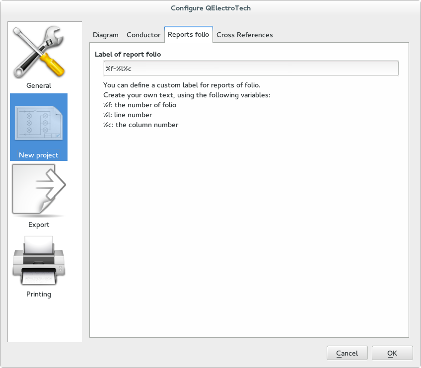
Fig.12 Configuring New Project — Reports folio
(2.3) Reports Folio: A set of
parent
and
child
elements are provided in QET Collection along with two other special referencing elements in QElectroTech. The two special referencing elements are
Previous folio
and
Next folio
located in the tree
QET Collection
–>
Electric
–>
All-pole
–>
Sheet referencing
. Refer to section uuuuuuu for more description on reports folio. The referencing index that these elements generate between different drawings with in a project or within the same drawing can be customized from Label of report folio in the Reports Folio tab. There are three keys f (the number of folio), l (line number), c (the column number), which are internally defined in QElectroTech. User can shuffle these keys to customize his/her default reference indexing.
%
symbol should be used prefixed to these keys to replace the keys with corresponding numbers in the drawing. A short explanation to the set of
parent
and
child
elements is provided in Cross References.
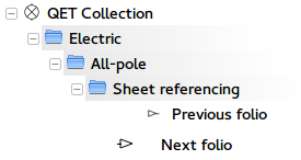
Fig.13 Folio elements in QET Collection
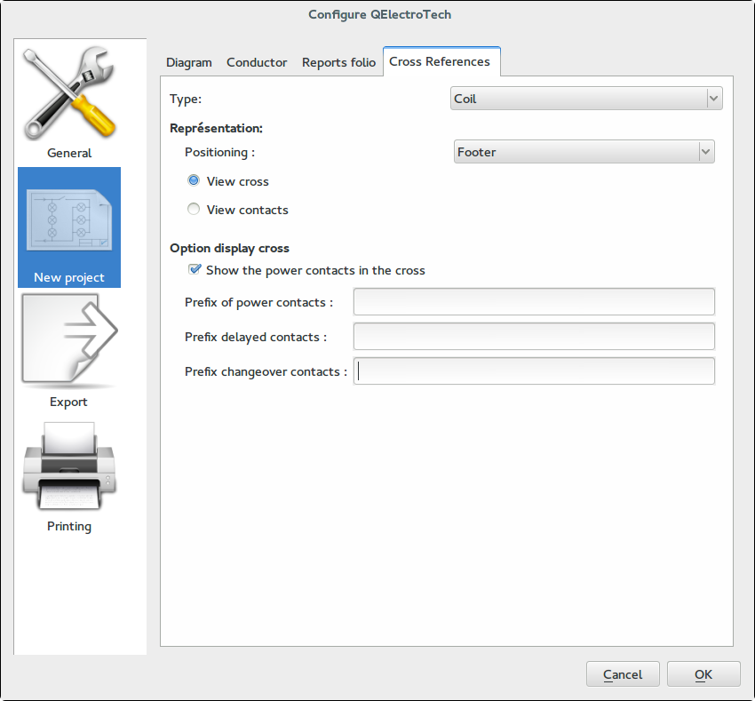
Fig.14 Configuring New Project — Cross references
(2.4) Cross References: The cross references tab is provided to improve electrical diagrams, particularly when using relays. Often electrical diagrams for example, like motor starters and protection systems will have a number of contacts and coils (Relays), with the coil often located at a different place (or sheet). Correct referencing of the contacts for their actuating coils in the diagram is of prime importance to interpret the functioning or operation of the system. A set of referencing relay elements are provided under QET Collection –> Electric –> All-pole –> Relays, contactors and contacts. The referencing customizations can be effected from this Cross references tab for subsequent projects or drawings. A brief explanation about the customization options are enumerated here:
- Representation:
- Positioning: Two options are available to place the references of the contacts linked to a coil, either below the coil’s label or in the footer region (bottom of the drawing & inline below the parent coil).
- View cross: The referenced contacts (actuated by the coil) are displayed as a table of two columns, one for Normally Closed (NC) contacts and the other column for Normally Opened (NO) contacts. The sequence of the entries in these columns is decided by vertical distribution of the linked contacts i.e. a contact located above the coil in the drawing is displayed first than a contact located below the coil.
- View contacts: The referenced contacts (actuated by the coil) are displayed as a contact, unlike the earlier option of a two column display in View cross. The sequencing of the entries falls in the same order as described for View cross.
- Option display cross: The fields customize a prefix to the texts that appear under View cross. The options provided here are:
- Show the power contacts in the cross: Checking the option will permit the power contacts to be displayed when the references are customized as a cross under a coil.
- Prefix of power contacts: The text field lets the user to define a customized prefix to the power contacts.
- Prefix of delayed contacts: The text field lets the user to define a customized prefix to the delay contacts.
- Prefix of change over contacts: The text fied lets the user to define a customized prefix to the change over contacts.
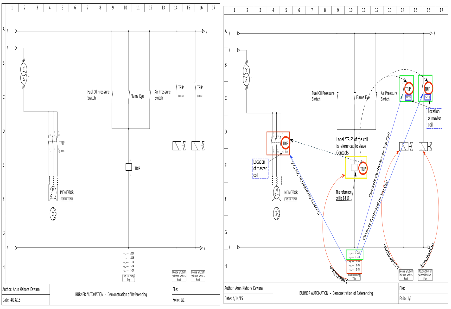
Fig.15(a) Illustration of Referencing fields using an example(Combustion system); Note the positioning option is set to «view contacts« (not cross)
- Export
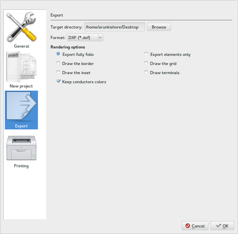
Fig.16 Configuring New Project — Export
The drawings from QElectroTech can be exported to different formats. Currently it is possible to export the drawings from QElectroTech as svg (Scalable Vector Graphics), bmp (Bit map), dxf (Drawing eXchange Format), jpg (Joint Photographers’ Expert Group format) and png (Portable Network Graphics). The various configuring options provided in the export window are:
- Target directory: The default directory to which the drawings can be exported.
- Format: The exporting format to which the drawing can be saved into the default directory.
- Rendering options:
- Export the border: This option will cause the entire drawing to be exported.
- Export only elements: This option will export only the elements from the drawing. The connectors between the elements will be preserved. However the rest of the workspace is omitted.
- Draw the border: The option specifies that the rows and columns provided in the drawing area to be included in the exported graphic.
- Draw the inset: The option specifies that the drawing title block to be included in the exported graphic.
- Keep conductor colors: The option specifies that the conductors colors assigned during drawing to be preserved and included in the exported graphic.
- Draw the grid: The option specifies that the `dotted’ grid to be included in the exported graphic.
- Draw terminals: The option specifies that the terminals (red tail with blue square) also to be preserved and included in the exported graphic.
Note
You can only choose one of these two options (a) or (b).
The default settings are Export the border, Draw the border, Draw the inset and Keep conductors colors only. Other options are left for the user to choose.
- Printing
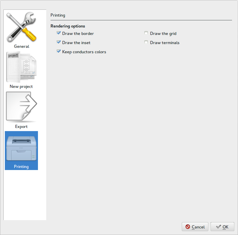
Fig.17 Configuring New Project — Printing
The printing options are similar to the export options. Refer to the description for Export. The default values are Draw the border, Draw the inset and Keep conductors colors only. Other options are left for the user to choose.
5. Working with elements
QElectroTech has a number of elements listed as a tree under QET Collection in the left pane of main window. The collection of elements (shown highlighted in yellow square in Fig.1) is organized under relevant categories (folders). Users can click on the + symbol located left to the category to surf the elements or more categories under its tree. Alternatively an element can be searched quickly using Filter field, refer to filter. Each element can be selected using left mouse click and drag dropped on to the work area to include it in a diagram. The elements can be positioned any where in the work area. Some of the tools in the tool bar apply to elements such as cut, copy, paste, delete, rotate, element properties and select tools. Refer to  from tool bar.
Some of the operations possible with elements:
- Cut and Paste
- Elements can be cut paste by using the `scissors’ icon and `Paste’ icon from the the tool bar.
- Standard keyboard shortcuts like Control+x will also cut the element and Control+ v will paste the element.
- Restrict the cut and paste functions within the same project. The elements would suffer data loss if the operations are effected over more than one project.
- Copy
- Elements can be copied by clicking the “Copy” icon from the tool bar or using Control+ c from the keyboard. Copied elements can be pasted in the same drawing or another drawing of the same Project. Pasting into a new project may cause loss of data.
- Always use add an element (drag dropping into drawing) for new projects.
- Delete
- Added elements can be deleted by selecting the element with a left mouse click and pressing either Delete key from keyboard or clicking the delete tool in the tool bar.
- It is possible to Delete more than one elements at a time by selecting them and applying delete option. Refer to Selection properties to know how to select more than one element.
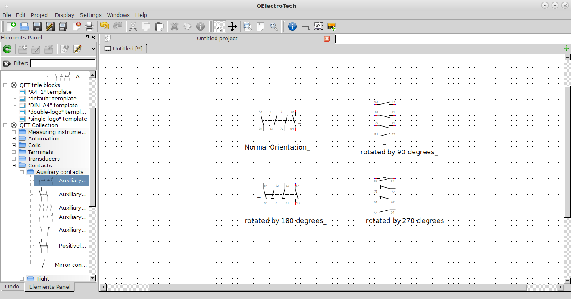
Fig.18 Rotating element (in steps of 90o)
- Rotating
- Rotation of elements can be performed by selecting the element in the work area with left mouse click and pressing space key from key board.
- Elements can be rotated in quantum steps of 90o (degrees).
- Rotate option in the tool bar turns active upon selecting at least one element in work area, which can be clicked to orient the selected element(s) to the required rotation.
- A number of elements can be selected together by holding control key from key board and left clicking required number of elements in the work area. Once the required elements are selected (evident from light gray box enclosing each selected element), rotation operation can now be performed on all the selected elements together as described earlier. Some elements like for example, a horizontal ammeter that cannot be rotated for obvious reasons.
Fig.19 Rotating more than one element (with and without text selected in steps of 90o)
- Selection properties
- Clicking the `Selection properties’ tool will pop open a properties window for the selected element.
- At a time more than one element can be selected either by holding Control key from keyboard and selecting each element by left clicking it with mouse or by clicking a point in the workspace, holding it and dragging a selection square encompassing the elements to be selected.
- When more than one element is selected, the selection properties window will have no options. Or in otherwords the software will not permit defining properties for a collection of elements simultaneously. It has to be done element by element.
Fig.20 Illustration of selecting more than one element with mouse
5.1 Folio Report
Folio report is included in the QET Collection –> Electric –> All-pole –> Sheet referencing in the collection of QET Elements. The element performs the referencing roles in the drawings. Refer to the section Reports folio .
6. Working with Text Fields
6.1 Inserting text field
Add a Text field tool is provided in the tool bar of the main window. To add a text field into the work space
- Click the Add a Text field tool and click at a point in the work space, where the text field should be added.
The text field by default appears as an underscore and it can be either used in association with an element or as an additional field inserted in the work space.
Some elements are provided with a text field at each of their terminals and / or one for the entire element. Additional text fields can be added any where in the work space by the procedure described earlier. The text field can be edited in the work space by
- Double left clicking the text field with the mouse and keying in text from keyboard.
- To exit editing, click any where else in the workspace. The text field supports multi-line entries and a few formatting options.
6.2 Orientation of the text field in workspace
All the text fields are horizontally oriented in the work space by default but, they can be oriented in any direction. The text field can be re-oriented by rotating it as described below:
- Select the text field by left clicking it with the mouse.
- Rotate it with the Rotate tool from the tool bar — refer to section on rotating elements. Alternatively the element can be rotated in quantum steps of 90o by pressing the Space bar from the keyboard.
- The text field has special rotation attribute that it can be rotated precisely upto two decimal places of a degree.
- Select the text field and press Control + Space keys from keyboard to pop open a GUI window to rotate the text field in any direction.
- The GUI window facilitates rotation in quantum steps of 45o degrees by clicking the green squares on the yellow circle.
- A double spin box is also provided to manually enter an angle of orientation upto two decimal places. The double spin box can also be interacted with a left mouse, by clicking the up or down arrow keys, to increment or decrement the angles in steps of 1 degree correspondingly with each click.
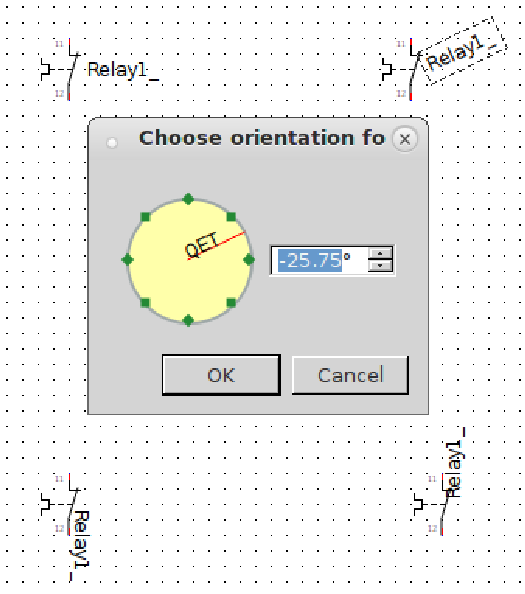
Fig.21 Rotate text with orientation pop up window (The text selected (top right corner) is rotated by -25.75o degrees)
6.3 Moving and editing text field in work place
- Text field can be moved any where in the workspace by
-
- Selecting it with a left mouse click and holding it and drag dropping the text to a new position.
- Text fields that are associated with the elements require control key to be pressed from the keyboard to permit moving its text field along with the earlier described procedure.
Moving an element’s text field produces a blue colored highlight over the element during relocation as shown in the Fig.22. This feature of QElectroTech helps user to perform such actions in a large diagram and still conspicuously keep track of its parent element.
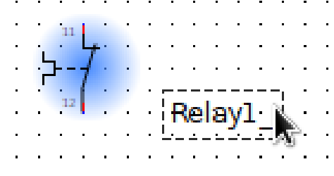
Fig.22 Illustration the step (b), repositioning an element’s text label
- Text fields that are not associated with elements have an additional editing options —
-
- Select the text field with a left mouse click and use the keyboard short cut Control + e or from the main menu bar, select Edit —> Edit the text field. A simple text editor window opens up to facilitate some basic text formatting features such as increasing the font size, font color, applying bold / italics / underlining formats to texts and inserting a hyperlink.
Note
The hyperlink is preserved only for the diagrams that are exported to `pdf’ format. For other picture exporting formats the hyperlink appears as a underlined text.
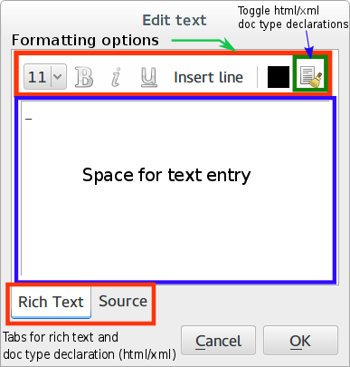
Fig.23 Edit text window for the text field in workspace This is a WYSIWYG (What You See Is What You Get) editor.
7. Working with connectors
Elements have terminals, a conductor generating extension to elements to connect them with other elements or connectors. Making connections between terminals can be summarized as follows:
- Position the cursor on the element connector or terminal you want to connect; you will see that a blue dot appearing on the terminals you want to join.
- Left click the blue dot and hold and drag the pointer to the connector or terminal to join the other element you want to connect. If a green dot appears on the target terminals, it means that the conductor path between them is complete. A red dot means a «forbidden connection”.
- Release the left mouse button and the conductor will be completed. The conductor assumes a path between the two elements. However, the connectors can be edited by selecting the conductor with a left mouse click and dragging the green squares on it. Refer to Section.8 for more operations with conductors.
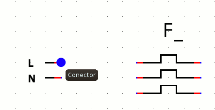
Fig.24 Animated graphics showing making of connection (by way of conductors) between two elements (Top) Graphic illustrates that for a connection to be made between the two terminals, blue dot should be selected and cursor should be dragged to the other terminal in a fashion shown by arrows. (Bottom) graphic animates connection between a relay and a push button. When a terminal of the coil is pointed with the mouse, a blue colored dot develops at the terminal tip. The dot turns red upon clicking and holding it. Holding and dragging the dot to the terminal of the push button causes a green colored dot to appear at the terminal of the push button, indicating that the connection is permitted. Releasing the mouse button at this point creates a conductor between the two terminals.
8. Resizing conductors (connectors)
8.1 Adjusting conductors by moving elements
- Select an element in a circuit by left clicking it and hold it in the work space.
- Drag the selected element in the circuit, the connectors linking the element to the rest of the circuit also moves.
Fig.25 Adjusting conductors by repositioning elements
8.2 Adjusting conductors with handles
- Select a connector with a left mouse click. The segment of the selected connector between two elements turns red, indicating that the conductor is selected.
- Position the cursor over the selected connector; you will find thick green colored squares appear over this segment, one each in a bend.
- The connector can now be adjusted as per the users demands by left clicking these thick little squares and holding and dragging to a new position. The connector changes its path during this action.
- To reset the altered path, left click the short cut icon `Reset conductors’ provided in the tool bar with the connector selected (highlighted red). This action will undo all the earlier changes effected to the connector.
Fig.26 Animation showing adjusting conductors with handles and reset tool
8.3 Adding text to connectors
Connectors are provided with text fields, which can be configured from the new project option and conductor tab. Additional text fields can be inserted at desired locations. Text fields for connectors have the same behavior as the text fields for elements discussed under creating a new diagram. Double left click a connector text field and enter the text. The text can orient horizontally or vertically depending on the section of the connector where the test field is provided. The text fields can be rotated and re-positioned as required. Refer section on configure conductor for a complete list of configuration options.
8.4 Connector properties window
A connector’s properties window can be activated by double left clicking it. The connector and its text field properties can be set from this window. Only multiline connectors have text fields. Selecting the single line radio button deactivates the text field. The single line option has further options to format the connector as an earth, phase or a neutral conductor or a combination of any. Selecting the neutral option further facilitates formatting the conductor as Protective Earth Neutral (PEN). Number of phases can also be set upto 3 by selecting the phase radio button and using the slider or keying a value into the double spin field. Color and styles to a connector can be applied irrespective of other choices. Refer section on configure conductor.
9. Element’s editor
Element can be viewed as a physical object (component) that is symbolically represented. An electrical, electronic, process or an instrumentation diagram employs a large number of symbols that are linked to each other that forms a system. Symbols can be standard, like those issued by ISA (International Society of Automation), or a custom defined by a design house. In QElectroTech such symbols are called elements. They can be given names to describe them and saved either in a *.elmt or a *.xml format.
9.1 Creating a new element
Elements in QElectroTech exist in “xml” format. The QET Collection of elements provided with default QElectroTech installation parameters, are saved in a invisible folder $HOME/.qet/elements. User may however save his/her elements anywhere on the disk. But, QElectroTech detects its elements only from this default folder whenever Reload is executed from the Element’s panel tool bar. Alternatively, users are also provided with a tool in element’s panel tool bar, to import elements from a different folder. Refer to animation tutorial Fig.36 of Section.10.
Elements provided in the QET collection are read only and cannot be edited. However, they can be added to “User collection” and subsequently edited and saved. The animation graphic presented at Fig.36 of Section.10 will explain the steps in creating a new element.
9.1.2 Creating a new category
- Select the User collection with a left mouse click. The elements can be directly created under it. However, it is a good practice to first create a category under the User collection.
- Left click the shortcut icon New category. Add a new category wizard pops open, which will prompt the user of further steps to create a new category. Category is analogous to folders on a disk. Each new category will create a folder under $HOME/.qet/elements.
- Enter a name to the new category field (internal name); the field takes only small letters, numbers and `-‘, `_’ and `.’.
- The field displays Name of the new category and language as en for English versions. Additional languages can also be added by left clicking the Add a line button. Double left click the text field and enter a name that the category should display. Hit enter from keyboard. Now left click Ok button to add the category to the user collection.
The new category is added and appears under the User collection. Point the cursor to the new category, its internal name is displayed in the tool tip and the text entered in the text field (explained in step 4) will be displayed as its name.
9.1.3 Creating a new element
- Click on the shortcut icon on the tool bar to create a New element.
- A wizard pops open prompting the user for subsequent inputs to Create a new element. Select the category in which the new element has to be created.
- Click the Next button. The action prompts for assigning a file name to the element. It is the name of the file on the disk in $HOME/.qet/elements. Overwrite the default filename new_element and click Next to continue. The field accepts only small letters, numbers and `-‘, `_’ and `.’.
- The action leads to a elements name field; double click the text field to enter a name by which the element is displayed. The default language is en (english). More languages can be added and corresponding names set by clicking Add a line button. The fields can be edited by a double click. After completing entering the name click Finish to begin drawing the element in the elements’ editor.
- The element will be displayed under the User collection under the category chosen after it is drawn and saved in the elements’ editor. However, a reload of the collection of elements is required. Refer to the graphic Fig.36 of Section.10.
The element editor facilitates drawing of a new element or editing imported elements. The element editor has a plain drawing area with two thin red colored reference cross hairs, whose center is origin with coordinates (0,0). The cross hair is basically a set of coordinate axes, that helps in dimensioning, positioning and scaling of drawings. However, it does not appear in the finished element. Refer Section.9.2 for a description on elements’ editor.
9.2 Description of Element editor
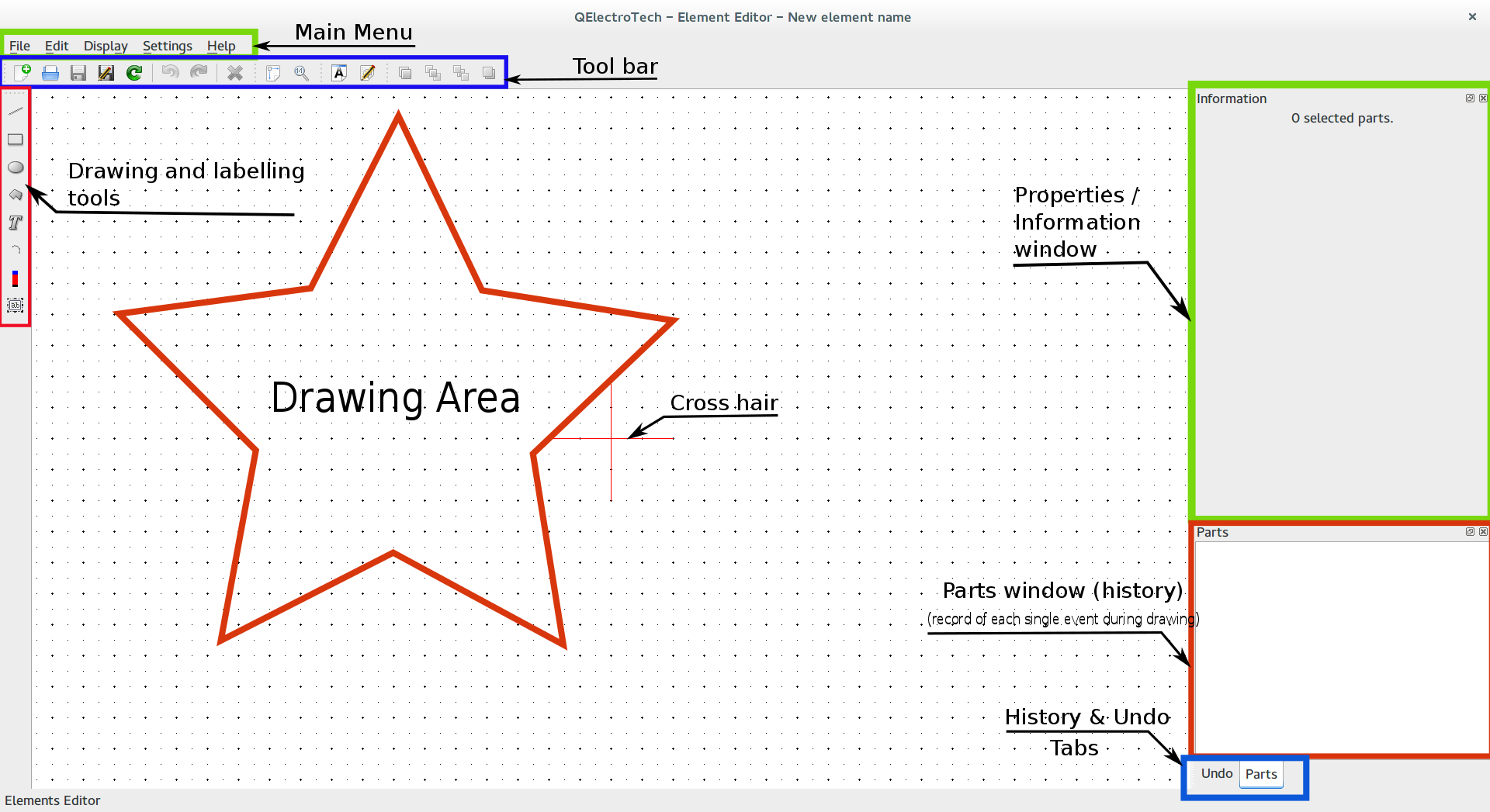
Fig.27 Elements Editor Main Window
9.2.1 Main Menu bar:
The Main menu bar has the standard set of windows options like File, Edit, Display, Settings and Help.
| Menu bar | Options | Function | Keyboard shortcut | Notes |
|---|---|---|---|---|
| File | New | Creates a new file | Ctrl + n | Same as New on tool bar |
| Open | Opens an existing element from user collection or imported list | Ctrl + o | Same as Open on tool bar | |
| Open from a file | Opens a file, usually a *.elmt file on disk | Ctrl + Shift + n | ||
| Recently opened | History of recently opened item | |||
| Save | Saves the current changes to the drawing / element (overwrites) | Ctrl + s | Same as Save on tool bar | |
| Save as | Saves the current drawing / element under a category | Same as Save as on tool bar | ||
| Save to a file | Saves the current drawing / element as a file on disk | Ctrl + shift + s | ||
| Reload | Reloads the element / drawing, can be used to revert changes | F5 | Same as Reload on tool bar | |
| Quit | Quit the elements editor window | Ctrl + q |
| Menu bar | Options | Function | Keyboard shortcut | Notes |
|---|---|---|---|---|
| Edit | Undo | Undo the last action | Ctrl + z | Same as Undo on tool bar |
| Redo | Repeat the last action | Ctrl + Shift + z | Same as Redo on tool bar | |
| Select All | Selects all objects in the drawing area | Ctrl + a | ||
| Select none | Removes all current selections | Ctrl + Shift + a | ||
| Invert selection | Inverts selection of objects in workspace | Ctrl + i | ||
| Cut | Equivalent to copy + delete the object | Ctrl + x | ||
| Copy | Copies the object selected | Ctrl + c | ||
| Paste | Pastes the object from last copy or cut | Ctrl + v | ||
| Paste in the area | Pastes object in the area specified by a mouse click | Ctrl + Shift + v | ||
| Paste from | Pastes objects from a file or element in collection | |||
| Delete | Deletes the selected object | Del | Same as Delete on tool bar | |
| Edit name and information of the element | Opens dialogue to change name or language | Ctrl + e | Same as in tool bar | |
| Edit author information | Opens dialogue to credit author | Ctrl + y | ||
| Edit element properties | Sets attributes for dependency or referencing | Same as in tool bar | ||
| Bring forward | Sets the selected object to be the top most part | Ctrl + Shift + Home | Same as in tool bar | |
| Raise | Sends up the selected object(s) by one level | Ctrl + Shift + Up | Same as in tool bar | |
| Lower | Sends down the selected object(s) by one level | Ctrl + Shift + Down | Same as in tool bar | |
| Send backward | Sets the selected object at the lowest level | Ctrl + Shift + End | Same as in tool bar |
| Menu bar | Options | Function | Keyboard shortcut |
|---|---|---|---|
| Display | Zoom in | Enlarges drawing | Ctrl + + |
| Zoom out | Gets a wider view of drawing | Ctrl + — | |
| Fit in view | Fits drawing in window | Ctrl + 9 | |
| Reset zoom | Sets zoon level to zero | Ctrl + 0 |
| Menu bar | Options | Function | Notes |
|---|---|---|---|
| Settings | Display | View or hide options in the editor window | Hides or shows information window etc., |
| Full screen mode | Spreads the window to fill the screen | Entire screen gets occupied by the window | |
| Configure QElectroTech | Opens the configure QElectroTech window | Same as described in Section.4 |
| Menu bar | Options | Function | Keyboard shortcut |
|---|---|---|---|
| Help | What is this ? | Enquires main menu options | Shift + F1 |
| About QElectroTech | Displays information about authors, contributors, translators and Licensing | ||
| About Qt | Displays information about Qt, a C++ toolkit for cross platform applications |
9.2.2 Drawing area:
This is the dotted grid area over which the elements are drawn. The grid area has two kinds of markings . and +. The distance between two consecutive + is 10px and between two consecutive . is 5px.
User can pick up a drawing tool from the drawing tools with a single click. A faded gray cross hair mark now appears with cursor, with its intersecting point at the cursor position. These reference marks assist in the drawing. The information window describes the properties of individual part in the drawing and it is accessible only when the part is selected. The interactive behaviour with mouse in the drawing editor window on a macro level includes :
- Selection of drawing parts is possible using left mouse button, in a manner described for selection of elements; refer Selection properties. Individual parts can be selected with a left mouse click.
- Mouse middle button can be used to zoom in and out.
- Right mouse button click in the window gives access to many interesting functions, that includes most of the keyboard shortcuts described under main menu bar.
9.2.3 Undo & Parts:
Undo & Parts windows are related to each other, in the sense Undo keeps a record of each of the user’s action in the drawing and Parts keep inventory of the parts. A brief use of these tabs are explained here —
- User may go back to any previous state by selecting the point in the Undo window. The states are listed in the chronological order with the latest state highlighted at the bottom of the list.
- Parts window will show the inventory of the parts in the state specified by Undo. Reverting to a previous state from Undo (by point (a)) will also update the corresponding inventory in the Parts window.
- By default the parts tab is displayed. It contains all the individual parts that make up the drawing.
- As the complexity of the drawing or element increases, it become easier to define properties of individual parts from the parts window. Select a part from the parts window, its referencing component in the drawing is highlighted in red color (other than texts). User can now define its attributes such as position, color, fill, thickness etc., in the information window.
- User can also exploit keyboard shortcuts Del (delete), Ctrl + c (copy), Ctrl + x (cut), Ctrl + v (paste) and Ctrl + z (undo) after selecting a part from the parts window, to speed up his/her work in the elements editor.
9.2.4 Information window:
Information window displays the properties (attributes) of the selected individual part in the drawing. The properties of each part is its type dependent. However, a few things are common to some common shapes and they are described here.
- Appearance (For Line, Square, Ellipse and Arc tools)
-
The appearance properties for a part are line style, outline color, weight (thickness of lines), filling color for closed geometry like rectangle, square etc., and antialiasing, which is to remove distortions of the skectches and smoothem for better smoother appearance.
- Outline color specifies a color for the lines of the part selected. The selected part can be any geometry such as an ellipse, a curve, a straight line or a rectangle etc.,. There are five colors that a user can choose from namely — Black, White, Green, Red and Blue.
- Filling lets user to fill colors in the area bounded by the part’s closed geometry such as a triangle, square, ellipse etc., User can keep the bounded area transparent by assigning None as the filling option or choose a color from Black, White, Green, Red and Blue.
- Line style describes how line(s) should be displayed for the part selected. Options include
- Normal: Straight continuous lines
- Dashed: Dashed lines
- Dotted: Dotted lines
- Dots and dashes: One dot followed by a dash and repeated.
- Weight defines the thickness of the line segments of the selected part. The options are qualitatively provided in QElectroTech such as None, Thin, Normal, Strong and High.
- Antialiasing is an option to remove distortions from the selected part. Some lines (especially slanting) appear with stairstep-like distortions at the edges, referred to as jaggies in computer graphics. These distortions can be minimized by choosing this option.
- Geometry
- Geometrical properties for a part varies with the part selected. A simple line, a square or a rectangle, a circle, text fields, a terminal and an arc will have their own set of specific parameters, which are displayed in the information panel. Try drawing each of the drawing tools in the work area and select them to check the information area. Watch how the parameters change with each geometry. Try changing the parameters from the information window to note their effect on the part in the drawing.
| Tool | Geometry defined by | Options in Information window |
|---|---|---|
| Line | Start position | x1, y1 (spin box) |
| End position | x2, y2 (spin box) | |
| Start arrow | End 1 and arrow size (value in px) | |
| End arrow | End 2 and arrow size (value in px) |
| Tool | Geometry defined by | Options in Information window |
|---|---|---|
| Rectangle | Top left corner position | x, y (spin box) |
| Width (Horizontal spread) | value in px | |
| Height (Vertical spread) | value in px |
| Tool | Geometry defined by | Options in Information window |
|---|---|---|
| Ellipse | Center position | x, y (spin box) |
| Diameter Horizontal | value in px | |
| Diameter Vertical | value in px |
| Tool | Geometry defined by | Options in Information window |
|---|---|---|
| Polygon |
Each coordinate in tabular form; double click to change |
x, y columns |
| Closed polygon | Selection box |
| Tool | Geometry defined by | Options in Information window |
|---|---|---|
| Add a Text | Position | x, y (spin box) |
| Size | Value in px (spin box) | |
| Color | Black or White as options | |
| Text | Text field (default text is T) | |
| Rotation angle | Graphic selection or input field |
| Tool | Geometry defined by | Options in Information window |
|---|---|---|
| Arc | Center | x, y |
| Diameter horizontal | Value in px (spin box) | |
| Diameter vertical | Value in px (spin box) | |
| Starting angle (begin of arc) | Value in px (spin box) | |
| Angle (Arc termination angle) | Value in px (spin box) |
| Tool | Geometry defined by | Options in Information window |
|---|---|---|
| Terminal | Position of blue tip | x, y (spin box) |
| Orientation | North, South, East or West |
| Tool | Geometry defined by | Options in Information window |
|---|---|---|
| Text field | Position | x, y (spin box) |
| Size (Font size) | Value in px (spin box) | |
| Default text | Text field (default text is _) | |
| Tagg (element requires 1 label) | None or Label (Combo box) | |
| Default rotation angle | Graphic selection or input field | |
| Donot follow parent rotations | Lock text field orientation (check box) |
9.2.5 Active area:
Active area is the part of the element that is selected with a left mouse click. The active area attributes (properties) are displayed in the information window and the segment will be highlighted in the parts window.
9.2.8 Drawing bar:
The drawing bar has a set of tools like a line, rectangle, ellipse etc., for constructing an element. Each instance of usage of a tool is called a part. Each tool has its characteristic properties displayed in the Information window. Refer to section on Geometry to know in detail about specific features of the corresponding tool. In the following topics, detailed procedure to apply each tool is described.
9.2.8.(G) Add text:
Some elements require a name to be associated with it. Add a text tool permits inserting such text with an element. It can be activated by a single left click on the Add a text the tool in the drawing bar. Select a point in the drawing area by a left mouse click to insert the text field. Text can be entered from its information panel. Few basic formatting options are also included such as font size, color, orientation etc.,. The add text field is used to label the element or its components and it cannot be edited during the elements use in QElectroTech main drawing window. Also refer to sections on working with drawing tools , Appearance and Geometry for more information.
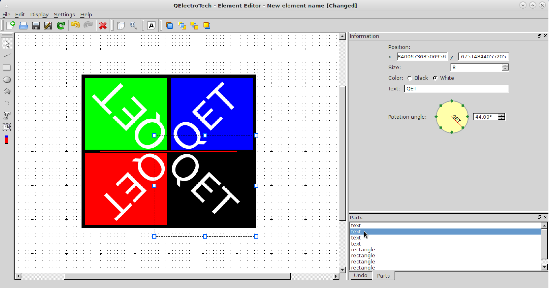
Fig.34 Text tool and information:
Add a text tool permits fixed naming of the element or its parts at the time of its drawing in elements editor. Add text appears as a text box with a default text T. The text can be resized from the font size field in its information panel. Drag and drop functions to reposition it in the elements editor drawing area are provided. The information panel describes the text box position by a single point coordinate, font size, color, text to display and orientation. Text can be set in any direction from 0 to 359.99o (degrees). The Fig.34 shows text QET added to rectangles filled with different colors for demonstration.
9.2.8.(H) Add a text field:
Select the Add a text field tool with a left mouse click to activate it. Use left mouse click to select a point in the drawing area to add a text label. A text box with a default font _, appears at the point selected. The field size is defined by the font size and can be set from its information panel. The add text field should be included as a label to the element or its components. The field is editable during its use in the QElectroTech drawings unlike the Add a text field. User may add information to the element using the field, while working with it in the QElectroTech main drawings. Also refer to sections on working with drawing tools , Appearance and Geometry for more information.
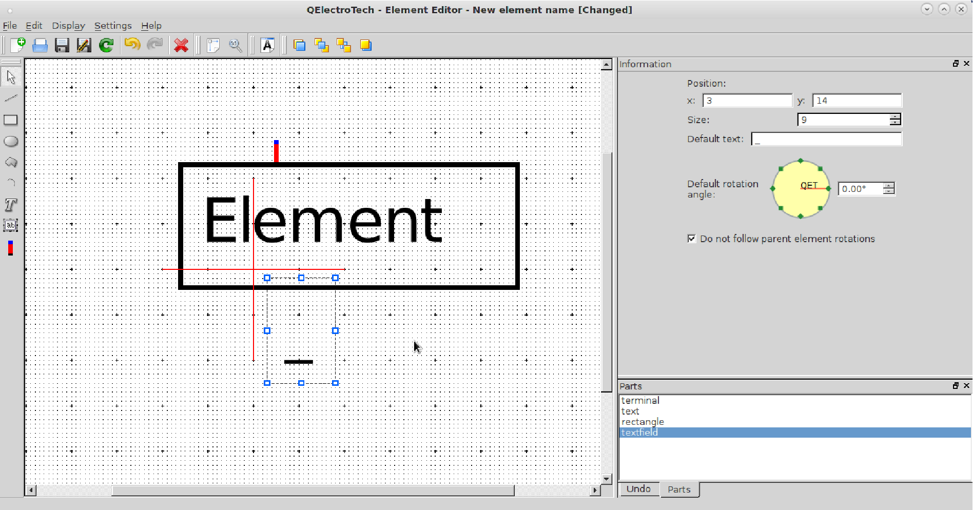
Fig.35 Text field inserted for an element:
Every element requires at least one Add a text field, which is tagged as a label from its information window. Drag and drop functions are possible for this field in both elements editor and in the QElectroTech drawing window independent of the parent element. The information panel describes the text box position by a single point coordinate, font size, default text as _. Add a text field can be oriented in any direction possible from 0 to 359.99. The Fig.35 shows the Add a text field in its default appearance. The tool has an additional option of Do not follow parent element rotations to lock its orientation in the QElectroTech drawing window. With this option selected, the text field does not rotate even when the parent element to which it is associated is rotated in the QElectroTech drawing.
10. Sample tutorial — Creating a Globe Valve Element
The tutorial here explains the creation of a globe valve element. You may click on the animated graphic to zoom to understand the sequence of steps followed to create and import elements in diagrams. The graphic is provided with text to offer guidance to each action required in the stage.
Fig.36 Steps for creating and importing elements in QElectroTech (Right click the image and select view image to watch the animation in full screen)
© Copyright 2015, QElectroTech, Arun Kishore Eswara, Nuri.
Last updated on Mar 12, 2017.
Created using Sphinx 1.2.2.
Scroll to navigation
| QELECTROTECH(1) | Руководство пользователя |
QELECTROTECH(1) |
NAME
qelectrotech — Редактор
электросхем
SYNOPSIS
qelectrotech [—common-elements-dir=DIR]
[—config-dir=DIR] [—lang-dir=DIR]
[—help] [-v|—version] [—license]
[FILE ]…
ОПИСАНИЕ
QElectroTech — это
редактор
электрических
схем. Схемы
(*.qet) и
электрические
элементы (*.elmt)
хранятся в
формате XML. В
схемах
могут быть
использованы
элементы
как из
коллекций
QElectroTech, так и из
коллекций
пользователя.
Обычно
общие
коллекции
QElectroTech доступны
пользователям
для чтения,
но
недоступны
для
редактирования.
У каждого
пользователя
есть
собственная
коллекция,
которую он
может
изменять
по своему
усмотрению.
ПАРАМЕТРЫ
- —common-elements-dir=DIR
- DIR — корневой
каталог
коллекций
QElectroTech.
Замечание :
Этот
параметр
доступен
только
если при
компиляции
была
указана
директива
QET_ALLOW_OVERRIDE_CED_OPTION. - —config-dir=DIR
- DIR — каталог
конфигурации
текущего
пользователя.
Этот
каталог
содержит
файл qelectrotech.conf,
который
содержит
настройки
программы,
и
подкаталог
elements,
содержащий
коллекцию
элементов
пользователя.
Замечание :
Этот
параметр
доступен
только
если при
компиляции
была
указана
директива
QET_ALLOW_OVERRIDE_CD_OPTION. - —lang-dir=DIR
- Ищет фалы
локализаций
в каталоге
DIR. - —help
- Показывает
короткое
описание
доступных
параметров. - -v, —version
- Показывает
версию
программы
(т.е.: 0.1). - —license
- Показывает
лицензию
программы
(GNU/GPL).
Обратите
внимание,
что если в
командной
строке
указан
один из
трех
последних
параметров,
программа
прекратит
исполнение
после
отображения
соответствующей
информации.
Если
запущенный
пользователем
экземпляр
программы
все еще
работает,
этот
экземпляр
примет
команду, и
особенно
файлы для
открытия.
Тем не
менее,
параметры,
переопределяющие
каталоги
(общие
коллекции,
конфигурации
и файлов
локализации)
не будут
приняты.
Если имена
файлов
оканчиваются
на .elmt, QElectroTech
будет
пытаться
открыть их
в
редакторе
элементов.
Иначе они
будут
открыты
как схемы.
АВТОРЫ
Benoit Ansieau <benoit@qelectrotech.org>
Xavier Guerrin <xavier@qelectrotech.org>
Laurent Trinques <scorpio@qelectrotech.org>
Joshua Claveau <joshua@qelectrotech.org>
Cyril.frausti <cyril@qelectrotech.org>
СООБЩЕНИЯ ОБ ОШИБКАХ
Если вы
заметили
необычное
для вас
поведение
программы
загляните
сперва в FAQ
<http://qelectrotech.org/wiki/doku.php?id=doc:faq> и
наш BugTracker
<http://qelectrotech.org/bugtracker/>
чтобы
убедиться,
что
проблема
еще не
известна. В
этом
случае
сообщите
об ошибке
через BugTracker.
АВТОРСКИЕ ПРАВА
Авторские
права (c)
Разработчики
QElectroTech.
Лицензия : GNU/GPL v2+ :
<http://www.gnu.org/licenses/old-licenses/gpl-2.0.html>
Эта
программа —
свободное
программное
обесчение.
Вы можете
изменять и
передавать
ее другим.
Поставляется
как есть и
БЕЗ ВСЯКИХ
ГАРАНТИЙ.
СМОТРИТЕ ТАКЖЕ
Официальная
страница в
сети
Интернет :
<http://qelectrotech.org/>

Aula 1 QElectroTech

Программа для рисования электрических схем

Aula 1 QElectrotech
Похожие уроки:
 Видео уроки на русском фотошоп скачать бесплатно на…
- Видео уроки фотошопа для начинающих на русском языке…
- Qelectrotech видеоурок
- Уроки фотошопа cs5 на русском языке видео скачать…
- Видео уроки на русском вегас про 11 на русском


Добавить комментарий
Ваш e-mail не будет опубликован. Обязательные поля помечены *
Комментарий
Имя *
E-mail *
Сайт
Current ye@r *
QElectroTech — это приложение с открытым исходным кодом для создания электрических, электронных схем, схем автоматизации и управления. Программное обеспечение также может использоваться для создания механических объектов для иллюстрации процессов, чертежей приборов среди различных творческих возможностей.
QЭлектроТех это хорошее приложение для рисования профессионального качества для нескольких чертежей, составляющих проект, поскольку он содержит большую коллекцию стандартных и пользовательских символов, называемых элементами, которые описывают большинство компонентов, обычно используемых в электрических, гидравлических и пневматических компьютерных системах.
Эти элементы можно выбирать, перетаскивать мышью над редактором диаграмм и соединять линиями для представления или описания системы. В рамках одного проекта можно написать большое количество таких диаграмм.
QЭлектроТех также состоит из встроенного редактора элементов что позволяет создавать новые элементы, которых нет в коллекции.
Элементы коллекции QET не редактируются, то есть доступны только для чтения. Но как только элемент перетаскивается на диаграмму, он автоматически добавляется в «импортированную» коллекцию в дубликате.
Эта копия элемента будет доступна для редактирования, чтобы внести соответствующие изменения для создания пользовательских символов.
QET доступен под лицензией GNU GPL v2. Разработка программного обеспечения ведется на C ++ и Qt5.
Индекс
- 1 О версии QElectroTech 0.7
- 1.1 Исправлен баг с «фантомными драйверами»
- 1.2 Редактируемые текстовые элементы
- 1.3 Совместимость старого текста
- 2 Загрузите и установите QelectroTech на Ubuntu и производные версии
В настоящее время QelectroTech находится в версии 0.7, которая был разработан как полированная версия, чтобы стереть различные мелкие дефекты это иногда требует много работы.
Исправлен баг с «фантомными драйверами»
Был ошибка в QET, связанная с библиотекой Qt, которая вызвала сбой. Это было предсказуемо, как только контроллер или простая форма, которая была очищена впервые, отображалась на экране и вызывала артефакты во время прокрутки мыши или переключения масштабирования. В конечном итоге это было исправлено, и поправка имела обратную силу.
Редактируемые текстовые элементы
Одно из больших изменений в этой версии — управление текстами элементов. В предыдущих версиях тексты элементов создавались из редактора элементов. После того, как элемент был помещен в редактор схем, единственная возможность, предлагаемая пользователю, заключалась в изменении содержимого текстового поля.
С новыми текстами все обстоит иначе:
Во-первых, тексты можно добавлять или удалять «на лету» из редактора схем, который огромен по сравнению с предыдущими версиями, но на этом улучшения не заканчиваются.
Тексты могут иметь три источника:
- текст пользователя: простой текст, написанный непосредственно пользователем
- Информация о товаре: в тексте отображается одна из сведений о товаре (тег, комментарий, производитель и т. Д.)
- Составной текст: это смесь того и другого.
Совместимость старого текста
Новые текстовые поля несовместимы со старыми, их просто удалили из кода (что позволило заодно лучше сократить код). При открытии проекта, созданного в предыдущей версии, функция конвертирует старый и новый тексты прозрачным для пользователя образом.
Загрузите и установите QelectroTech на Ubuntu и производные версии
Для тех, кто хочет установить и протестировать это отличное приложение для создания электрических цепей.
Первое, что мы сделаем, это зайдем на его официальный сайт, то, что вы можете сделать, нажав По следующей ссылке.
Здесь мы собираемся перейти в раздел загрузки и получить последнюю стабильную версию 0.7.
Или из терминала вы можете сделать это, набрав следующую команду:
wget https://download.tuxfamily.org/qet/builds/AppImage/QElectroTech_0.7-r5967-x86_64.AppImage
Как только загрузка будет завершена, мы дадим ей права на выполнение с помощью следующей команды:
sudo chmod +x QelectroTech_0.7-r5967-x86_64.AppImage
Наконец, мы можем запустить приложение, дважды щелкнув загруженный файл или с того же терминала с помощью:
./QelectroTech_0.7-r5967-x86_64.AppImage
Мы также можем установить QelectroTech из репозиториев Snap.. Таким образом, у нас должна быть поддержка только для этого типа пакетов.
Установка выполняется с терминала с:
sudo snap install qelectrotech
Содержание статьи соответствует нашим принципам редакционная этика. Чтобы сообщить об ошибке, нажмите здесь.