App Designer provides a tutorial that guides you through the process of creating a
simple app containing a plot and a slider. The slider controls the amplitude of the
plotted function. You can create this app by running the tutorial, or you can follow the
tutorial steps listed here.
Tutorial Steps for Creating the App
App Designer has two views for creating an app: Design View
and Code View. Use Design View to create
UI components and interactively lay out your app. Use Code View
to program your app behavior. You can switch between the two views using the toggle
buttons in the upper right-corner of App Designer.
To create the simple plotting app, open a new app in App Designer and follow these
steps.
Step 1: Create an Axes Component
In Design View, create UI components and modify their
appearance interactively. The Component Library contains
all components, containers, and tools that you can add to your app
interactively. Add a component by dragging it from the Component
Library onto the app canvas. You can then change the appearance
of the component by setting properties in the Component
Browser, or by editing certain aspects of the component, such as
size and label text, directly on the canvas.
In your plotting app, create an axes component to display plotted data. Drag
an Axes component from the Component
Library onto the canvas.
Step 2: Create a Slider Component
Drag a Slider component from the Component
Library onto the canvas. Place it below the axes
component.
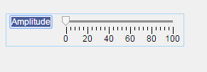
Step 3: Update the Slider Label
Replace the slider label text. Double-click the label and replace the word
Slider with Amplitude.
When you have finished laying out your app, the canvas in Design
View should look like this:
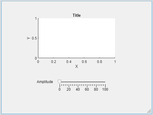
For more information about laying out apps, see Lay Out Apps in App Designer Design View.
Step 4: Navigate to Code View
Once you have laid out your app, write code to program the behavior of your
app. Click the Code View button above the canvas to edit
your app code.
When you add components to your app in Design View, App
Designer automatically generates code that executes when you run the app. This
code configures your app appearance to match what you see on the canvas. This
code is not editable and is displayed on a gray background. As part of this
generated code, App Designer creates some objects for you to use when
programming your app behavior.
-
The
appobject — This object stores all of the
data in your app, such as the UI components and any data you specify
using properties. All functions in your app require this object as
the first argument. This pattern enables you to have access to your
components and properties from within those functions. -
The component objects — Whenever you add a component in
Design View, App Designer stores the
component as an object named using the form
app.ComponentName.
You can view and modify the names of the components in your app
using the Component Browser. To access and
update component properties from within your app code, use the
pattern
app.ComponentName.Property.
Step 5: Add a Slider Callback Function
Program your app behavior using callback functions. A
callback function is a function that executes when the app user performs a
specific interaction, such as adjusting the value of a slider.
In your plotting app, add a callback function that executes whenever the user
adjusts the slider value. Right-click app.AmplitudeSlider in
the Component Browser. Then select > in the context menu.
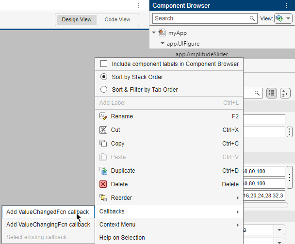
When you add a callback to a component, App Designer creates a callback
function and places the cursor in the body of that function. App Designer
automatically passes the app object as the first argument of
the callback function to enable access components and their properties. For
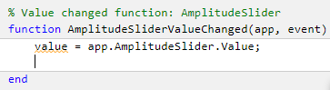
example, in the AmplitudeSliderValueChanged function, App
Designer automatically generates a line of code to access the value of the slider.
For more information about programming app behavior using callback functions,
see Callbacks in App Designer.
Step 6: Plot Data
When you call a graphics function in App Designer, specify the target axes or
parent object as an argument to the function.
In your plotting app, update the plotted data in the axes whenever the app
user changes the slider value by specifying the name of the axes object in your
app, app.UIAxes, as the first argument to the
plot function. Add this code to the second line of the
AmplitudeSliderValueChanged callback to plot the scaled
output of the peaks function on the
axes.
plot(app.UIAxes,value*peaks)
For more information about displaying graphics in an app, see Display Graphics in App Designer.
Step 7: Update Axes Limits
To access and update component properties from within your app code, use the
pattern
app.ComponentName.Property.
In your plotting app, change the limits of the y-axis by
setting the YLim property of the app.UIAxes object. Add this command to the third line of the
AmplitudeSliderValueChanged
callback:
app.UIAxes.YLim = [-1000 1000];
Step 8: Run the App
Click 
Run to save and run the app. Adjust the value of the
slider to plot some data in the app.
After saving your changes, your app is available for running again in App
Designer or by typing its name (without the .mlapp extension)
in the MATLAB® Command Window. When you run the app from the command prompt, the
file must be in the current folder or on the MATLAB path.
App Designer
Create apps interactively
Description
App Designer is an interactive development environment for designing
an app layout and programming its behavior.
You can use App Designer to:
-
Interactively create, edit, and share apps.
-
Interactively create custom UI components to use in apps or share with
others. -
Explore featured examples to help you get started with building apps using
MATLAB®. -
Take a guided tutorial to learn the basics of interactive app development in
MATLAB.
For more information, see Create and Run a Simple App Using App Designer.
Open the App Designer
-
MATLAB Toolstrip: On the Apps tab, click

Design App. -
MATLAB command prompt: Enter
appdesigner.
Examples
expand all
Create App
When you open App Designer, the App Designer Start Page appears.
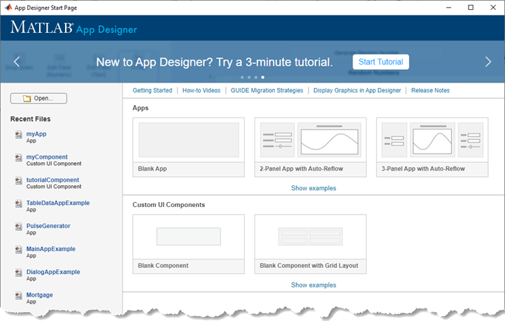
To create an app, select one of the app templates from the Apps
section of the Start Page:
-
Blank App — Create a blank app file.
-
2-Panel App with Auto-Reflow — Create an app with two
panels that automatically resize and reflow to fit different device screen
sizes. -
3-Panel App with Auto-Reflow — Create an app with three
panels that automatically resize and reflow to fit different device screen
sizes.
A new file named app1.mlapp opens in App Designer. The
app1.mlapp file does not appear in the MATLAB Current Folder browser until you save it.
To learn more about how to design your app using App Designer, see Create and Run a Simple App Using App Designer.
Create Custom UI Component
Create a custom UI component that you can use in your apps or share
with others.
When you open App Designer, the App Designer Start Page appears.
To create a custom UI component, select one of the templates from the
Custom UI Components section of the Start Page:
-
Blank Component — Create a blank custom UI component
file. -
Blank Component with Grid Layout — Create a custom UI
component with a grid layout that manages the UI component layout and size in an
app.
A new file named comp1.mlapp opens in App Designer. The
comp1.mlapp file does not appear in the MATLAB Current Folder browser until you save it.
To learn more about creating custom UI components using App Designer, see Create a Simple Custom UI Component in App Designer.
Open Existing App File
Open an existing app created in App Designer by clicking the
Open button on the App Designer Start Page. Alternatively, if
you have recently opened an app, click the app name in the Recent
Files section to reopen the file.
Package and Share App
After creating an app, you can package it into a single installer
file that you can easily share with others.
With the app open in App Designer, select the Designer tab.
Then select Share > MATLAB App.
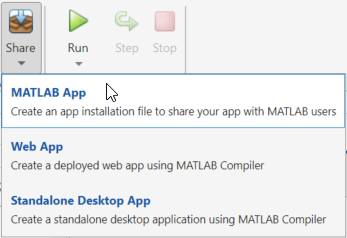
Fill out the Package App dialog box, then click Package to
create an installation file to share your app with your users.
For more information, see Package Apps in App Designer.
Related Examples
- Ways to Build Apps
- Lay Out Apps in App Designer Design View
- Manage Code in App Designer Code View
Programmatic Use
expand all
appdesigner
appdesigner opens the App Designer Start Page.
appdesigner(filename)
filename)appdesigner( opens the specifiedfilename)
MLAPP file in App Designer. Specify filename as a string scalar or
character vector.
If the MLAPP file is not on the MATLAB path, specify the full path. For example,
appdesigner("C:\Documents\myapp.mlapp") opens the specified file in App
Designer.
Version History
Introduced in R2016a
Разработайте приложения в интерактивном режиме с помощью App Designer
App Designer является интерактивной средой разработки для разработки размещения приложения и программирования его поведения. Это обеспечивает полностью интегрированную версию MATLAB® Редактор и большой набор интерактивных компонентов пользовательского интерфейса. Это также предлагает менеджеру по размещению сетки, чтобы организовать ваш пользовательский интерфейс и автоматические опции обратного течения, чтобы заставить ваше приложение обнаружить и ответить на изменения в размере экрана. Это позволяет вам распределить приложения путем упаковки их в файлы инсталлятора непосредственно от панели инструментов App Designer, или путем создавания автономного настольного приложения, или веб-приложение (требует MATLAB Compiler™).
Чтобы начать, смотрите, Создают и Запуск Простое приложение Используя App Designer или смотрят Getting Started with App Designer.
Функции
appdesigner |
Начальная страница Открытия App Designer или существующий файл приложения |
Темы
Сопутствующая информация
Рекомендуемые примеры
Introduction:
MATLAB App Designer is a drag and drops feature of MATLAB that lets you create professional apps without being an experienced software developer. Drag and drop visual components to layout your graphical user interface (GUI) design and use the integrated editor to program its behaviour quickly. In this blog, you will get to know the essential elements of the app designer. After going through the blog, you will be able to design a complex-looking yet simple app in MATLAB App Designer. The app that we will be creating is an Amplitude Modulation Analyzer.
Difference between App Designer and GUIDE:
App designer is the recommended environment for app development. MathWorks is no longer putting development effort into improving GUIDE and hasn’t for several years. Meanwhile, a significant development effort is going into improving App Designer. Existing GUIDE apps can run in MATLAB, but they are no longer editable. App Designer looks much better and is easier to use than GUIDE. As of R2017b, App Designer can do anything GUIDE can do. App designer also supports Rich Canvas Interactions, Embedded Code Editor, Rich Property Editors, App Metadata Management etc. For more details or an in-depth comparison, you can refer to this link.
Main features of App Designer:
- Beginner-friendly interface makes it easy for new users to explore it independently.
- Design the user interface as well as the code behaviour of the app.
- The generated codes are fully object-oriented.
- Availability of many instrumentation devices like knob, lam, led, switch.
Now that we know some of the advantages of MATLAB App Designer, let’s go through the interface of the app designer.
Starting with App Designer:
There are two ways to start the App Designer in MATLAB. These are:
- On the Home tab, go to ‘New’ and select ‘App’ from the drop-down menu.

Starting app designer by home tab

Starting app designer by command
Once the App Designer is launched, you should have the following screen in front of you.

App designer window
On the top side of the designer tab, you have the following options – New, Open, Save, App Details, Share, and Run.

Designer tab
The first three options are self-explanatory. ‘App Details’ option shows your app’s name, summary, and description.

App details window
All three options are editable. You are advised to fill in the summary and description of your app so that whenever you share your app with someone, they can quickly get an overview of the functioning of your app.
The next button is ‘Share’, which, as the name suggests, is used to share your app with someone else. The ‘Run’ button is used to run the app.
The second tab, named canvas, gives you alignment and resizing options. As of now, you can leave it as it is.
The component library contains sliders, buttons, axes, led, gauges, etc.

Component library
It is divided into four parts: Common, Containers, Figure Tools, and Instrumentation. You can refer to the MATLAB documentation for a complete and detailed list of all the available components.
Designing your first app:
To start designing your app, you should first figure out what components you need. For example, if you need to show graphs in your app, you might need the Axes and Slider components. Also, have a rough idea in your mind of an interface that you want for your app. In this blog, we are creating a simple Amplitude Modulation App. We will start with dragging the Axes component on the design sheet.

Dragging axes component to Design View
In the app, I want to show three graphs for the message signal, carrier signal, and the modulated result respectively; therefore, I will have to set three axes on the design sheet.

All axes component in Design View
As you keep dragging specific components in the sheet, you might have noticed that new entries automatically appear in the component browser on the window’s right side. You can also edit certain properties by selecting the specific component and modifying it in the properties section below.

Component Browser and Properties
We will change the title, x, and y-axis only for now. You can also double-click on the text to edit it.

Labeling the axes
Now I want to give some input to my app. Since the information needs to be numeric, I have to use Edit Field (Numeric) component, Slider component, or Knob component. I will be using the first two components mentioned earlier, so let’s drag them to our design sheet.

Complete interface of app
As you can see, I have used four numeric fields and one slider component. I have already changed the labels of all the added components. Vm and Vc fields will be used to get the voltage or amplitude of the message and carrier signal. Similarly, Fm and Fc will be used to get the frequency of the message and carrier signal. Let’s add additional labels to them by dragging the Label component.

Adding labels
I will change the labels to ‘Voltage’ and ‘Frequency’, respectively. You should get the following UI in your design view if you have been following along until now.

Final UI of app
For now, our work in the design view is completed. Click on the Code View to switch to the coding part of the App Designer.

Opening code view

Code View of app
You will notice specific new options have come out while some things have changed. Let’s quickly glance over the new stuff. The first thing is the Editor tab on the top. It has some essential elements in the insert part. These are Callback, Function, Property, and App Input Arguments.

Editor tab in code view
A callback is a function that executes when a user interacts with a UI component in your app. We use callbacks to program the behaviour of our app. The function creates either a public function or a private function. Property is used to share data within an app. It is also of two types: public and private. App Input Arguments are used to bring in input arguments.
Callbacks, functions, and properties are accessible from the left side of the window under Code Browser. Below that, you can see App Layout, which shows a preview of your app. The right-side accessibility options are the same as before.

Code Browser and App Layout
Adding interactivity to the app components:
Now let’s add some callbacks to our app so that the added components can respond to the user input. I will be sowing the more straightforward method of adding callbacks. It would be best to have a rough idea of the components for which you want the callbacks. For example, I want to take voltage input and frequency input in my app. The moment I get the frequency input, I want to display their graphs in the axes. Therefore, I will be adding callbacks for the Fc and Fm fields.
In the component browser in the code view, select the entry having the name ‘FmEditField’. Right-click on it and go to callbacks.

Adding the first callback

Adding the first callback
After clicking on add callback button, your cursor will be placed in the following section.

Callback function
As you can see, you have created a private callback function for your app for the Fm Edit Field component. The value variable takes whatever value is being provided by the user.
Add the following lines of code in this function.
% Value changed function: fmEditField
function fmEditFieldValueChanged(app, event)
fm = app.fmEditField.Value;
vm = app.VmEditField.Value;
Ta=1/fm;
t=0:Ta/999:6*Ta;
ym=vm*sin(2*pi*fm*t);
plot(app.UIAxes, ym, ‘r’)
end
Here, we are also reading the value of the Vm edit field, but there is no response for that in the app. The moment we get the frequency or Fm, we plot the graph. So you can say that the Fm edit filed is creating some response in the app. Add another callback function for the Fc edit field by following the above steps. After adding the callback, write the following lines of code in the function.
% Value changed function: fcEditField
function fcEditFieldValueChanged(app, event)
fm = app.fmEditField.Value;
fc = app.fcEditField.Value;
vc = app.VcEditField.Value;
Ta=1/fm;
t=0:Ta/999:6*Ta;
yc=vc*sin(2*pi*fc*t);% Eqation of carrier signal
plot(app.UIAxes2, yc)
end
We are doing the same thing here, i.e., as soon as we have the value of Vc and Fc, we plot a graph for the carrier signal.
Now add a callback function for the slider component and write the following lines of code.
% Value changed function: ModulationSlider
function ModulationSliderValueChanged(app, event)
m = app.ModulationSlider.Value;
m = 0.01*m;
vc = app.VcEditField.Value;
fm = app.fmEditField.Value;
fc = app.fcEditField.Value;
Ta=1/fm;
t=0:Ta/999:6*Ta;
y = vc*(1+m*sin(2*pi*fm*t)).*sin(2*pi*fc*t);
plot(app.UIAxes3, y, ‘g’)
end

Running our app
I have given the app a name and tweaked the plot colours. You can do the same in the design view in the app properties.
Let’s give some sample input and check whether the app is working or not.
Input:
Vm – 5
Vc – 5
Fm – 500
Fc – 2000
Modulation % – 20

Output result in app
Conclusion:
We have successfully created an Amplitude Modulation Analyzer as an app using MATLAB App Designer. Why did we even bother to do our work with an app? Well, the answer lies in our results. We can create an incredible looking impact with the help of apps. It also decreases the amount of work needed to get the output or outcome. Even a non-technical person can use the app to do their job.
Explore more:
We have covered many more topics using the MATLAB App Designer. Some of our most sought-after works are:
IPL with MATLAB
Perform programming with the Indian Premier League in MATLAB and visualize the progress of each team as it’s happening with the graphical power of MATLAB & App Designer.
Blood Cell Counter with MATLAB
In this webinar, you will learn the concepts of image segmentation for analyzing and counting red and white blood cells in MATLAB App Designer. This webinar is a must-watch if you want to create a project based on RBC & WBC Segmentation.
Fitness Tracker with MATLAB
In this webinar, you will learn about your fitness and health and the importance of the parameters like BMI, WHR, WHtR, etc. You will be able to track your fitness within MATLAB with our Application.
Get instant access to the code, model, or application of the video or article you found helpful! Simply purchase the specific title, if available, and receive the download link right away! #MATLABHelper #CodeMadeEasy
Ready to take your MATLAB skills to the next level? Look no further! At MATLAB Helper, we’ve got you covered. From free community support to expert help and training, we’ve got all the resources you need to become a pro in no time. If you have any questions or queries, don’t hesitate to reach out to us. Simply post a comment below or send us an email at [email protected].
And don’t forget to connect with us on LinkedIn, Facebook, and Subscribe to our YouTube Channel! We’re always sharing helpful tips and updates, so you can stay up-to-date on everything related to MATLAB. Plus, if you spot any bugs or errors on our website, just let us know and we’ll make sure to fix it ASAP.
Ready to get started? Book your expert help with Research Assistance plan today and get personalized assistance tailored to your needs. Or, if you’re looking for more comprehensive training, join one of our training modules and get hands-on experience with the latest techniques and technologies. The choice is yours – start learning and growing with MATLAB Helper today!
Education is our future. MATLAB is our feature. Happy MATLABing!
How to use App Designer for Simple GUI Design
Requirements for App Designer
Mathworks rolled out the App Designer , as alternative for GUIDE in R2016a. This is a major product improvement in MATLAB after it’s major graphics system upgrade in 2014b. To use App Designer,one will need to have R2016a installed, or if you already have any versions between 2014b or 2015b installed, you can download the install package for App Designer from FileExchange :
http://www.mathworks.com/matlabcentral/fileexchange/48142-app-designer
To invoke App Designer, type “appdesigner” at the command-line
App Designer main features
Sever main features of App Designer I think it’s important to notice :
- The most obvious one: The generated code are fully object oriented code
- The most advantage: More industrial related UI controls: dashboard, knob, LED light etc.

- More friendly designer interface, easy for new user to explore on their own.
How to use App Designer to do the layout of a GUI
In my book , I had an ATM example as the following:
![[GUI][Scatch][DepositWithdrawOneView].jpg](https://lifeinplaintextblog.files.wordpress.com/2016/04/guiscatchdepositwithdrawoneview2.jpg?w=776)
In section 7.1, I first used GUIDE to design such interface, and then in section 7.2, 7.3, I introduced programmatic way to design the GUI without using GUIDE, and eventually I used OOP to design the GUI. In this series of App Designer tutorial, I will use the similar approach: First use App Designer’s GUI to design, and then introduce how to programmatically implement the GUI.
First, open the App Deisgner GUI
Drag a Edit Field(Numeric) and a Button from App Designer

App Designer offers very friendly GUI layout design, if we move the UI control a little on the canvas, it will offers guidance for alignment

The final adjusted GUI looks like the following:

Notice , if choose more than one UI control, App Designer offers option for all kinds of alignment, horizontally or vertically, this is one of the most friendly feature in my opinion.

How to change the UI control/property name
If we click the CodeView tab, we will see auto-generated code for this app. Some of the code area are grayed out, because this view does not allow for editing directly, it can only be changed via interactive ways offered by App Designer. In tutorial 1, we will follow this recommended workflow, in later tutorials, I will show how to change the grayed code programmatically.
In CodeView, we saw two Buttons are the properties of the class, and their names are “Button”, and “Button2”, such names are not helpful for the readability of the code,so lets change them to become more meaningful:

We can click the app.Button and app.Button2 in the Component Browser(right column) to type the new names. Notice the code on the left will change automatically at the same time, even they are grayed-out code.

Other two important properties are the edit fields, their names are “NumericEditField” and “NumericEditField2” initially, lets change the names for readability, make them “ViewBalance” and “ViewRMB” respectively

How to add properties for the app
Using MVC pattern, we are hoping to separate the GUI’s View and Model(We will not implement MVC in tutorial 1), in this app, the Model class should include the Balance of the account, therefore lets add a properties for the Balance, it can be achieved by “Editor->Property->Insert Private Property”

From CodeView, we saw that App Designer automatically inserted a property, and the attribute of the property is Private, this means that such property can not be accessed from outside of the class.
How to set the initial value for the UI control
When we present the GUI to the end user, usually there should be some initial value in the edit field. Here we hope to have some initial value in the ViewBalance and ViewRMB field as well. This can be achieved by modifying the startupFcn. This function is functionally equivalent to the Constructors of the MVC pattern
% Code that executes after component creation
function startupFcn(app)
    app.Balance = 500;
    app.ViewRMB.Value = 0 ;
    app.ViewBalance.Value = app.Balance;
end
The initial balance is 500, the initial draw/deposit amount is 0.

How to add callback for the UI control
In the end, we need to add two callbacks for the button. This can be achieved by “Component Browser->app.WithDrawButton->Callbacks->Add ButtonPushedFcn callback:

App Designer will automatically insert a method in the class definition, there is only one input of such method, which is called “app”, this is similar to “obj”, or “this” that we commonly use in the OOP code :
WithDrawButton’s callback
function WithDrawButton_ButtonPushed(app)
    value = app.ViewRMB.Value ;
    app.Balance = app.Balance - value;
    app.ViewBalance.Value = app.Balance;
end
DepositButton’s callback
% DepositButton button pushed function
function DepositButton_ButtonPushed(app)
    value = app.ViewRMB.Value ;
    app.Balance = app.Balance + value;
    app.ViewBalance.Value = app.Balance;
end
Notice , we separate the View’s Balance from the Model’s balance as two properties, this is the design principle from MVC pattern, App Designer does not really require the user to understand the OOP and design pattern, but in order to designer more robust and flexible Apps, such knowledge is indispensable.
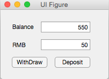
Finally, click the RUN button to test the simple program. The initial value is 500, and deposit 50, the Balance becomes 550, withdraw 200, the Balance becomes 350.