![]()
Unlock the world of statistics with this tutorial
Course Content
Take a Brief Tour of Prism
INSIDE THE VIDEO
From Prism’s toolbar to customizing graphs, this video takes you on a tour of Prism’s main features essential to understanding how Prism works.
How to Begin a New Project in Prism
INSIDE THE VIDEO
Learn how the Prism welcome screen helps get you the right data structure so you can quickly and easily enter your data and get the analysis and graphs you need for your research.
How to Import Your Data in Prism
INSIDE THE VIDEO
Explore features designed to efficiently organize your data in Prism. You will learn how to import your data, various options to arrange it, and keep it synced with your source files.
How to Access and Navigate Key Information for Your Projects in Prism
INSIDE THE VIDEO
Learn how projects are organized and be able to efficiently move around projects to get the information you need.
How to Change Your Analysis Choices in Prism
INSIDE THE VIDEO
Changing an analysis option or repeating an existing analysis is quick and easy in Prism. This video shows you how by introducing the Change menu and Change toolbar.
How to Correctly Move Data Between Data Tables in Prism
INSIDE THE VIDEO
Learn how to seamlessly copy data from one table format to another without the risk of incorrectly moving data to the wrong cells.
9 Prism Features to Help You Work Remotely
INSIDE THE VIDEO
This video walks you through helpful Prism features for better collaboration while working remotely.
How to Avoid P-Hacking
INSIDE THE VIDEO
Watch this video to learn more about P-Hacking with tips on how you can avoid it.
How to Choose between Regression and Correlation
INSIDE THE VIDEO
Watch this video to learn about the similarities and differences between correlation and regression and the advantages of each.
How to Choose the Right Statistical Test
INSIDE THE VIDEO
This video provides an informative overview of how to choose the right statistical test in Prism for your analyses. Think of this as a decision-making framework for all your data analysis projects in Prism.
Key Concepts of Prism Data Tables
INSIDE THE VIDEO
Prism has eight data tables, each one aligned with a specific set of analyses and graphs. This video will show you how to choose the right table and explain how to enter your data into that table.
When to Use the XY Data Table
INSIDE THE VIDEO
Important analyses such as dose-response, nonlinear regression, simple logistic regression, and simple linear regression can only be run from an XY table. Learn more here.
When to Use the Column Data Table
INSIDE THE VIDEO
If you have a single categorical variable with two or more groups and a numeric response, you need a Column data table. Watch this video to learn more.
When to Use the Grouped Data Table
INSIDE THE VIDEO
If you have two categorical variables and a numeric response, you need a Grouped data table. Important analyses such as two-way and three-way ANOVA and multiple t tests can only be run from a Grouped table. Watch this video for more.
When to Use the Multiple Variables Data Table
INSIDE THE VIDEO
If you have more than two numeric columns that you want to relate to each other, you need a Multiple Variables data table. I
When to Use the Nested Data Table
INSIDE THE VIDEO
If you have two categorical variables and one variable is nested within the other, then you need a Nested data table. Important analyses such as nested one-way ANOVA and nested t tests can only be run from a nested table.
When to Use Contingency, Survival, or Parts of a Whole Data Tables
INSIDE THE VIDEO
Need specific tables for different data types: Contingency for counts, Survival for time-to-event, Parts of a Whole for grouped counts. Vital for tests like Chi-square, Fisher’s exact, and Kaplan-Meier analysis. Learn more in this video.
How to Transform Data
INSIDE THE VIDEO
Transformations are often required to meet the assumptions for analysis or to improve the appearance and interpretability of a graph. This video shows you how to easily transform your data using Prism’s built-in functions and much more!
How to Normalize Data
INSIDE THE VIDEO
Learn the significance of normalization—aligning response scales & setting shared min-max values (e.g., 0-100) across datasets. This video will guide you to normalize efficiently using Prism, covering reasons and rapid steps for normalization.
How to Remove Baseline Values
INSIDE THE VIDEO
Discover the process of eliminating baseline values and executing column operations and gain insights into optimal timing for baseline removal, techniques to define values, and the impact on repeated measures and replicates.
How to Transpose Data
INSIDE THE VIDEO
Watch this video to learn the steps you need to follow in order to transpose data and review the results in Prism.
How to Obtain Descriptive Statistics
INSIDE THE VIDEO
Learn how to summarize your data in Prism, including quartiles, median, SD, SEM, confidence interval, coefficient of variation, geometric mean, and more. In addition, this video will cover how to test for normality in your experimental data.
How to Test for Normality and Lognormality
INSIDE THE VIDEO
Learn how to test your data for normality and lognormality in Prism. This video walks you through how to statistically analyze whether or not a data set was drawn from a normal population.
How to Generate a Frequency Distribution of Your Data
INSIDE THE VIDEO
Watch this video to learn the steps required to generate a frequency distribution of a data set in Prism.
How to Identify Outliers
INSIDE THE VIDEO
This video will guide you through the steps required to detect and remove outliers from data in Prism.
How to Choose the Right Statistical Test
INSIDE THE VIDEO
This video provides an informative overview of how to choose the right statistical test in Prism for your analyses. Think of this as a decision-making framework for all your data analysis projects in Prism.
How to Choose between Regression and Correlation
INSIDE THE VIDEO
Watch this video to learn about the similarities and differences between correlation and regression and the advantages of each.
How to Choose Between A Paired and Unpaired T Test
INSIDE THE VIDEO
Learn to determine whether a paired, unpaired, or one-sample t-test is appropriate in your particular situation
When Do You Use Regression Instead of ANOVA?
INSIDE THE VIDEO
Watch this video to learn more about when to use regression instead of ANOVA
When to Use a Nonparametric Analysis
INSIDE THE VIDEO
Learn the benefits and drawbacks of a nonparametric analysis and when it’s important to use one.
Understanding Chi-Square and Fisher’s Exact Tests in Prism
INSIDE THE VIDEO
Running a Chi-square or Fisher’s exact test will help you determine whether or not there is a significant difference between two proportions. However, there are a few questions you should consider answering before running each test.
How to Choose Between a One-Sided and Two-Sided Test
INSIDE THE VIDEO
Learn about the differences between one-tailed and two-tailed hypothesis tests and their advantages and disadvantages
Repeated Measures ANOVA and How It Differs From Ordinary ANOVA
INSIDE THE VIDEO
Learn about some of the ways that repeated measures can appear in an experiment
Learn to Perform Descriptive Statistics in Prism
INSIDE THE VIDEO
Learn how to find out more about your data in Prism, including quartiles, median, SD, SEM, confidence interval, coefficient of variation, geometric mean, and more. In addition, this video will cover how to test for normality in your experimental data.
How to Perform a T Test in Prism
INSIDE THE VIDEO
Learn the steps required to undertake a t test in Prism. The video also features tips to help you more efficiently navigate and use Prism.
How to Perform a One-way ANOVA in Prism
INSIDE THE VIDEO
Learn the steps required to perform a one-way ANOVA, including what analysis choices and options you will have to make about your experiment to perform the analysis.
Learn to Perform Repeated Measures One-way ANOVA in Prism
INSIDE THE VIDEO
Learn the steps required to perform a one-way repeated measures ANOVA, including how to correctly enter your data and specify where the repeated measures occur in your data.
Learn to Perform Repeated Measures Two-way ANOVA in Prism
INSIDE THE VIDEO
Learn when you should use a two-way ANOVA test, as well as the steps to performing the analysis.
Learn to Perform a Three-way ANOVA in Prism
INSIDE THE VIDEO
Learn the steps required to perform a three-way ANOVA, including the analysis choices and options available in Prism to help you extract the most information out of your three-factor experiments.
How to Perform Linear Regression in Prism
INSIDE THE VIDEO
Learn the steps required to perform a linear regression, including the analysis choices and options available in Prism to help you extract the most information out of your regression analyses.
How to Perform a Kaplan-Meier Survival Analysis in Prism
INSIDE THE VIDEO
Learn how to correctly enter failure/censor times and perform a Kaplan-Meier survival analysis in Prism.
Learn to do a Chi-square or Fisher’s Exact Test in Prism
INSIDE THE VIDEO
Learn the steps required to perform Chi-square and Fisher’s exact tests in Prism, including how to select and interpret an odds ratio.
Getting Started on the Right Foot with Statistics
INSIDE THE VIDEO
Prism is a powerful tool, but without an understanding of the fundamentals of statistics, it can be intimidating. This video gives you the statistical background you need to start performing analyses in Prism with confidence.
Using Data Exploration to Check Statistical Assumptions
INSIDE THE VIDEO
Parametric tests, such as the unpaired t test, have important assumptions that need to be verified before an analysis can be carried out. This video discusses those assumptions and how to verify them using statistical tests and data exploration graphs.
How to Perform a Two Sample T Test
INSIDE THE VIDEO
Learn how you can use Prism’s two sample t test to help check the analysis of your assumptions
Calculating Sample Size With Power Analysis
INSIDE THE VIDEO
Sample size plays a critical role in every statistical analysis. Learn how power analysis can help you get a large enough sample size to detect the effect you are looking for while avoiding unnecessarily large sample sizes that waste resources.
Descriptive Statistics in Prism
INSIDE THE VIDEO
Summarizing your data into a few useful statistics allows you to quickly and concisely see differences between groups and/or trends over time. Measures of center and spread are covered as well as an introduction to confidence intervals.
Understanding One-Way ANOVA
INSIDE THE VIDEO
It’s easy to produce a p value, but it’s difficult to do good stats. This video walks you through what you should consider before running a one-way ANOVA.
An Introduction To Correlation
INSIDE THE VIDEO
Learn how to perform a correlation analysis in Prism and correctly interpret the results
Multiple Logistic Regression in Prism
INSIDE THE VIDEO
What is multiple logistic regression and why do you need it? Watch this video to learn more!
Regression with Prism Goodness-of-Fit
INSIDE THE VIDEO
Regression is one of the most popular tools in statistics, but how do you know if your regression model is good? Learn how to assess the regression fit using 5 basic techniques.
Understanding the Different Types of Data
INSIDE THE VIDEO
Knowing the scale of measurement for your data is an important aspect in choosing the right statistical tool and can help prevent mistakes. In this video, you will learn about the four types of data scales and see examples of each.
Understanding Your P Value
INSIDE THE VIDEO
If you are conducting a scientific experiment, the chances are high that you will encounter a p value or two. Learn how to correctly state your conclusions, whether your p value is below or above your cut-off.
How to Avoid P-Hacking
INSIDE THE VIDEO
Watch this video to learn more about P-Hacking with tips on how you can avoid it.
Master the Basics of Graphing in Prism
INSIDE THE VIDEO
Improve your ability to effectively visualize and present your research by learning the different ways you can customize the appearance of your graphs.
How to Format Your Graphs in Prism
INSIDE THE VIDEO
Personalize the feel and presentation of your data with a deep dive into how to format the appearance of your graphs.
How to Format Graph Axes in Prism
INSIDE THE VIDEO
You will often need to individualize the axis range, numbering, and ticks. While Prism automatically generates options for your graph, you have many options for customization. In this short video, you can discover all these options and more.
How to Change Graph Colors in Prism
INSIDE THE VIDEO
Watch this video to learn how you can quickly and easily change colors in your graph.
How to Change the Global Settings of a Graph in Prism
INSIDE THE VIDEO
Watch this video to learn how you can quickly make changes globally to all data sets on your graphs.
Analyze, graph and present your scientific work easily with GraphPad Prism. No coding required.
Skip to content
Select Country
Select Country
Select Country
Resources
Explore our educational resources to advance your knowledge of Prism, statistics and data visualization.
Prism Video Tutorials
Explore the Knowledgebase
In the 1940s, Stanley Smith Stevens introduced four scales of measurement: nominal, ordinal, interval, and ratio. These are still widely used today as a way to describe the characteristics of a variable. Knowing the scale of measurement for a variable is an important aspect in choosing the right statistical analysis.
Nominal
A nominal scale describes a variable with categories that do not have a natural order or ranking. You can code nominal variables with numbers if you want, but the order is arbitrary and any calculations, such as computing a mean, median, or standard deviation, would be meaningless.
Examples of nominal variables include:
-
genotype, blood type, zip code, gender, race, eye color, political party
Ordinal
An ordinal scale is one where the order matters but not the difference between values.
Examples of ordinal variables include:
-
socio economic status (“low income”,”middle income”,”high income”), education level (“high school”,”BS”,”MS”,”PhD”), income level (“less than 50K”, “50K-100K”, “over 100K”), satisfaction rating (“extremely dislike”, “dislike”, “neutral”, “like”, “extremely like”).
Note the differences between adjacent categories do not necessarily have the same meaning. For example, the difference between the two income levels “less than 50K” and “50K-100K” does not have the same meaning as the difference between the two income levels “50K-100K” and “over 100K”.
Make more informed and accurate analysis choices with Prism. Start your free Prism trial.
Interval
An interval scale is one where there is order and the difference between two values is meaningful.
Examples of interval variables include:
-
temperature (Farenheit), temperature (Celcius), pH, SAT score (200-800), credit score (300-850).
Ratio
A ratio variable, has all the properties of an interval variable, and also has a clear definition of 0.0. When the variable equals 0.0, there is none of that variable.
Examples of ratio variables include:
-
enzyme activity, dose amount, reaction rate, flow rate, concentration, pulse, weight, length, temperature in Kelvin (0.0 Kelvin really does mean “no heat”), survival time.
When working with ratio variables, but not interval variables, the ratio of two measurements has a meaningful interpretation. For example, because weight is a ratio variable, a weight of 4 grams is twice as heavy as a weight of 2 grams. However, a temperature of 10 degrees C should not be considered twice as hot as 5 degrees C. If it were, a conflict would be created because 10 degrees C is 50 degrees F and 5 degrees C is 41 degrees F. Clearly, 50 degrees is not twice 41 degrees. Another example, a pH of 3 is not twice as acidic as a pH of 6, because pH is not a ratio variable.
Learn more about the difference between nominal, ordinal, interval and ratio data with this video by NurseKillam
|
OK to compute…. |
Nominal |
Ordinal |
Interval |
Ratio |
|
Frequency distribution |
Yes |
Yes |
Yes |
Yes |
|
Median and percentiles |
No |
Yes |
Yes |
Yes |
|
Add or subtract |
No |
No |
Yes |
Yes |
|
Mean, standard deviation, standard error of the mean |
No |
No |
Yes |
Yes |
|
Ratios, coefficient of variation |
No |
No |
No |
Yes |
Does measurement scale matter for data analysis?
Knowing the measurement scale for your variables can help prevent mistakes like taking the average of a group of zip (postal) codes, or taking the ratio of two pH values. Beyond that, knowing the measurement scale for your variables doesn’t really help you plan your analyses or interpret the results.
Note that sometimes, the measurement scale for a variable is not clear cut. What kind of variable is color? In a psychological study of perception, different colors would be regarded as nominal. In a physics study, color is quantified by wavelength, so color would be considered a ratio variable. What about counts?
There are occasions when you will have some control over the measurement scale. For example, with temperature, you can choose degrees C or F and have an interval scale or choose degrees Kelvin and have a ratio scale. With income level, instead of offering categories and having an ordinal scale, you can try to get the actual income and have a ratio scale. Generally speaking, you want to strive to have a scale towards the ratio end as opposed to the nominal end.
Save time performing statistical analysis with Prism. Try Prism for free.
Test your understanding of Nominal, Ordinal, Interval, and Ratio Scales
Each scale is represented once in the list below.
- Favorite candy bar
- Weight of luggage
- Year of your birth
- Egg size (small, medium, large, extra large, jumbo)
Each scale is represented once in the list below.
- Military rank
- Number of children in a family
- Jersey numbers for a football team
- Shoe size
Answers: N,R,I,O and O,R,N,I
Quantitative (Numerical) vs Qualitative (Categorical)
There are other ways of classifying variables that are common in statistics. One is qualitative vs. quantitative. Qualitative variables are descriptive/categorical. Many statistics, such as mean and standard deviation, do not make sense to compute with qualitative variables. Quantitative variables have numeric meaning, so statistics like means and standard deviations make sense.
This type of classification can be important to know in order to choose the correct type of statistical analysis. For example, the choice between regression (quantitative X) and ANOVA (qualitative X) is based on knowing this type of classification for the X variable(s) in your analysis.
Quantitative variables can be further classified into Discrete and Continuous. Discrete variables can take on either a finite number of values, or an infinite, but countable number of values. The number of patients that have a reduced tumor size in response to a treatment is an example of a discrete random variable that can take on a finite number of values. The number of car accidents at an intersection is an example of a discrete random variable that can take on a countable infinite number of values (there is no fixed upper limit to the count).
Continuous variables can take on infinitely many values, such as blood pressure or body temperature. Even though the actual measurements might be rounded to the nearest whole number, in theory, there is some exact body temperature going out many decimal places That is what makes variables such as blood pressure and body temperature continuous.
It is important to know whether you have a discrete or continuous variable when selecting a distribution to model your data. The Binomial and Poisson distributions are popular choices for discrete data while the Gaussian and Lognormal are popular choices for continuous data.
Test your understanding of Discrete vs Continuous
The list below contains 3 discrete variables and 3 continuous variables:
- Number of emergency room patients
- Blood pressure of a patient
- Weight of a patient
- Pulse for a patient
- Emergency room wait time rounded to the nearest minute
- Tumor size
Answers: d,c,c,d,d,c
Note, even though a variable may discrete, if the variable takes on enough different values, it is often treated as continuous. For example, most analysts would treat the number of heart beats per minute as continuous even though it is a count. The main benefit of treating a discrete variable with many different unique values as continuous is to assume the Gaussian distribution in an analysis.
Start your free trial of Prism.
In the 1940s, Stanley Smith Stevens introduced four scales of measurement: nominal, ordinal, interval, and ratio. These are still widely used today as a way to describe the characteristics of a variable. Knowing the scale of measurement for a variable is an important aspect in choosing the right statistical analysis.
Nominal
A nominal scale describes a variable with categories that do not have a natural order or ranking. You can code nominal variables with numbers if you want, but the order is arbitrary and any calculations, such as computing a mean, median, or standard deviation, would be meaningless.
Examples of nominal variables include:
-
genotype, blood type, zip code, gender, race, eye color, political party
Ordinal
An ordinal scale is one where the order matters but not the difference between values.
Examples of ordinal variables include:
-
socio economic status (“low income”,”middle income”,”high income”), education level (“high school”,”BS”,”MS”,”PhD”), income level (“less than 50K”, “50K-100K”, “over 100K”), satisfaction rating (“extremely dislike”, “dislike”, “neutral”, “like”, “extremely like”).
Note the differences between adjacent categories do not necessarily have the same meaning. For example, the difference between the two income levels “less than 50K” and “50K-100K” does not have the same meaning as the difference between the two income levels “50K-100K” and “over 100K”.
Make more informed and accurate analysis choices with Prism. Start your free Prism trial.
Interval
An interval scale is one where there is order and the difference between two values is meaningful.
Examples of interval variables include:
-
temperature (Farenheit), temperature (Celcius), pH, SAT score (200-800), credit score (300-850).
Ratio
A ratio variable, has all the properties of an interval variable, and also has a clear definition of 0.0. When the variable equals 0.0, there is none of that variable.
Examples of ratio variables include:
-
enzyme activity, dose amount, reaction rate, flow rate, concentration, pulse, weight, length, temperature in Kelvin (0.0 Kelvin really does mean “no heat”), survival time.
When working with ratio variables, but not interval variables, the ratio of two measurements has a meaningful interpretation. For example, because weight is a ratio variable, a weight of 4 grams is twice as heavy as a weight of 2 grams. However, a temperature of 10 degrees C should not be considered twice as hot as 5 degrees C. If it were, a conflict would be created because 10 degrees C is 50 degrees F and 5 degrees C is 41 degrees F. Clearly, 50 degrees is not twice 41 degrees. Another example, a pH of 3 is not twice as acidic as a pH of 6, because pH is not a ratio variable.
Learn more about the difference between nominal, ordinal, interval and ratio data with this video by NurseKillam
|
OK to compute…. |
Nominal |
Ordinal |
Interval |
Ratio |
|
Frequency distribution |
Yes |
Yes |
Yes |
Yes |
|
Median and percentiles |
No |
Yes |
Yes |
Yes |
|
Add or subtract |
No |
No |
Yes |
Yes |
|
Mean, standard deviation, standard error of the mean |
No |
No |
Yes |
Yes |
|
Ratios, coefficient of variation |
No |
No |
No |
Yes |
Does measurement scale matter for data analysis?
Knowing the measurement scale for your variables can help prevent mistakes like taking the average of a group of zip (postal) codes, or taking the ratio of two pH values. Beyond that, knowing the measurement scale for your variables doesn’t really help you plan your analyses or interpret the results.
Note that sometimes, the measurement scale for a variable is not clear cut. What kind of variable is color? In a psychological study of perception, different colors would be regarded as nominal. In a physics study, color is quantified by wavelength, so color would be considered a ratio variable. What about counts?
There are occasions when you will have some control over the measurement scale. For example, with temperature, you can choose degrees C or F and have an interval scale or choose degrees Kelvin and have a ratio scale. With income level, instead of offering categories and having an ordinal scale, you can try to get the actual income and have a ratio scale. Generally speaking, you want to strive to have a scale towards the ratio end as opposed to the nominal end.
Save time performing statistical analysis with Prism. Try Prism for free.
Test your understanding of Nominal, Ordinal, Interval, and Ratio Scales
Each scale is represented once in the list below.
- Favorite candy bar
- Weight of luggage
- Year of your birth
- Egg size (small, medium, large, extra large, jumbo)
Each scale is represented once in the list below.
- Military rank
- Number of children in a family
- Jersey numbers for a football team
- Shoe size
Answers: N,R,I,O and O,R,N,I
Quantitative (Numerical) vs Qualitative (Categorical)
There are other ways of classifying variables that are common in statistics. One is qualitative vs. quantitative. Qualitative variables are descriptive/categorical. Many statistics, such as mean and standard deviation, do not make sense to compute with qualitative variables. Quantitative variables have numeric meaning, so statistics like means and standard deviations make sense.
This type of classification can be important to know in order to choose the correct type of statistical analysis. For example, the choice between regression (quantitative X) and ANOVA (qualitative X) is based on knowing this type of classification for the X variable(s) in your analysis.
Quantitative variables can be further classified into Discrete and Continuous. Discrete variables can take on either a finite number of values, or an infinite, but countable number of values. The number of patients that have a reduced tumor size in response to a treatment is an example of a discrete random variable that can take on a finite number of values. The number of car accidents at an intersection is an example of a discrete random variable that can take on a countable infinite number of values (there is no fixed upper limit to the count).
Continuous variables can take on infinitely many values, such as blood pressure or body temperature. Even though the actual measurements might be rounded to the nearest whole number, in theory, there is some exact body temperature going out many decimal places That is what makes variables such as blood pressure and body temperature continuous.
It is important to know whether you have a discrete or continuous variable when selecting a distribution to model your data. The Binomial and Poisson distributions are popular choices for discrete data while the Gaussian and Lognormal are popular choices for continuous data.
Test your understanding of Discrete vs Continuous
The list below contains 3 discrete variables and 3 continuous variables:
- Number of emergency room patients
- Blood pressure of a patient
- Weight of a patient
- Pulse for a patient
- Emergency room wait time rounded to the nearest minute
- Tumor size
Answers: d,c,c,d,d,c
Note, even though a variable may discrete, if the variable takes on enough different values, it is often treated as continuous. For example, most analysts would treat the number of heart beats per minute as continuous even though it is a count. The main benefit of treating a discrete variable with many different unique values as continuous is to assume the Gaussian distribution in an analysis.
How ito calculate the standard deviation
1. Compute the square of the difference between each value and the sample mean.
2. Add those values up.
3. Divide the sum by n-1. This is called the variance.
4. Take the square root to obtain the Standard Deviation.
Why n-1?
Why divide by n-1 rather than n in the third step above? In step 1, you compute the difference between each value and the mean of those values. You don’t know the true mean of the population; all you know is the mean of your sample. Except for the rare cases where the sample mean happens to equal the population mean, the data will be closer to the sample mean than it will be to the true population mean. So the value you compute in step 2 will probably be a bit smaller (and can’t be larger) than what it would be if you used the true population mean in step 1. To make up for this, divide by n-1 rather than n.v This is called Bessel’s correction.
But why n-1? If you knew the sample mean, and all but one of the values, you could calculate what that last value must be. Statisticians say there are n-1 degrees of freedom.
When should the SD be computed with a denominator of n?
Statistics books often show two equations to compute the SD, one using n, and the other using n-1, in the denominator. Some calculators have two buttons.
The n-1 equation is used in the common situation where you are analyzing a sample of data and wish to make more general conclusions. The SD computed this way (with n-1 in the denominator) is your best guess for the value of the SD in the overall population.
If you simply want to quantify the variation in a particular set of data, and don’t plan to extrapolate to make wider conclusions, then you can compute the SD using n in the denominator. The resulting SD is the SD of those particular values. It makes no sense to compute the SD this way if you want to estimate the SD of the population from which those points were drawn. It only makes sense to use n in the denominator when there is no sampling from a population, there is no desire to make general conclusions.
The goal of science is always to generalize, so the equation with n in the denominator should not be used. The only example I can think of where it might make sense is in quantifying the variation among exam scores. But much better would be to show a scatterplot of every score, or a frequency distribution histogram.
GraphPad Prism and InStat always compute the SD with the n-1 denominator.
It is tempting to look at whether two error bars overlap or not, and try to reach a conclusion about whether the difference between means is statistically significant.
Resist that temptation (Lanzante, 2005)!
SD error bars
SD error bars quantify the scatter among the values. Looking at whether the error bars overlap lets you compare the difference between the mean with the amount of scatter within the groups. But the t test also takes into account sample size. If the samples were larger with the same means and same standard deviations, the P value would be much smaller. If the samples were smaller with the same means and same standard deviations, the P value would be larger.
When the difference between two means is statistically significant (P < 0.05), the two SD error bars may or may not overlap. Likewise, when the difference between two means is not statistically significant (P > 0.05), the two SD error bars may or may not overlap.
Knowing whether SD error bars overlap or not does not let you conclude whether difference between the means is statistically significant or not.
SEM error bars
SEM error bars quantify how precisely you know the mean, taking into account both the SD and sample size. Looking at whether the error bars overlap, therefore, lets you compare the difference between the mean with the precision of those means. This sounds promising. But in fact, you don’t learn much by looking at whether SEM error bars overlap.
By taking into account sample size and considering how far apart two error bars are, Cumming (2007) came up with some rules for deciding when a difference is significant or not. But these rules are hard to remember and apply.
Here is a simpler rule:
If two SEM error bars do overlap, and the sample sizes are equal or nearly equal, then you know that the P value is (much) greater than 0.05, so the difference is not statistically significant. The opposite rule does not apply. If two SEM error bars do not overlap, the P value could be less than 0.05, or it could be greater than 0.05. If the sample sizes are very different, this rule of thumb does not always work.
Confidence interval error bars
Error bars that show the 95% confidence interval (CI) are wider than SE error bars. It doesn’t help to observe that two 95% CI error bars overlap, as the difference between the two means may or may not be statistically significant.
Useful rule of thumb: If two 95% CI error bars do not overlap, and the sample sizes are nearly equal, the difference is statistically significant with a P value much less than 0.05 (Payton 2003).
With multiple comparisons following ANOVA, the signfiicance level usually applies to the entire family of comparisons. With many comparisons, it takes a much larger difference to be declared “statistically significant”. But the error bars are usually graphed (and calculated) individually for each treatment group, without regard to multiple comparisons. So the rule above regarding overlapping CI error bars does not apply in the context of multiple comparisons.
Rules of thumb (for when sample sizes are equal, or nearly equal).
|
Type of error bar |
Conclusion if they overlap |
Conclusion if they don’t overlap |
|
SD |
No conclusion |
No conclusion |
|
SEM |
P > 0.05 |
No conclusion |
|
95% CI |
No conclusion |
P < 0.05 |
Unequal sample sizes
This page was updated 4/16/2010 to point out that the rules of thumb are true only when the sample sizes are equal, or nearly equal.
Here is an example where the rule of thumb about confidence intervals is not true (and sample sizes are very different).
Sample 1: Mean=0, SD=1, n=10
Sample 2: Mean=3, SD=10, n=100
The confidence intervals do not overlap, but the P value is high (0.35).
And here is an example where the rule of thumb about SE is not true (and sample sizes are very different).
Sample 1: Mean=0, SD=1, n=100, SEM=0.1
Sample 2: Mean 3, SD=10, n=10, SEM=3.33
The SEM error bars overlap, but the P value is tiny (0.005).
References
Cumming et al. Error bars in experimental biology. J Cell Biol (2007) vol. 177 (1) pp. 7-11
Lanzante. A Cautionary Note on the Use of Error Bars. Journal of Climate (2005) vol. 18 pp. 3699-3703
Payton et al. Overlapping confidence intervals or standard error intervals: what do they mean in terms of statistical significance?. J Insect Sci (2003) vol. 3 pp. 34
When you write up your results, how should you report P values?
Don’t overemphasize P values
A few pointers:
- Consider emphsizing the effect size and confidence interval, rather than a P value. The effect size can be a difference or a ratio or a correlation coefficient (or something else) and all can be reported with a 95% confidence interval to demonstrate how precisely you have determined the effect size. This is more useful, in many cases, than P values.
- Don’t just say if the P value is greater or less than 0.05 (or some other value). If you can, give the P value as a number.
- With multiple comparisons, it is not possible to give individual P values for each comparison, but it is possible in many cases to report multiplicity adjusted P values.
- If you computed many P values, show them all. At a mimunum, state the number of comparisons you made. Performing many analyses on your data and then just reporting the comparisons that result in a small P value will create misleading results.
- It doesn’t help to report a P value unless you clearly state what test was used to compute it.
Asterisks?
Many people add asterisks to tables and graphs to show how low the P value is. The standards for one to three asterisks are quite standard (<0.05, <0.01, <0.001), and both the NEJM and APA agree. Prism (since 5.04/d) will also show four asterisks when the P value is less than 0.0001.
| P value | 0.04 | 0.009 | 0.0009 | 0.00009 |
| APA | * | ** | *** | *** |
| NEJM | * | ** | *** | *** |
| GP Prism up to 5.04/d | * | ** | *** | *** |
| GP Prism 5.04/d and later | * | ** | *** | **** |
Make sure it is clear what null hypothesis the P value is testing
Every P value tests a null hypothesis, so your readers need to be sure what the P value is testing. If you put an asterisk on a graph, ti has to be clear exactly what comparison was made.
Issues that copy editiors care about (but scientists don’t)
How many digits to report? Leading zero or not?
How exactly should P values be reported? Three styles are summarized below:
| P value | 0.1234 | 0.01234 | 0.00123 | 0.00012 | 0.00001 |
|---|---|---|---|---|---|
| APA | “.123” | “0.012” | “.001” | “<.001” | “<.001” |
| NEJM | “0.12” | “0.012” | “0.001” | “<.001” | “<.001” |
| GP | “0.1234” | “0.0123” | “0.0012” | “0.0001” | “<0.0001” |
The Americal Psychological Association (APA) has published an extensive style guide used for publishing in the social sciences. One rule is to not include the zero before the decimal point when reporitng a P value: “There are some values that by definition can never exceed 1.0. The omission of the leading zero is a visual indicator of this restricted range. The most common cases are p values and correlations.”. They also state to report two or three digits after the decimal point. The P value in the first column of the table is shown as “.123” in APA style, but you could read their style to mean “.12”.
The New England Journal of Medicine (NEJM) states: “Except when one-sided tests are required by study design, such as in noninferiority trials, all reported P values should be two-sided. In general, P values larger than 0.01 should be reported to two decimal places, those between 0.01 and 0.001 to three decimal places; P values smaller than 0.001 should be reported as P<0.001. Notable exceptions to this policy include P values arising in the application of stopping rules to the analysis of clinical trials and genetic-screening studies.”
We never intended to create a style, but GraphPad (GP) programs are in wide use, so many people follow our lead. GraphPad InStat and Prism always report a zero before the decimal point, and four digits after. If the P value is less than 0.0001, we report “<0.0001”.
“P value” or “p value”
There is no uniform style.
The APA suggest “p value” The p is lowercase and italicized, and there is no hyphen between “p” and “value”.
GraphPad has adapted the style “P value”, which is used by the NEJM and journals. The P is upper case and not italicized, and there is no hyphen between “P” and “value”.
Sometimes, you see “p-value”. Note the hyphen.
There are better alternatives to graphing the mean with SD or SEM.
If you want to show the variation in your data:
If each value represents a different individual, you probably want to show the variation among values. Even if each value represents a different lab experiment, it often makes sense to show the variation.
With fewer than 100 or so values, create a scatter plot that shows every value. What better way to show the variation among values than to show every value? If your data set has more than 100 or so values, a scatter plot becomes messy. Alternatives are to show a box-and-whiskers plot, a frequency distribution (histogram), or a cumulative frequency distribution.
What about plotting mean and SD? The SD does quantify variability, so this is indeed one way to graph variability. But a SD is only one value, so is a pretty limited way to show variation. A graph showing mean and SD error bar is less informative than any of the other alternatives, but takes no less space and is no easier to interpret. I see no advantage to plotting a mean and SD rather than a column scatter graph, box-and-wiskers plot, or a frequency distribution.
Of course, if you do decide to show SD error bars, be sure to say so in the figure legend so no one will think it is a SEM.
If you want to show how precisely you have determined the mean:
If your goal is to compare means with a t test or ANOVA, or to show how closely our data come to the predictions of a model, you may be more interested in showing how precisely the data define the mean than in showing the variability. In this case, the best approach is to plot the 95% confidence interval of the mean (or perhaps a 90% or 99% confidence interval).
What about the standard error of the mean (SEM)? Graphing the mean with an SEM error bars is a commonly used method to show how well you know the mean, The only advantage of SEM error bars are that they are shorter, but SEM error bars are harder to interpret than a confidence interval.
Whatever error bars you choose to show, be sure to state your choice. Noticing whether or not the error bars overlap tells you less than you might guess.
If you want to create persuasive propaganda:
If your goal is to emphasize small and unimportant differences in your data, show your error bars as SEM, and hope that your readers think they are SD
If our goal is to cover-up large differences, show the error bars as the standard deviations for the groups, and hope that your readers think they are a standard errors.
This approach was advocated by Steve Simon in his excellent weblog. Of course he meant it as a joke. If you don’t understand the joke, review the differences between SD and SEM.
Excel uses the term “100% stacked column” graph to refer to a stacked bar graph, where the sum of all the slices is 100.
Prism 6 lets you make that graph in two ways.
- As a parts of whole graph. Parts of whole data are often plotted as pie charts, but Prism lets you show it as a stack if you want (horizontal or vertical). When plotted this way, Prism doesn’t show any axis, so you get a visual sense of the division with no numbers (unless you ask Prism to superimpose each percentage value on each slice). A parts of whole graph plots data you entered into one column (without any subcolumns). If you want your graph to have several stacks, you’ll need to make them individually, and then combine them on a layout.
- As a stacked bar graph. This is generally a better approach, as it lets you create several stacks in one graph. Enter data onto a Grouped table. Each row in the table becomes one stack in the graph. If you enter the data so the values sum to 100, you can plot these directly. If your values don’t sum to 100, Prism can normalize them so they do. Don’t use the Normalize analysis. Instead use the “Fraction of total” analysis (new to Prism 6) and choose to divide each value by its row total and report the results as percentages. Then plot the results.

The attached Prism file shows several examples.
If you use Prism 5, you’ll need to use the second approach above. There is no Fraction of Total analysis, so you’ll need to figure out how to do the math using Normalize, Transform, Row means, or Remove baseline analyses.
Transposing means that every row becomes a column, and every column becomes a row. There are three ways to transpose in Prism.
- From the data table, click “Analyze”, then choose “Transpose” from the list of data manipulations. The transposed data will be on a new results table.
- Copy a block of data to the clipboard (from Prism or another program). Put the insertion point into the upper left corner of the block where you want the data to go. Choose “Paste Transpose” from the Edit menu or from the shortcut menu you see when you right click.
- When importing data, you can choose to Transpose in the Placement tab of the Import dialog.
Perhaps you don’t want to transpose, but want to swap the X and Y columns. This is possible via the Transform analysis.

This example shows how to make an odds ratio plot, also known as a Forest plot or a meta-analysis plot, graphs odds ratios (with 95% confidence intervals) from several studies. It also shows how to place a custom grid line on a graph.
How to do it:
GraphPad Prism can make this kind of graph easily.
- When you start the program, or use New table/graph to create a Column data table. Keep the default choice to enter the “replicates” into columns. (In this case, they are not replicates, but Prism thinks they are).
- Enter the data. Enter in each column the Odds ratio itself, as well as the high and low confidence limits (computed elsewhere). Each treatment group should be entered in a separate column, and you’ll enter three values in each column (the odds ratio, and the lower and upper confidence limits). The order of those three values doesn’t matter. Label the groups by entering column titles. You may use Greek symbols, super and subscript, etc. This example plots results from three studies, but use columns D, E, F, etc. to plot results from more studies.

- Click on the Graphs tab.
- Choose the thumbnail for how you want your graph to look. Also choose to plot the median and range since the median of the three values you entered is the middle one, the odds ratio, and the range of the three values you entered will cover the confidence interval computed elsewhere.
- View the graph.
- The default graph is vertical. To make the graph horizontal (as below), double click on the graph to bring up Format Graph, and go to the third tab.
- Some metaanalysis plots use larger symbols to denote studies with more subjects. Prism can’t do this automatically. But you can adjust the size of each symbol in the Format Graph dialog, so make some larger and some smaller.
- Edit the graph and axis titles, add an additional custom line (actually a dotted line) at X=1.0 (from Format Axes dialog as shown below), and you are done.


Epidemiologists often like to make the x axis logarithmic. This makes sense as it makes odd ratios greater than 1.0 and less than 1.0 symmetrical (for example, an odds ratio of 2.0 becomes symmetrical with an odds ratio of 0.5).
This is easy to do with Prism. Format the X axis with a Log 10 scale and set the range from 0.1 to 10 with “antilog” numbering and a grid line at X=1.

Download this file to see how this graph was made.
Keywords: horizontal error bars odd’s ratio metanalysis meta metaanalysis Forrest
- APA (American Psychological Association) style, which shows three digits but omits the leading zero (.123). P values less than 0.001 shown as “< .001”. All P values less than 0.001 are summarized with three asterisks, with no possibility of four asterisks.
- NEJM (New England Journal of Medicine) style, which shows three digits and includes the leading zero (0.123). P values less than 0.001 shown as “< .001”. All P values less than 0.001 are summarized with three asterisks, with no possibility of four asterisks.
- GraphPad style which reports four digits after the decimal point with a leading zero (0.1234). P values less than 0.0001 shown as “< .0001”. P values less than 0.001 are summarized with three asterisks, and P values less than 0.0001 are summarized with four asterisks.
- Choose how many digits you want to see after the decimal point, up to 15. P values less than 0.001 are given three asterisks, and P values less than 0.0001 are given four asterisks.
Symbol Meaning ns P > 0.05 * P ≤ 0.05 ** P ≤ 0.01 *** P ≤ 0.001 **** P ≤ 0.0001 (For the last two choices only)
Note that the first two choices (APA and NEJM) show at most three asterisks (***) and the last two choices will show four asterisks with tiny P values (****).
The multiple t test analysis is different than all the rest. In earlier versions of the software (Prism 6), the “Significant?” column would display a single asterisk if the t test for that row is statistically significant, given your setting for alpha and the correction for multiple comparisons. Prism would either places a single asterisk in that column or leaves it blank. It would never places more than one asterisk. In this column, current versions of Prism simply write “Yes” or “No” depending on if the test corresponding to that row was found to be statistically significant or not.
Note a possible misunderstanding. Prism 8.0-8.2 presents the choices for P value formatting like this:
The P values shown are examples. It shows one P value presented as “.033”, or as “0.033”, or as “0.0332” depending on the choice you made (note the difference in the number of digits and presence or absence of a leading zero). Some people have misunderstood this to mean that we define a single asterisk to mean P<0.0332. But of course, we use the standard definition of <0.05. We’ll find a way to make these choices less confusing in a future release.
You can interpret the rsults of two-way ANOVA by looking at the P values, and especially at multiple comparisons. Many scientists ignore the ANOVA table. But if you are curious in the details, this page explains how the ANOVA table is calculated.
Example
I entered data with two rows, three columns, and three side-by-side replicates per cell. No missing values. So 18 values entered in all. Prism file.
I analyzed the data four ways: assuming no repeated measures, assuming repeated measures with matched values stacked, assuming repeated measures with matched values spread across a row, and with repeated measures in both directions. The tables below are color coded to explain these designs. Each color within a table represents one subject. The colors are repeated between tables, but this means nothing.
.png)
Powerpoint file
Here are the ANOVA tables for the four conditions. These values are all reported by Prism. I rearranged and renamed a bit so the four can be shown on one table (Excel file).

Sum-of-squares
Focus first on the sum-of-squares (SS) column with no repeated measures:
- The first row shows the interaction of rows and columns. It quantifies how much variation is due to the fact that the differences between rows are not the same for all columns. Equivalently, it quantifies how much variation is due to the fact that the differences among columns is not the same for both rows.
- The second row show the the amount of variation that is due to systematic differences between the two rows.
- The third row show the the amount of variation that is due to systematic differences between the columns.
- The second to the last row shows the variation not explained by any of the other rows. This is called residual or error.
- The last row shows the total amount of variation among all 18 values.
Now look at the SS columns for the analyses of the same data but with various assumptions about repeated measures.
- The total SS stays the same. This makes sense. This measures the total variation among the 18 values.
- The SS values for the interaction and for the systematic effects of rows and columns (the top three rows) are the same in all four analyses.
- The SS for residual is smaller when you assume repeated measures, as some of that variation can be attributed to variation among subjects. In the final columns, some of that variation can also be attributed to interaction between subjects and either rows or columns.
Degrees of freedom
Now look at the DF values.
- The total DF (bottom row) is 17. This is the total number of values (18) minus 1. It is the same regardless of any assumptions about repeated measures.
- The df for interaction equals (Number of columns – 1) (Number of rows – 1), so for this example is 2*1=2. This is the same regardless of repeated measures.
- The df for the systematic differences among rows equals number of rows -1, which is 1 for this example. This is the same regardless of repeated measures.
- The df for the systematic differences among columns equals number of columns -1, whiich is 2 for this example. It is the same regardless of repeated measures.
- The df for subjects is the number of subjects minus number of treatments. When the matched values are stacked, there are 9 subjects and three treatments, so df equals 6. When the matched values are in the same row, there arr 6 subjects treated in two ways (one for each row), so df is 4. When there are repeated measures for both factors, this value equals the number of subjects (3) minus 1, so df=2.
Details on how the SS and DF are computed can be found in Maxwell and Delaney (reference below). Table 12.2 on page 576 explains the ANOVA table for repeated measures in both factors. But note they use the term “A x B x S” where we say “Residual”. Table 12.16 on page 595 explains the ANOVA table for repeated measures in one factor. They say “B x S/A” where Prism says “residual”, and say “S/A” where Prism says “subject”.
Mean squares
Each mean square value is computed by dividing a sum-of-squares value by the corresponding degrees of freedom. In other words, for each row in the ANOVA table divide the SS value by the df value to compute the MS value.
F ratio
Each F ratio is computed by dividing the MS value by another MS value. The MS value for the denominator depends on the experimental design.
- For two-way ANOVA with no repeated measures: The denominator MS value is always the MSresidual.
- For two-way ANOVA with repeated measures in one factor (p 596 of Maxwell and Delaney):
- For interaction, the denominator MS is MSresidual
- For the factor that is not repeated measures, the denominator MS is MSsubjects
- For the factor that is repeated measures, the denominator MS is MSresidual
- For two-way ANOVA with repeated measures in both factors (p 577 of Maxwell and Delaney): The MS for the denominator is the MS for the interaction of the factor being tested with subjects.
- For Row Factor, the denominator MS is for Interaction of Row factor x Subjects
- For Column Factor, the denominator MS is for Interaction of Column factor x Subjects
- For the Interaction:Row Factor x Column Factor, the denominator MS is for Residuals (also called the interaction of Row x Column x Subjects)
P values
Each F ratio is computed as the ratio of two MS values. Each of those MS values has a corresponding number of degrees of freedom. So the F ratio is associated with one number of degrees of freedom for the numerator and another for the denominator. Prism reports this as something like: F (1, 4) = 273.9
Calculting a P value from F and the two degrees of freedom can be done with a free web calculator or with the =FDIST(F, dfn, dfd) Excel formula
Multiple comparisons
The details of multiple comparisons are explained in this document.
The t test assumes equal variances
The standard unpaired t test (but not the Welch t test) assumes that the two sets of data are sampled from populations that have identical standard deviations, and thus identical variances, even if their means are distinct.
Testing whether two groups are sampled from populations with equal variances
As part of the t test analysis, Prism tests this assumption using an F test to compare the variance of two groups. Note that a bug in earlier versions of Prism and InStat gave a P value for the F test that was too small by a factor of two.
Don’t mix up the P value testing for equality of the standard deviations of the groups with the P value testing for equality of the means. That latter P value is the one that answers the question you most likely were thinking about when you chose the t test or one-way ANOVA. The P value that tests for equality of variances answers this question:
If the populations really had identical standard deviations, what is the chance of observing as large a discrepancy among sample standard deviations as occurred in the data (or an even larger discrepancy)?
What to do if the variances differ
If the P value is small, you reject the null hypothesis that both groups were sampled from populations with identical standard deviations (and thus identical variances).
Then what?
There are five possible answers.
- Conclude that the populations are different. In many experimental contexts, the finding of different standard deviations is as important as the finding of different means. If the standard deviations are different, then the populations are different regardless of what the t test concludes about differences between the means. Before treating this difference as a problem to workaround, think about what it teslls you about the data. This may be the most important conclusion from the experiment! Also consider whether the group with the larger standard deviation is heterogeneous. If a treatment was applied to this group, perhaps it only worked on about half of the subjects.
- Transform your data. In many cases, transforming the data can equalize the standard deviations. If that works, you can then run the the t test on the transformed results. Logs are especially useful. (See Chapter 46 of Intuitive Biostatistics for an example). The log transform is appropriate when data are sampled from a lognormal distribution. In other situations, a reciprocal or square root transform may prove useful. Ideally, of course, the transform should have been planned as part of the experimental design.
- Ignore the result. With equal, or nearly equal, sample size (and moderately large samples), the assumption of equal standard deviations is not a crucial assumption. The t test work pretty well even with unequal standard deviations. In other words, the t test is robust to violations of that assumption so long as the sample size isn’t tiny and the sample sizes aren’t far apart. If you want to use ordinary t tests, run some simulations with the sample size you are actually using and the difference in variance you are expecting, to see how far off the t test results are.
- Go back and rerun the t test, checking the option to do the Welch t test that allows for unequal variance. While this sounds sensible, Moser and Stevens (1) have shown that it isn’t. If you use the F test to compare variances to decide which t test to use (regular or Welch), you will have increased your risk of a Type I error. Even if the populations are identical, you will conclude that the populations are different more than 5% of the time. Hayes and Cai reach the same conclusion (2). The Welch test must be specified as part of the experimental design.
- Use a permuation test. No GraphPad program offers such a test. The idea is to treat the observed values as a given, and to ask about the distribution of those values to the two groups. Randomly shuffle the values between the two groups, maintaining the original sample size. What fraction of those shuffled data sets have a difference between means as large (or larger) than observed. That is the P value. When the populations have different standard deviations, this test still produces reasonably accurate P values (Good, reference below, page 55). The disadvantage of these tests is that they don’t readily yield a confidence interval. Learn more in Wikipedia, or Hyperstat.
What about switching to the nonparametric Mann-Whitney test? At first glance, this seems to be a good solution to the problem of unequal standard deviations. But it isn’t! The Mann-Whitney test tests whether the distribution of ranks is different. If you know the standard deviations are different, you already know that the distributions are different. What you may still want to know is whether the means or medians are distinct. But when the groups have different distributions, nonparametric tests do not test whether the medians differ. This is a common misunderstanding.
How to avoid the problem
None of the solutions above are great. It is better to avoid the problem.
One approach to avoiding the problem is to think clearly about the distribution of your data, and transform the data as part of routine data processing. If you know a system creates lognormal data, analyze the logarithms always.
Another solutions is to use the unequal variance (Welch) t test routinely. As mentioned above, it is not a good idea to first test for unequal standard deviations, and use that results as the basis to decide whether to use the ordinary or modified (unequal variance, Welch) t test. But does it make sense to always use the modified test? Ruxton suggests that this is the best thing to do (3). You lose some power when the standard deviations are, in fact, equal but gain power in the cases where they are not.
The Welch t test makes a strange set of assumptions. What would it mean for two populations to have the same mean but different standard deviations? Why would you want to test for that? Swailowsky points out that this situation simply doesn’t often come up in science (4). I prefer to think about the unequal variance t test as a way to create a confidence interval. Your prime goal is not to ask whether two populations differ, but to quantify how far apart the two means are. The unequal variance t test reports a confidence interval for the difference between two means that is usable even if the standard deviations differ.
References
- Moser, B.K. and G.R. StevensHomogeneity of Variance in the Two Sample Means Test, The American Statistician, 1992;46(1):19-22.
- Hayes and Cai.Further evaluating the conditional decision rule for comparing two independent means. Br J Math Stat Psychol (2007)
- Ruxton.The unequal variance t-test is an underused alternative to Student’s t-test and the Mann-Whitney U test. Behavioral Ecology (2006) vol. 17 (4) pp. 688
- S.S. Sawilowsky. Fermat, Schubert, Einstein, and Behrens-Fisher: The Probable Difference Between Two Means With Different Variances. J. Modern Applied Statistical Methods (2002) vol. 1 pp. 461-472
The potency of a drug is commonly quantified as the EC50, the concentration that leads to 50% maximal response (or the logarithm of the EC50). But in some systems you might be more interested in the EC80 or the EC90 or some other value. You can either compute these values from the EC50 or fit a curve in such a way as to directly fit ECanything.
Use a free web calculator
One of our free web calculators does the calculation for you. Enter the EC50 and Hill Slope and it will calculate whatever EC value you want.
ComputingECanythingfrom the EC50
If you’ve already obtained an EC50 value by nonlinear regression in Prism and you don’t need an error estimate, use this equation to determine ECF (where F might be 80 or 90 …) from the EC50 and Hill Slope (H):
(This equation was derived by starting with the equation that defines percent response F, from EC50, H, and concentration, and then rearranging to solve for the concentration (ECF).)
If you know the EC50 and Hill slope (H), you can easily compute the EC80 or EC10 or any other value you want. For example, if the Hill slope equals 1, the EC90 equals the EC50 times nine. If H equals 0.5, the curve is shallower and the EC90 equals the EC50 times 81.
Fitting the ECanything directly using Prism
You can fit data directly to an equation written in terms of the ECF, where F=fraction of maximal response (example: for EC90, F=90). The advantage of this approach is that Prism will report the 95% confidence value for ECF.
The needed equation is built in to Prism starting with version 5. Details.
ICanything
If your response goes down with increasing dose (so the Hill slope is negative), watch out for the terminology. The EC10 (for example) is defined as the concentration that gives you a response 10% of the way between the Bottom and Top plateaus. In situations where the response goes down as you increase dose, you may think of this as the “IC90” since it gives 90% of the maximum inhibition.
Another example. Let’s say you set F=80. Then the ECf for inhibitory data would be the concentration (X value) required to bring the curve down to 80%. If you actually want the concentration that brings the curve down by 80%, to 20%, then you’d need to set F equal to 20.
What if the dose-response curve is incomplete?
When a dose-response curve is incomplete, then the determination of a value on the curve is not accurate. If you can not define the top and bottom plateaus of a curve, then it is not possible to determine other regions of the curve that are defined by their relationship to the top and bottom plateaus. This point is discussed further in a section of FAQ 1356.
What about EC100?
As the concentration (X) goes up, the dose-response equation computes the response (Y) as getting closer and closer to the Top plateau. But it never reaches it. When a drug binds to a receptor with mass action rules, the fraction occupancy equals D/(D+K), where D is the concentration of drug (that you vary) and K is the equilibrium binding dissioction constant, which is a fixed property of the drug and receptor. As D gets higher and higher, the fractional occupancy gets closer and closer to 1.0, but never reaches it. Therefore, there can be no EC100. And no EC0.
For early releases of Prism (or other programs):
If you are using Prism 4 or earlier, you will need to write your own equation. From the table (if you entered your data as log of concentration) or results sheet (if Prism did the log transformation for you), initiate a nonlinear regression analysis. In the “Parameters” dialog, choose “More equations” and then select “[Enter your own equation]” from the list. In the “Equation” dialog, give your equation a name you’ll recognize, then enter this equation set:
Click “Rules for Initial Values” and tell Prism how to derive the initial values for the curve fit. Note that we’re setting up the analysis described under Determining any EC value directly at curvefit.com:
Click “OK” three times to back out of these dialogs and perform the curve fit. Prism displays a results sheet showing the best fit value, the standard error, and the 95% confidence interval for the ECF, or in this case, the EC90.
Here are some additional tips:
- Notice that the equation name will show up among your choices under “More equations” the next time you want to do the analysis.
- If you occasionally want a different ECF, you can edit the equation, changing the value of F.
- If you’re always interested in the same value of F, you can simplify the equations. Here is the simplified equation set for EC90 (note that the results sheet will now explicitly display “logEC90”):
Y=Bottom + (Top-Bottom)/(1+10^((LogEC50-X)*HillSlope))
Of course, you can always set up multiple ECF analyses, based upon different F values, using the simplified equations.
- APA (American Psychological Association) style, which shows three digits but omits the leading zero (.123). P values less than 0.001 shown as “< .001”. All P values less than 0.001 are summarized with three asterisks, with no possibility of four asterisks.
- NEJM (New England Journal of Medicine) style, which shows three digits and includes the leading zero (0.123). P values less than 0.001 shown as “< .001”. All P values less than 0.001 are summarized with three asterisks, with no possibility of four asterisks.
- GraphPad style which reports four digits after the decimal point with a leading zero (0.1234). P values less than 0.0001 shown as “< .0001”. P values less than 0.001 are summarized with three asterisks, and P values less than 0.0001 are summarized with four asterisks.
- Choose how many digits you want to see after the decimal point, up to 15. P values less than 0.001 are given three asterisks, and P values less than 0.0001 are given four asterisks.
Symbol Meaning ns P > 0.05 * P ≤ 0.05 ** P ≤ 0.01 *** P ≤ 0.001 **** P ≤ 0.0001 (For the last two choices only)
Note that the first two choices (APA and NEJM) show at most three asterisks (***) and the last two choices will show four asterisks with tiny P values (****).
The multiple t test analysis is different than all the rest. In earlier versions of the software (Prism 6), the “Significant?” column would display a single asterisk if the t test for that row is statistically significant, given your setting for alpha and the correction for multiple comparisons. Prism would either places a single asterisk in that column or leaves it blank. It would never places more than one asterisk. In this column, current versions of Prism simply write “Yes” or “No” depending on if the test corresponding to that row was found to be statistically significant or not.
Note a possible misunderstanding. Prism 8.0-8.2 presents the choices for P value formatting like this:
The P values shown are examples. It shows one P value presented as “.033”, or as “0.033”, or as “0.0332” depending on the choice you made (note the difference in the number of digits and presence or absence of a leading zero). Some people have misunderstood this to mean that we define a single asterisk to mean P<0.0332. But of course, we use the standard definition of <0.05. We’ll find a way to make these choices less confusing in a future release.
Customer Testimonial

This wiki page is dedicated to the training course «Introductory statistics in GraphPad Prism».
Contents
- 1 Training material
- 1.1 Slides
- 1.2 FAQ
- 1.3 Exercises
- 1.3.1 Demo exercises
- 1.3.2 Group Exercises
- 1.4 Links
- 2 Prism tutorial
- 2.1 Importing data in Prism
- 2.1.1 Importing example data
- 2.1.2 Entering your own data
- 2.1.3 Importing your data from a text file in a table
- 2.1.4 Importing a European csv file in a table
- 2.1.5 Automatically generating values of a table
- 2.2 Changing tables in Prism
- 2.2.1 Adding row names to a table
- 2.2.2 Sorting rows
- 2.2.3 Excluding data values
- 2.3 Data transformation
- 2.4 Comparison of groups
- 2.4.1 Comparing unranked categorical data to hypothetical values (2 categories)
- 2.4.2 Comparing unranked categorical data to hypothetical values (3 or more categories)
- 2.4.3 Comparing three groups of measurements
- 2.4.4 Comparing ordered groups
- 2.4.5 Comparing groups defined by two grouping variables
- 2.4.6 Comparing groups of unranked categorical data defined by two grouping variables
- 2.5 Graphics in Prism
- 2.5.1 Histograms
- 2.5.2 Scatter plot
- 2.5.3 Exercise 14: Boxplots
- 2.5.4 Exercise 16: Heat map
- 2.5.5 Exercise 15a: Using row titles as labels on a plot
- 2.5.6 Exercise 15b: Changing the appearance of a plot
- 2.5.7 Exercise 15c: Adding data sets to a graph
- 2.5.8 Exercise 15d: Color data points according to row (for paired data)
- 2.6 Survival analysis
- 2.6.1 Exercise: Survival analysis
- 2.7 Regression
- 2.7.1 Exercise: Linear regression
- 2.7.2 ELISA or RIA
- 2.8 Nonlinear regression
- 2.8.1 Exercise: Enzyme kinetics
- 2.9 Solutions
- 2.1 Importing data in Prism
Training material
Slides
- slides of regular VIB Prism course
- slides of Prism course for ATP staff in Gasthuisberg
- slides of graphics in Prism course for ATP staff in Gasthuisberg
- slides of Prism course in Rotterdam
- slides of the Basic Statistics Theory training
- solutions of the Basic Statistics Theory training
- slides of the MetaCan session
FAQ
Q&A added during the Prism and Statistics theory training
Exercises
Demo exercises
In the training we perform 4 exercises together using the following data sets (you can also download them in zip format):
- First demo exercise: simple statistical tests (see slides)
— Data sorted on second column (drug treatment)
— Data with different numbers of patients in each group
— Data with more patients in group B
— Manually cleaned data set
— Extended data set (more patients)
— Extended data set not normally distributed
— Data set for histogram
— Data set before and after
— Data set with 3 normally distributed groups
— Data set with 3 groups - Second demo exercise: advanced statistical tests
— Manually cleaned complex data set - Third demo exercise: graphs and layouts
— Description of the data
— Babies data set
— Prism project containing additional data for the graphics exercises - Fourth demo exercise: curve fitting
— Pharmacology data set: effect of drug on receptor - Fifth demo exercise: survival analysis
— survival data set
Group Exercises
- group exercises on basic statistics of regular VIB Prism course
- group exercises on advanced statistics of regular VIB Prism course
- group exercises on graphics of regular VIB Prism course
- group exercises on curve fitting of regular VIB Prism course
- data sets for the group exercises
- data sets for the heat map exercise
- data set for the last exercise
Links
Most universities require students to follow APA format in the reporting of statistics. APA (American Psychological Association) style was the first and most commonly used set of rules to report statistics. The medical field then came up with their own set of guidelines: the SAMPL guidelines.
- Reporting statistics in APA format
- Reporting statistics in APA style
- SAMPL guidelines
Prism tutorial
Importing data in Prism
Prism stores data in projects that can contain several tables: each table contains a set of measurements from one experiment.
Tables contain columns: each column corresponds to one individual data set. If necessary, replicates can be placed in subcolumns.
Follow this link for an overview of the different types of tables in Prism. It is important to choose the right type of table for your data since graphs and especially analyses are linked strictly to specific table types. Graphs can be used for any table type but often they will not look good if you use a graph for a table type it is not intended for: the titles and the legend will be messed up. Analyses are only possible for a specific table type: you are not allowed to perform them on a table type they are not intended for!!
Importing example data
Prism software comes with an elaborate set of example data sets. Follow this link to see how to use these example data sets
Entering your own data
You can also use your own data in Prism. Click the title to see how to manually enter data in a table in Prism.
Importing your data from a text file in a table
Manually entering data is not very efficient. Fortunately, Prism allows you to import data from files into tables.
Click the title to see how to import data from a csv file into a table.
![]()
When you import a file you have to create a new data table first to hold the data.
When you import a text file (.txt or .csv) you have to specify the role of the commas.
Importing a European csv file in a table
As we said before, there are many different table types in Prism.Click the title to see how to import data from a European csv file into a table.
![]()
European Windows computers generates csv files using a semicolon as column separator and a comma as decimal separator.
Automatically generating values of a table
Changing tables in Prism
Once you have imported data into a table, you can still make changes to the data.
Adding row names to a table
Showing and adding row titles.
Sorting rows
This link shows you how to sort the rows in a table in alphabetical order.
Excluding data values
This link shows you how to exclude individual data values from a table. The excluded values will still be shown in the table but they will no longer be used in graphs and analyses.
![]()
Important: do not exclude data values unless you have a good reason to do so
Data transformation
See how to perform mathematical transformations on your data.
This is often done to improve normality of the data. Some statistical analyses are only allowed on normally distributed data. So when data values are not normal, you can transform them and check if the transformed values do show a normal distribution. If this is the case you can do the statistical analysis on the transformed data. The most common transformations are:
- log transformation
- square transformation
- square root transformation
- reciprocal transformation
…
Comparison of groups
Comparing unranked categorical data to hypothetical values (2 categories)
Categorical data are non numerical data and the values taken are usually names e.g. variable sex: male or female. The particular case of a categorical variable with only 2 categories, is a binary variable e.g. alive/dead or male/female.
For unranked categorical data you cannot calculate a mean or a median. Therefore, analyses on this type of data are based on comparing observed proportions to expected proportions. Each test subject is seen as a separate trial with a binary outcome. For instance, you check in 50 persons whether they carry a SNP in a gene that is linked to epilepsy. Each person becomes a trial with a binary outcome:
- Yes, the person carries the SNP
- No, the persons is not a carrier of the SNP
The proportion of persons that carry the SNP is calculated and compared to the expected proportion using a binomial test. Click the title to see how to perform such a test in Prism.
Comparing unranked categorical data to hypothetical values (3 or more categories)
When you have more than two categories, you also compare observed proportions with expected values, this time using a chi square test. The typical example is a crossing experiment, where you want to know if the outcome follows the Mendelian ratio. Click the title to see how to perform a chi-square test in Prism.
Comparing three groups of measurements
When you have more than two groups, you have to compare them using ANOVA. Click the title to see how to compare the means of three groups.
![]()
ANOVA tells you if there is a difference between the groups, not which groups are different.
To know that you have to do follow-up tests to make pairwise comparisons between the groups.
Comparing ordered groups
Click the title for an example of checking for a linear trend.
Comparing groups defined by two grouping variables
A special case of more than two groups is when the groups are defined by multiple grouping variables. Grouping variables define the groups and are called factors, e.g. gender, age, treatment, genotype, smoking behaviour… When you have two grouping variables, you can compare the groups that are defined by them using two-way ANOVA. Click the title for an example on comparing the means of six groups, defined by two factors: gender and genotype.
![]()
If one of the factors is quantitative (time, dose) do not choose two-way ANOVA.
Two-way ANOVA will treat the groups as a set of independent groups, without regarding the link/trend between the groups.
Instead, fit a curve to the data and calculate time to peak, peak level, slope or area under the curve and compare these values with one-way ANOVA.
Comparing groups of unranked categorical data defined by two grouping variables
You can also do a similar analysis on unranked categorical data. But of course, you have to use other tests on these kind of data: to compare unranked categorical data you use a Fisher’s exact test or a chi square test. The Fisher’s test is only used for 2×2 tables, so the chi square test is more general.
Click the title to see an example in which we want to compare cell distributions between two groups: a mutant and a wild-type. We used a number of perforin-deficient and wild type mice and used flow cytometry to count T-cell subpopulations in these mice. We counted the number of CD8+ naive cells, CD8+ central memory T cells (TCM) and CD8+ effector memory T cells (TEM). All variables are nominal: wt/mutant and CD8+ naive/TCM/TEM. The question is: Is there an effect of the mutation on the distribution of CD8+ T cells?
Graphics in Prism
Histograms
Click the title for an exercise on calculating the mode of a column based on a graph of the frequency distribution.
The frequency distribution is a table that shows for each column the frequency of each data value (the number of times it occurs in that column).
Histograms are graphical representations of frequency distributions: the frequency is plotted along the Y-axis, while the X-axis displays the bins.
Frequency distributions and histograms are by definition discrete:
- For discrete data values, the bins correspond to the values
- For continous data values, discrete intervals or bins are created:
e.g. bin with center = 1 and width = 1 then all data values between 0.5 and 1.5 belong in this bin and the frequencies of all members of a bin are added to calculate and plot the bin frequency.
Tips on graphing histograms
Scatter plot
Exercise on generating a scatter plot.
Exercise 14: Boxplots
Exercise on generating boxplots.
Exercise 16: Heat map
Exercise on generating a heat map.
Exercise 15a: Using row titles as labels on a plot
Exercise on changing the appearance of the scatter plot of the babies data set.
Exercise 15b: Changing the appearance of a plot
Exercise on changing the appearance of the scatter plot of the galileo data set.
Exercise 15c: Adding data sets to a graph
Exercise on changing the appearance of the box plots of the babies data set.
Exercise 15d: Color data points according to row (for paired data)
Exercise on how to individually color points of the same row on a dot plot.
In this example we have measured 6 mice before and after drug treatment. I now want to plot a bar chart with individual data points but I want to color the data points according to the mouse they come from.
Survival analysis
Exercise: Survival analysis
Survival analysis studies the occurrence of events in time. Events are binary (yes or no) e.g. death, failure, injury, sickness, recovery from sickness, exceeding a threshold… As such survival analysis answers questions like:
- How many out of 100 people will survive until 86 years?
- What’s a person’s chance of surviving past 20 years?
- Are there environmental factor that increase or decrease the death rate…
- What is the effect of hormone treatment in women on the incidence of coronary heart disease?
Exercise on assessing the effect of a novel drug on the incidence of heart attack in high risk patients (obese smokers with a family history of heart disease)
Regression
Exercise: Linear regression
Linear regression fits a straight line through a set of data points.
ELISA or RIA
In ELISA, plates are coated with an antigen. Then antibodies are added allowing to detect (the amount) of antigen on the plates. When you include a standard curve in the test (a serial dilution of a known, purified antigen) ELISA data can be used to precisely calculate the concentrations of antigen in samples.
Download OD450 measurements obtained by ELISA. The data consists of OD measurements for a standard series and a set of unknown samples. Each measurement was done twice.
| Import the file into Prism. |
|---|
Import the data file into this data table File -> Import. Commas are used as decimal separators. |
Sometimes people subtract the OD readings of the empty wells (blanks) from the other readings. In most cases, like when interpolating unknowns against a standard curve or doing titrations this is not really necessary. For the sake of showing you how it can be done in Prism we will subtract the blank value.
| Subtract the OD of the blank measurement (0,113) from each measurement. |
|---|
Import the data file into this data table File -> Import. Commas are used as decimal separators. |
The interpolation is an analysis that is specific for XY-tables. So we now need to get the data in the right format.
| Create a new XY-table. |
|---|
|
Since we are going to use Interpolation from a standard curve, like in the previous exercise the data has to be in the following format:
- Column 1: Concentration of proteins in the samples of the standard dilution series
- Column 2: Optical densities of all samples.
- Column titles: Rows that contain OD’s of unknown samples have to labeled as Unknown
The first and the last column contain the data for the dilution series. It’s a 4-fold dilution series with concentrations ranging from 500 to 0.
| Insert the numbers of the dilution series in the X-column. |
|---|
|

Then create the rest of the table by copying and pasting. Don’t forget to label the unknown samples. The result should look like this:

| Create a scatter plot, show means only. |
|---|
|

It’s not so clear which curve is the best to fit on the data. We will first try a second order polynomial.
| Fit the standard curve, use a second order polynomial and interpolate unknown concentrations with a 95% CI. Don’t plot confidence bands. |
|---|
|

We will also try a hyperbola and compare the fit with the polynomial.
| Fit the standard curve, use a hyperbola and interpolate unknown concentrations with a 95% CI. Don’t plot confidence bands. |
|---|
|
| Compare the two fitted curves on the plot. |
|---|
|
Go to the plot. Prism has automatically added the fitted curves to the plot. Color the polynomial in red (via the Format graph button in the Change section of the top toolbar).
|

Since most of the data points are squashed in the left side of the plot the plot will be more clear if you use a logarithmic X axis.
| Switch the X axis to a log scale. |
|---|
|
Click the Format axes button in the Change section of the top toolbar. Go to the X axis tab and set the Scale to Log 2.
|

From this plot you clearly see that the hyperbola is a better fit than the second order polynomial.
| Confirm this by looking at the R square values. |
|---|
|
When you go to the Table of results sheet of each fit you that the R square is indeed higher for the hyperbola function. |
| Look at the estimated concentrations of antigen in the unknown samples according to the hyperbola fit. |
|---|
|
When you go to the Interpolated X mean values sheet of the hyperbola fit you see the estimated concentrations (and confidence interval) of the unknown samples. |
Nonlinear regression
Exercise: Enzyme kinetics
Enzyme kinetics is the study of chemical reactions that are catalysed by enzymes. The rate (speed) of the reaction is measured and the effect of different conditions on the reaction rate is investigated.
Exercise on assessing the effect of two inhibitors on the kinetics of the enzyme lysozyme.
Solutions
- solutions of questions asked during the Basic Statistics Theory training
- slides with solutions of group exercises
- Prism project with solutions to group exercises on statistics
- Prism project with solutions to group exercises on graphics
GraphPad
Prism изначально была разработана для
анализа экспериментальных данных в
биологии, медицине и фармакологии.
Однако в настоящее время данную программу
используют не только в этих сферах
исследований, так же она нашла свое
применение в других науках. Хотя данная
программа и не заменяет «тяжелые»
программы статистической обработки,
но позволяет выполнить основные операции
анализа в лабораторных и клинических
исследованиях.
GraphPad
Prism позволяет выполнить основные тесты,
это: непараметрические сравнения, одно-
и двухсторонний дисперсионный анализ,
анализ таблиц сопряженности, выживаемости.
Выбор анализа представлен на понятном
языке, что позволяет избавиться от
излишней загромажденности.
Одно
из отличий этой программы в том, что она
обеспечивает на любом шаге предоставление
статистической помощи нажатием «Learn»
из любого диалогового окна. В появившейся
подсказке будет объяснение принципа
анализа для подтверждения правильности
выбора. После завершения анализа будут
предложены контрольные списки, которые
помогают убедиться в правильности
выбранного статистического анализа
для исследуемого эксперимента. Так же
в готовом документе можно посмотреть
последовательность и изменить все шаги
анализа, что полезно, когда статистический
обсчет проводился другим человеком.
Помимо этого в GraphPad Prism можно полученные
результаты визуализировать в виде
графиков и диаграмм и экспортировать
их в различные форматы, например в
PowerPoint, Word или в графический формат TIFF,
EPS, JPG, PDF и другие.
Стартовое
окно GraphPad Prism, где предоставляется
возможность выбора необходимого вида
анализа показано на рисунке 2.2.1.
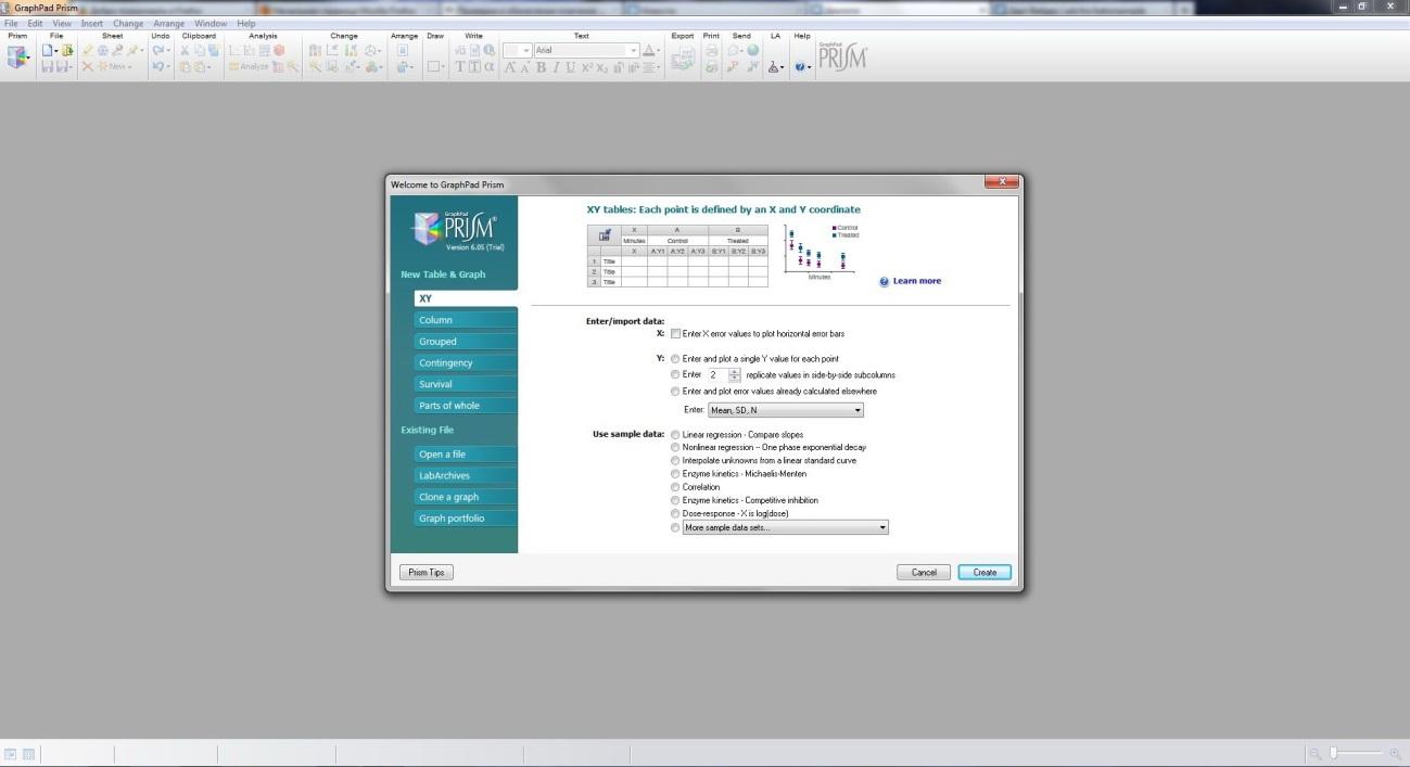
Рис. 2.2.1. Стартовое
окно GraphPad Prism
2.3 Обзор Advanced Grapher
Часто
при работе на различном оборудовании
(спектрофотометры, спектрофлуориметры,
полярограф и др.), исследователь получает
результат в виде лог-файла, например, в
формате *.csvкоторый
содержит данные для постройки кинетики
исследуемого фермента или спектральную
кривую. Далее возникает необходимость
по полученным данным построить график.
Для этих целей можно использовать
множество программ. Одной из которых
является Advanced Grapher – это мощная но
простая в использовании программа для
построения графиков и их анализа.
Поддерживает построение графиков
функций вида Y(x), X(y), в полярных координатах,
заданных параметрическими уравнениями,
графиков таблиц, неявных функций
(уравнений) и неравенств. Так же содержит
вычислительные возможности: регрессионный
анализ, нахождение нулей и экстремумов
функций, точек пересечения графиков,
нахождение производных, уравнений
касательных и нормалей, численное
интегрирование. Большое количество
параметров графиков и координатной
плоскости. Имеет возможности печати,
сохранения и копирования графиков в
виде рисунков, многодокументный
настраиваемый интерфейс. Пример
построения данной программой спектров
поглощения на основе лог-файла
спектрофотометра показан на рисунке
2.3.1.

Рис. 2.3.1. Интерфейс
Advanced Grapher 2.2
Глава 3. Пример использованияAdvanced Grapher, statistica и GraphPad Prism для расчетов
В
данной главе будет рассмотрен пример
расчета активности фермента по его
кинетической кривой в биологическом
образце. Исходные данные представляют
собой csv-файл с данными
зависимости оптической плотности
инкубационной среды от времени полученный
на спектрофотометреCary-100.
Для определения активности исследуемого
фермента полученный лог-файл импортируется
в Advanced Grapher командой «файл/импортировать
таблицу», после указания формата данных
таблицы, свойств графика (Рис. 3.1),
программа строит исследуемый график
(Рис 3.2).
Рис.3.1. Добавление
нового графика в Advanced Grapher 2.2
Далее
необходимо рассчитать изменение
оптической плотности образца за одну
минуту. Для этого на графике выбирается
максимально прямолинейный участок в
начале измерения, на данном участке
должны отсутствовать шумы и прочие
погрешности, не касающиеся активности
фермента, по нему проводится регрессионный
анализ и строится прямая (Рис. 3.3).
Рис. 3.2. Построенные
с помощью Advanced Grapher графики активности
ферментов в различных пробах
Рис. 3.3. Наложение
прямой на кинетическую кривую активности
фермента
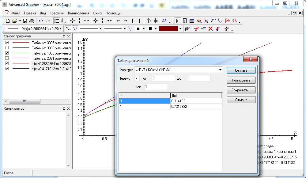
Рис. 3.4. Расчет
начального и конечного значения за
единицу времени
Следующим
шагом будет вызов окна «таблица значений»
в котором в строке ввода формулы
выбирается формула прямой, полученная
на предыдущем этапе. В поле «переменная
(х)» вводятся значения 0 и 1 с шагом
1. После нажатия кнопки «считать»
программа выдаст результатf(x)
для значений 0 и 1, разность которых и
будет дельтой изменения за единицу
времени для построенной прямой, которая
соответствует активности исследуемого
фермента (Рис. 3.4).
Эти
вычисления проводятся для всех проб и
полученные значения обычно записываются
в таблицу MSExel,
где проводятся дальнейшие расчеты для
установления реальной активности
(проводится умножение на коэффициент
белка для данной пробы, поправочные
коэффициенты, время инкубации др.). В
итоге полученные значения активности
для всех проб сортируются в соответствии
с экспериментальными группами, к которым
они относились.
Для
статистической обработки результатов
таблица значений активности переносится
в «STATISTICA» (Рис. 3.5), где
вначале проводится описательная
статистика (Statistics/BasicStatisticsTables/Breakdown&one-wayANOVA), в окне настроек
указывается расположение показателей,
группирующих столбцов и других параметров,
после чего выводится сводный отчет, где
представлены необходимые показатели
(Рис. 3.6).
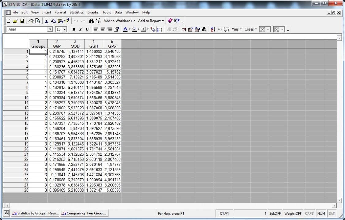
Рис. 3.5. Таблица
данных STATISTICA
7
Далее
проводится групповые сравнения. Так
как выборка небольшая, проводится
непараметрический анализ для выборок
с ненормальным распределением или n≥30
–U-тест Манна-Уитни.
Выбирается
«Statistica/Nonparametrics»,
во всплывающем окне указывается
необходимый модуль, после чего выбираются
сравниваемые показатели и группы.
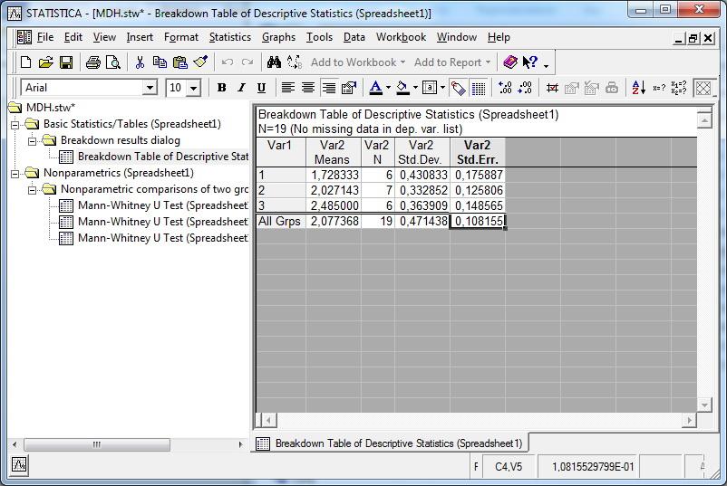
Рис. 3.6. Описательная
статистика для одного из ферментов
После
чего открывается сводное окно результатов
сравнения показателей в двух разных
группах, где указано действительные
значения nи двухстороннее
и одностороннее значениеp.
В случае еслиp≤0,05,
результат выделяется программой красным
цветом, так как здесь есть статистически
значимые различия (Рис. 3.7).
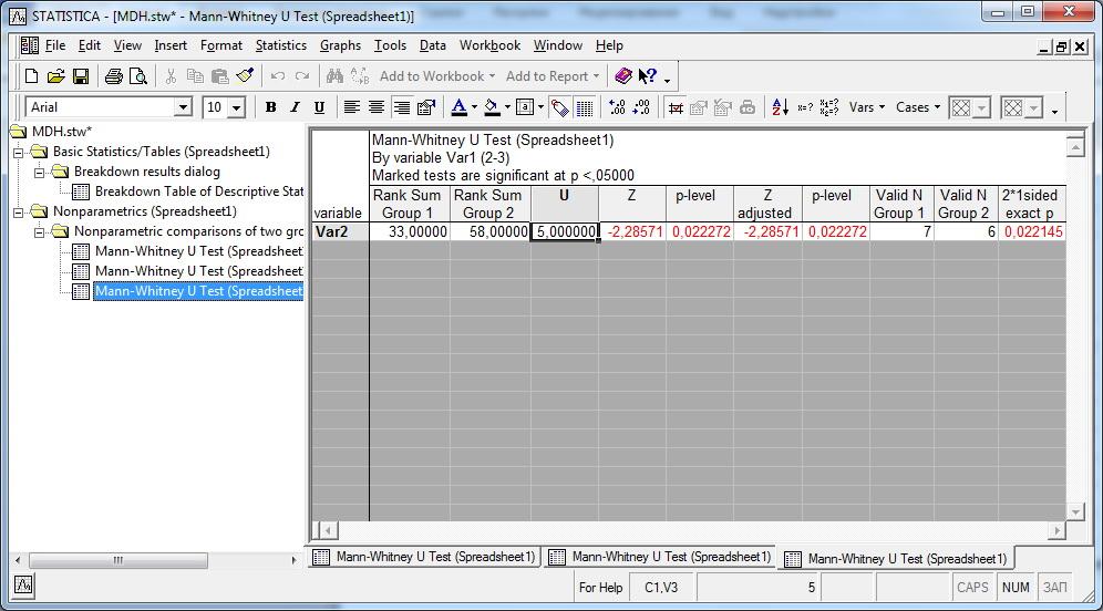
Рис. 3.7. Достоверно
значимые различия между 2 и 3 экспериментальной
группой
Для
публикаций полученных данных зачастую
возникает необходимость в их графическом
представлении. Здесь хорошо себя
зарекомендовала GraphPad Prism. Большинство
диаграмм и графиков создаются именно
в этой программе. С помощью данной
программы можно построить диаграмму,
имея только среднее значение и ошибку
средней. Для этого в стартовом окне
(Рис. 2.2.1) выбирается необходимое действие,
указывается из предложенных вариантов
тип диаграммы или графика.
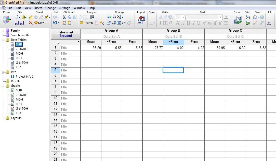
Рис. 3.8. Ввод
данных для постройки диаграммы в Prism
В
открывшейся таблице данных вводятся
соответствующие значения для средней
и ошибки средней (Рис. 3.8) и при открытии
в области переходов соответствующей
ссылки мы получаем нужную диаграмму,
где можно дополнительно ее настроить
в зависимости от нужных требований
(Рис. 3.9-3.10).
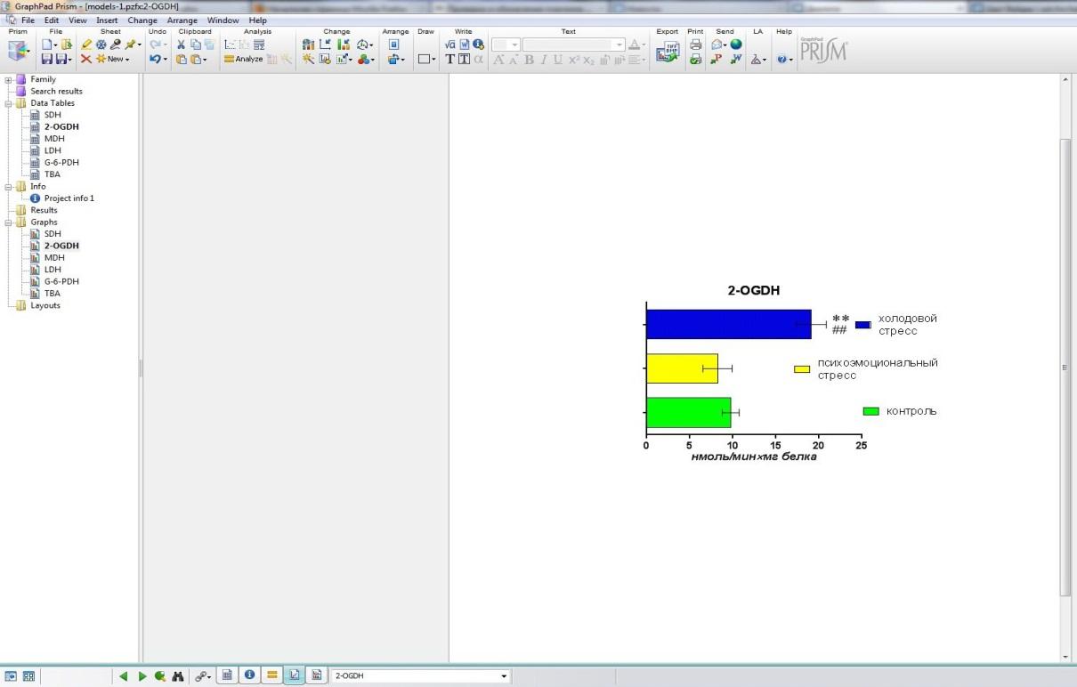
Рис. 3.9. Диаграмма
стандартного вида в GraphPad
Prism
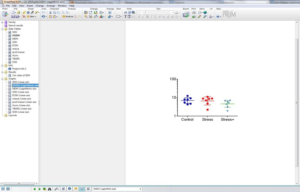
Рис. 3.10.
Логарифмическая диаграмма в GraphPad
Prism с визуализацией размещения вариант
Соседние файлы в предмете [НЕСОРТИРОВАННОЕ]
- #
- #
- #
- #
- #
- #
- #
- #
- #
- #
- #
Большинство статей о научных исследованиях неотделимы от диаграмм, особенно диаграмм. Знакомство с некоторыми программами для рисования и отображение диаграмм в статьях и PPT является важным содержанием обучения научным исследованиям. Красивые статьи с картинками могут добавить много очков к вашей работе, Shengxinbaodian запускает серию руководств по R.Эффективное и практическое руководство ggplot2 (визуальный сценарий, инструменты, процедуры, сопоставление цветов)Объясните, как рисовать высококачественные изображения с помощью языка R. Позже, чтобы было удобнее использовать, команда Shengxinbaodian разработала онлайн-инструмент для рисования.www.ehbio.com/ImageGP, Поддерживает 14 общих графиков и частичный анализ ампликона, очень популярный, со средним ежедневным посещением 400 раз, в общей сложности сотнями тысяч посещений, охватывающим все континенты мира, и функции постоянно добавляются и улучшаются.
Многие знакомые на заднем плане говорили, что на рисование больше спроса, поэтому разобралсяGraphpadОдно из них — распространение знаний, второе — учиться на отличном программном обеспечении.Онлайн-рисунокВсе лучше и лучше.Graphpad, Origin и SigmaPlotЭто три программы для статистического картирования, обычно используемые в областях научных исследований. У них есть свои преимущества и недостатки, и их часто необходимо использовать вместе.
Сегодня я познакомлю вас с основами использования Graphpad.
Понять типы диаграмм Graphpad
Вот приветственный интерфейс Graphpad
ИзВставка 1Видно, что Graphpad Prism 6 предоставляет пользователям6 видовВыбор базовой статистической диаграммы;Вставка 2Есть пояснение к выбранному типу диаграммы, нажмитеLearn moreПросмотр официальных справочных документов;Вставка 3Вы можете выбрать небольшую категорию под определенный тип диаграммы;Вставка 4В офисе есть демонстрационный набор данных, который поможет новичкам начать работу.

graphpad_welcome.png
Описание шести типов статистических диаграмм и используемых статистических методов:
-
XY:
Введение: То есть система координат XY используется для определения положения точки. Если данные имеют несколько повторений, можно вычислить среднее значение и стандартное отклонение, а при рисовании можно вставить планки ошибок.
Статистические методы: Линейная регрессия, нелинейная регрессия, корреляционный анализ.
-
столбец: гистограмма
Введение: Есть только один индекс группировки, такой как группа лечения и контрольная группа.
Статистические методы: T-критерий для одной выборки, парный t-критерий, групповой t-критерий, тест на сумму рангов для одной выборки, тест на сумму рангов для двух независимых выборок, тест на сумму рангов для нескольких независимых выборок, односторонний дисперсионный анализ.
-
grouped: двумерная сгруппированная гистограмма
Введение: Есть несколько показателей группирования, например, статистика разницы между группой лечения и контрольной группой у пациентов мужского и женского пола.
Статистические методы: Двухфакторный дисперсионный анализ, двухвыборочный дисперсионный анализ с повторными измерениями.
-
непредвиденные обстоятельства: таблица непредвиденных обстоятельств
Введение: Он очень похож на сгруппированную комбинированную диаграмму, разница в том, что нет полосы ошибок, то есть потому, что нет повторяющегося значения измерения, один столбец — это одно значение.
Статистические методы: Тест хи-квадрат, точный тест Фишера.
-
выживаемость: график кривой выживаемости
Статистические методы: Сравнение одномерных кривых выживаемости.
-
Части от целого: отношение частей к целому, обычно представленное в виде круговой диаграммы.
Демонстрация построения сгруппированной гистограммы
Выберите здесьgroupedВторой готовый набор данных представлен ниже для демонстрации картографии. Щелкните сразу после выбораcreatОК.

graph_grouped.png
Основной интерфейс работы
После предыдущего шага мы вошли в основной интерфейс работы графической панели,

control_panel.png
Вставка 1Здесь представлены наши данные, каждая группа представляет три разные клеточные линии (клетки дикого типа, клеточная линия GPP5 и клеточная линия GPP7); каждая строка представляет различное лечение (сывороточное голодание и нормальная культура); каждая группа 5 параллельных повторов.
В экспериментальных данных отсутствуют значения, например A: Y4 в первой строке.
Вставка 2ГдеДерево каталогов
- Таблицы данных: нажмите, чтобы отобразить проанализированный набор данных;
- Информация: щелкните здесь, чтобы отобразить основную информацию о данных, и вы можете добавить некоторые замечания и описания;
- Результаты: отображение результатов биометрического анализа (будет обсуждено далее);
- Графики: после ввода данных щелкните этот значок, чтобы сначала создать статистический график, а затем слегка изменить его в соответствии с результатами статистического анализа;
- Макеты: макет нескольких диаграмм.
Выберите тип рисунка
После импорта данных нажмитеGraphsКартину можно нарисовать так:

Graph0.png
В этом интерфейсе вы можете изменить тип графика в соответствии с вашими потребностями. Новички должны осмелитьсяГрязный, Попробуйте сами разные варианты, вы можете узнать, какая функция у каждой части. (Попробуй научиться)
- Семейство графиков: измените тип графика, который представляет собой 6 типов, упомянутых в начале;
- Нанесите на график отдельные значения и составьте сводные данные: как следует из названия, первое отображает 5 параллельных значений каждой группы экспериментов на рисунке, а второе отображает среднее значение. Выберите подходящий способ рисования группировки;
- Чередующиеся полосы: полосы ошибок, щелкните раскрывающийся список График, добавьте полосы ошибок на график в соответствии с различным статистическим анализом, обычно выбирайте
Mean with SD。
Статистический анализ
Предварительный статистический график, сделанный выше, не показывает результаты статистического анализа, такие как различия между группами, поэтому как мы можем добавить*Чтобы показать разницу между группами?
В приветственном интерфейсеenter and plot error values already calculated elsewhereОпция, это означает, что вы можете импортировать извне результаты статистического анализа, выполненного в других местах. Вы хотите провести расчеты в других местах перед рисованием?
Незачем! Потому что статистический анализ можно проводить прямо на Graphpad! ! ! Хотя вы можете проводить анализ и в других местах, это делать не рекомендуется, и удобнее работать напрямую.
Сначала определите наши цели анализа:
1) Оценить, превышают ли различия между линиями клеток ожидания;
2) Оцените, превышает ли разница между обработками ожидаемую вероятность непредвиденных обстоятельств;
3) Оценить, соответствует ли разница между обработками для каждой клеточной линии;
4) Рассчитайте 95% доверительный интервал для разницы между клеточными линиями, обработанными разными способами.
Итак, нам нужноДвухфакторный дисперсионный анализ, НажмитеAnalyze, Выберите из списка сгруппированного анализаTwo-way ANOVAИ примите все параметры по умолчанию в диалоговом окне. Гуманность Graphpad заключается в том, что он автоматически распознает текущую структуру анализируемых данных и показывает пользователям лучшие варианты анализа по умолчанию.

analyze.png
Последующий конкретный анализ требует определенных статистических знаний. Не бойтесь попробовать. Вы обнаружите, что, когда вы нажимаете на различные параметры, значки также изменяются, что очень удобно для пользователей.
1) Первая часть: экспериментальный план. Вначале было упомянуто, что этот набор данных не является парным, поэтому выберите первый.
2) Вторая часть: несколько вариантов сравнения, то есть если вам нужно соотношение по горизонтали, вертикали или диагонали;
3) Часть 3. Выберите некоторые параметры для статистического анализа.


После настройки всего вышеперечисленного нажмитеOK, Результат анализа будет отображаться в главном рабочем интерфейсе и сохранен слева.Дерево каталоговвнизResultsПапка.

analyze_results.png

analyze_results1.png
Улучшение и улучшение статистического графика
1. Введение в панель инструментов редактирования графики

tools.png
1) Первая часть: модуль работы с документом, аналогичный офисному, например, открытие, создание, сохранение, копирование и вставка и т.д .;
2) Вторая часть: анализ данных, то есть статистический анализ исходных данных, продемонстрированный ранее;
3) Третья часть: редактирование графики, эта часть является сутью программного обеспечения. Редактировать и изменять графику, такую как тип графики, оси координат, полосы ошибок, размер графики, цвет и т. Д .;
4) Четвертая часть: редактирование текста, вы можете рисовать линии и добавлять текст на статистический график;
5) Часть 5: графический вывод, вы можете экспортировать, распечатать или вывести законченную графику в word / PPT.
2. Согласно результатам предыдущего статистического анализа, используйте инструменты редактирования текста, чтобы добавить на статистический график признаки различий между группами.
1) рисовать: можно вставлять линии разной формы;
2) писать: редактировать текст, вставлять формулу и т. д .;
3) Дважды щелкните любой элемент в графике, чтобы изменить форму, размер, толщину и т. д. текста, линий и т. д.

draw.png
3. Регулировка координатной оси
Нажмите наChangeсреднийВторой значок, Или на картинкеДважды щелкните по осиВызвать инструмент настройки координат;
Общие настройки оси координат и настройки оси X, см. Диаграмму, обычно не вносят слишком много изменений;

format01.png
Сосредоточьтесь на объяснении, как установить ось Y и сделатьУсеченный граф, Это общая проблема статистического картирования.
Предыдущие данные не сильно отличаются и не подходят для демонстрации, поэтому также создается гистограмма. Значение столбца слева слишком велико, значение столбца справа слишком мало, а столбец справа почти исчез, что делает график очень непоследовательным. ДелатьУсеченный графЭту проблему можно хорошо решить.

formatY0.png
1) Нажмите в настройках координатLeft Y axis(Обычно для рисования по умолчанию создается только левая ось Y);
2)Gaps and DirectionвыбиратьTwo segments, То есть ось Y разбита на две части (по фактическим данным вы также можете разбить ось Y на 3 части);
3) ВSegmentУстановите параметры (Rang) для оси Y нижней части (Bottom) и верхней части (Top) соответственно;
4) Затем вRegularly spaced ticksвнизMajor ticks intervalУстановите метку значения оси Y на место;
длина: 50%, половина длины верхней и нижней частей;
минимум: минимальное значение нижнего сегмента равно 0, а минимальное значение верхнего сегмента — 150;
максимум: максимальное значение нижнего сегмента — 10, максимальное значение верхнего сегмента — 200;
Основные отметки: размер каждой ячейки в нижнем разделе равен 2, а размер каждой ячейки в верхнем разделе равен 10.
Таким образом, средняя часть оси Y 10–150 обрезается, и вся картина выглядит намного лучше.
4. Модификация цвета
Нажмите наChangeсреднийПоследний значок, Или на картинкеДважды щелкните столбецВызвать панель инструментов для настройки параметров;

change.png
Основная операция использования графической панели для построения статистических графиков, вероятно, изложена выше.Нетрудно освоить использование инструмента, просто попробуйте его еще раз. Сложность заключается в статистических знаниях, стоящих за этим, как выбрать подходящий метод статистического анализа для ваших данных? После того, как вы освоите, к каким структурам данных применимы различные методы анализа, вы можете делать выводы друг из друга и проводить соответствующий анализ данных различных экспериментальных планов.
Статистика и графики R
- Похвалите вас в R за усердную работу и наградите CheatShet
- Электронные книги других людей, ваши электронные книги, все в резерве
- Среда ввода языка R Rstudio
- Рисование тепловой карты на языке R (тепловая карта)
- Основные понятия языка R и матричные операции
- Тепловая карта языка R упрощена
- Улучшение языка R и тепловой карты
- Рисование линейного графика на языке R
- Одношаговый метод R language-line graph
- График языковой рамки R (график скрипки, график джиттера, график разброса по площади)
- Одношаговый метод построения графика в языке R
- R язык-карта вулкана
- Пузырьковая диаграмма анализа обогащения языка R
- Рисунок графика разброса на языке R
- Диаграмма языка R-Венна
- Гистограмма языка R
- Настройки языка и графики R Китайский и английский шрифты
- Непараметрический анализ выживаемости на языке R
- Схема логотипа seq на языке R
- Анализ WGCNA, простой и всеобъемлющий последний учебник
- Анализ основных компонентов PCA в одной статье
- Обогащающий анализ DotPlot может служить
- Кластерный анализ коэкспрессии генов и визуализация
- 1010 методов рисования тепловой карты в R
- Все еще используете PCA для уменьшения размерности? Быстро изучите любимый алгоритм Дэниела t-SNE с кодом Python / R
- Функция для сбора всех табличных данных авторитетной базы данных метаболомики HMDB
- Доработка и набор картинок
- network3D: Интерактивная диаграмма Санки
- network3D интерактивное создание сети
- Инструмент для онлайн-рисования логотипов seq-Weblogo
- Руководство по получению и сборке иллюстративного материала биологического ИИ
- Эффективное и практическое руководство ggplot2 (визуальный сценарий, инструменты, процедуры, сопоставление цветов)
- Примечания к исследованию магии пакета R для обработки изображений
- Предварительное исследование кластерного анализа экспрессии гена SOM
- Используйте gganimate для визуализации глобального развития R-Ladies (организация сообщества R по гендерному разнообразию)
- Нарисуйте фосфолипидный бислой за одну минуту: введение AI на основе нуля и базовый графический рисунок
Skip to content
Select Country
Select Country
Select Country
Prism Resourceswebo2021-04-14T23:04:15+05:30
Resources
Explore our educational resources to advance your knowledge of Prism, statistics and data visualization.
Master the basics in Prism with short video tutorials.
Learn key concepts in stats, curve fitting and data visualization with online guides and articles.
Find answers to your questions from the Prism community.
Prism Video Tutorials
Explore the Knowledgebase
What is the difference between ordinal, interval and ratio variables? Why should I care?webo2020-11-27T09:56:54+05:30
In the 1940s, Stanley Smith Stevens introduced four scales of measurement: nominal, ordinal, interval, and ratio. These are still widely used today as a way to describe the characteristics of a variable. Knowing the scale of measurement for a variable is an important aspect in choosing the right statistical analysis.
Nominal
A nominal scale describes a variable with categories that do not have a natural order or ranking. You can code nominal variables with numbers if you want, but the order is arbitrary and any calculations, such as computing a mean, median, or standard deviation, would be meaningless.
Examples of nominal variables include:
-
genotype, blood type, zip code, gender, race, eye color, political party
Ordinal
An ordinal scale is one where the order matters but not the difference between values.
Examples of ordinal variables include:
-
socio economic status (“low income”,”middle income”,”high income”), education level (“high school”,”BS”,”MS”,”PhD”), income level (“less than 50K”, “50K-100K”, “over 100K”), satisfaction rating (“extremely dislike”, “dislike”, “neutral”, “like”, “extremely like”).
Note the differences between adjacent categories do not necessarily have the same meaning. For example, the difference between the two income levels “less than 50K” and “50K-100K” does not have the same meaning as the difference between the two income levels “50K-100K” and “over 100K”.
Make more informed and accurate analysis choices with Prism. Start your free Prism trial.
Interval
An interval scale is one where there is order and the difference between two values is meaningful.
Examples of interval variables include:
-
temperature (Farenheit), temperature (Celcius), pH, SAT score (200-800), credit score (300-850).
Ratio
A ratio variable, has all the properties of an interval variable, and also has a clear definition of 0.0. When the variable equals 0.0, there is none of that variable.
Examples of ratio variables include:
-
enzyme activity, dose amount, reaction rate, flow rate, concentration, pulse, weight, length, temperature in Kelvin (0.0 Kelvin really does mean “no heat”), survival time.
When working with ratio variables, but not interval variables, the ratio of two measurements has a meaningful interpretation. For example, because weight is a ratio variable, a weight of 4 grams is twice as heavy as a weight of 2 grams. However, a temperature of 10 degrees C should not be considered twice as hot as 5 degrees C. If it were, a conflict would be created because 10 degrees C is 50 degrees F and 5 degrees C is 41 degrees F. Clearly, 50 degrees is not twice 41 degrees. Another example, a pH of 3 is not twice as acidic as a pH of 6, because pH is not a ratio variable.
Learn more about the difference between nominal, ordinal, interval and ratio data with this video by NurseKillam
|
OK to compute…. |
Nominal |
Ordinal |
Interval |
Ratio |
|
Frequency distribution |
Yes |
Yes |
Yes |
Yes |
|
Median and percentiles |
No |
Yes |
Yes |
Yes |
|
Add or subtract |
No |
No |
Yes |
Yes |
|
Mean, standard deviation, standard error of the mean |
No |
No |
Yes |
Yes |
|
Ratios, coefficient of variation |
No |
No |
No |
Yes |
Does measurement scale matter for data analysis?
Knowing the measurement scale for your variables can help prevent mistakes like taking the average of a group of zip (postal) codes, or taking the ratio of two pH values. Beyond that, knowing the measurement scale for your variables doesn’t really help you plan your analyses or interpret the results.
Note that sometimes, the measurement scale for a variable is not clear cut. What kind of variable is color? In a psychological study of perception, different colors would be regarded as nominal. In a physics study, color is quantified by wavelength, so color would be considered a ratio variable. What about counts?
There are occasions when you will have some control over the measurement scale. For example, with temperature, you can choose degrees C or F and have an interval scale or choose degrees Kelvin and have a ratio scale. With income level, instead of offering categories and having an ordinal scale, you can try to get the actual income and have a ratio scale. Generally speaking, you want to strive to have a scale towards the ratio end as opposed to the nominal end.
Save time performing statistical analysis with Prism. Try Prism for free.
Test your understanding of Nominal, Ordinal, Interval, and Ratio Scales
Each scale is represented once in the list below.
- Favorite candy bar
- Weight of luggage
- Year of your birth
- Egg size (small, medium, large, extra large, jumbo)
Each scale is represented once in the list below.
- Military rank
- Number of children in a family
- Jersey numbers for a football team
- Shoe size
Answers: N,R,I,O and O,R,N,I
Quantitative (Numerical) vs Qualitative (Categorical)
There are other ways of classifying variables that are common in statistics. One is qualitative vs. quantitative. Qualitative variables are descriptive/categorical. Many statistics, such as mean and standard deviation, do not make sense to compute with qualitative variables. Quantitative variables have numeric meaning, so statistics like means and standard deviations make sense.
This type of classification can be important to know in order to choose the correct type of statistical analysis. For example, the choice between regression (quantitative X) and ANOVA (qualitative X) is based on knowing this type of classification for the X variable(s) in your analysis.
Quantitative variables can be further classified into Discrete and Continuous. Discrete variables can take on either a finite number of values, or an infinite, but countable number of values. The number of patients that have a reduced tumor size in response to a treatment is an example of a discrete random variable that can take on a finite number of values. The number of car accidents at an intersection is an example of a discrete random variable that can take on a countable infinite number of values (there is no fixed upper limit to the count).
Continuous variables can take on infinitely many values, such as blood pressure or body temperature. Even though the actual measurements might be rounded to the nearest whole number, in theory, there is some exact body temperature going out many decimal places That is what makes variables such as blood pressure and body temperature continuous.
It is important to know whether you have a discrete or continuous variable when selecting a distribution to model your data. The Binomial and Poisson distributions are popular choices for discrete data while the Gaussian and Lognormal are popular choices for continuous data.
Test your understanding of Discrete vs Continuous
The list below contains 3 discrete variables and 3 continuous variables:
- Number of emergency room patients
- Blood pressure of a patient
- Weight of a patient
- Pulse for a patient
- Emergency room wait time rounded to the nearest minute
- Tumor size
Answers: d,c,c,d,d,c
Note, even though a variable may discrete, if the variable takes on enough different values, it is often treated as continuous. For example, most analysts would treat the number of heart beats per minute as continuous even though it is a count. The main benefit of treating a discrete variable with many different unique values as continuous is to assume the Gaussian distribution in an analysis.
Start your free trial of Prism.
What does it mean when some results have e in the number?webo2020-11-27T10:02:46+05:30
In the 1940s, Stanley Smith Stevens introduced four scales of measurement: nominal, ordinal, interval, and ratio. These are still widely used today as a way to describe the characteristics of a variable. Knowing the scale of measurement for a variable is an important aspect in choosing the right statistical analysis.
Nominal
A nominal scale describes a variable with categories that do not have a natural order or ranking. You can code nominal variables with numbers if you want, but the order is arbitrary and any calculations, such as computing a mean, median, or standard deviation, would be meaningless.
Examples of nominal variables include:
-
genotype, blood type, zip code, gender, race, eye color, political party
Ordinal
An ordinal scale is one where the order matters but not the difference between values.
Examples of ordinal variables include:
-
socio economic status (“low income”,”middle income”,”high income”), education level (“high school”,”BS”,”MS”,”PhD”), income level (“less than 50K”, “50K-100K”, “over 100K”), satisfaction rating (“extremely dislike”, “dislike”, “neutral”, “like”, “extremely like”).
Note the differences between adjacent categories do not necessarily have the same meaning. For example, the difference between the two income levels “less than 50K” and “50K-100K” does not have the same meaning as the difference between the two income levels “50K-100K” and “over 100K”.
Make more informed and accurate analysis choices with Prism. Start your free Prism trial.
Interval
An interval scale is one where there is order and the difference between two values is meaningful.
Examples of interval variables include:
-
temperature (Farenheit), temperature (Celcius), pH, SAT score (200-800), credit score (300-850).
Ratio
A ratio variable, has all the properties of an interval variable, and also has a clear definition of 0.0. When the variable equals 0.0, there is none of that variable.
Examples of ratio variables include:
-
enzyme activity, dose amount, reaction rate, flow rate, concentration, pulse, weight, length, temperature in Kelvin (0.0 Kelvin really does mean “no heat”), survival time.
When working with ratio variables, but not interval variables, the ratio of two measurements has a meaningful interpretation. For example, because weight is a ratio variable, a weight of 4 grams is twice as heavy as a weight of 2 grams. However, a temperature of 10 degrees C should not be considered twice as hot as 5 degrees C. If it were, a conflict would be created because 10 degrees C is 50 degrees F and 5 degrees C is 41 degrees F. Clearly, 50 degrees is not twice 41 degrees. Another example, a pH of 3 is not twice as acidic as a pH of 6, because pH is not a ratio variable.
Learn more about the difference between nominal, ordinal, interval and ratio data with this video by NurseKillam
|
OK to compute…. |
Nominal |
Ordinal |
Interval |
Ratio |
|
Frequency distribution |
Yes |
Yes |
Yes |
Yes |
|
Median and percentiles |
No |
Yes |
Yes |
Yes |
|
Add or subtract |
No |
No |
Yes |
Yes |
|
Mean, standard deviation, standard error of the mean |
No |
No |
Yes |
Yes |
|
Ratios, coefficient of variation |
No |
No |
No |
Yes |
Does measurement scale matter for data analysis?
Knowing the measurement scale for your variables can help prevent mistakes like taking the average of a group of zip (postal) codes, or taking the ratio of two pH values. Beyond that, knowing the measurement scale for your variables doesn’t really help you plan your analyses or interpret the results.
Note that sometimes, the measurement scale for a variable is not clear cut. What kind of variable is color? In a psychological study of perception, different colors would be regarded as nominal. In a physics study, color is quantified by wavelength, so color would be considered a ratio variable. What about counts?
There are occasions when you will have some control over the measurement scale. For example, with temperature, you can choose degrees C or F and have an interval scale or choose degrees Kelvin and have a ratio scale. With income level, instead of offering categories and having an ordinal scale, you can try to get the actual income and have a ratio scale. Generally speaking, you want to strive to have a scale towards the ratio end as opposed to the nominal end.
Save time performing statistical analysis with Prism. Try Prism for free.
Test your understanding of Nominal, Ordinal, Interval, and Ratio Scales
Each scale is represented once in the list below.
- Favorite candy bar
- Weight of luggage
- Year of your birth
- Egg size (small, medium, large, extra large, jumbo)
Each scale is represented once in the list below.
- Military rank
- Number of children in a family
- Jersey numbers for a football team
- Shoe size
Answers: N,R,I,O and O,R,N,I
Quantitative (Numerical) vs Qualitative (Categorical)
There are other ways of classifying variables that are common in statistics. One is qualitative vs. quantitative. Qualitative variables are descriptive/categorical. Many statistics, such as mean and standard deviation, do not make sense to compute with qualitative variables. Quantitative variables have numeric meaning, so statistics like means and standard deviations make sense.
This type of classification can be important to know in order to choose the correct type of statistical analysis. For example, the choice between regression (quantitative X) and ANOVA (qualitative X) is based on knowing this type of classification for the X variable(s) in your analysis.
Quantitative variables can be further classified into Discrete and Continuous. Discrete variables can take on either a finite number of values, or an infinite, but countable number of values. The number of patients that have a reduced tumor size in response to a treatment is an example of a discrete random variable that can take on a finite number of values. The number of car accidents at an intersection is an example of a discrete random variable that can take on a countable infinite number of values (there is no fixed upper limit to the count).
Continuous variables can take on infinitely many values, such as blood pressure or body temperature. Even though the actual measurements might be rounded to the nearest whole number, in theory, there is some exact body temperature going out many decimal places That is what makes variables such as blood pressure and body temperature continuous.
It is important to know whether you have a discrete or continuous variable when selecting a distribution to model your data. The Binomial and Poisson distributions are popular choices for discrete data while the Gaussian and Lognormal are popular choices for continuous data.
Test your understanding of Discrete vs Continuous
The list below contains 3 discrete variables and 3 continuous variables:
- Number of emergency room patients
- Blood pressure of a patient
- Weight of a patient
- Pulse for a patient
- Emergency room wait time rounded to the nearest minute
- Tumor size
Answers: d,c,c,d,d,c
Note, even though a variable may discrete, if the variable takes on enough different values, it is often treated as continuous. For example, most analysts would treat the number of heart beats per minute as continuous even though it is a count. The main benefit of treating a discrete variable with many different unique values as continuous is to assume the Gaussian distribution in an analysis.
Why use n-1 when calculating a standard deviation?webo2020-11-27T10:04:41+05:30
How ito calculate the standard deviation
1. Compute the square of the difference between each value and the sample mean.
2. Add those values up.
3. Divide the sum by n-1. This is called the variance.
4. Take the square root to obtain the Standard Deviation.
Why n-1?
Why divide by n-1 rather than n in the third step above? In step 1, you compute the difference between each value and the mean of those values. You don’t know the true mean of the population; all you know is the mean of your sample. Except for the rare cases where the sample mean happens to equal the population mean, the data will be closer to the sample mean than it will be to the true population mean. So the value you compute in step 2 will probably be a bit smaller (and can’t be larger) than what it would be if you used the true population mean in step 1. To make up for this, divide by n-1 rather than n.v This is called Bessel’s correction.
But why n-1? If you knew the sample mean, and all but one of the values, you could calculate what that last value must be. Statisticians say there are n-1 degrees of freedom.
When should the SD be computed with a denominator of n?
Statistics books often show two equations to compute the SD, one using n, and the other using n-1, in the denominator. Some calculators have two buttons.
The n-1 equation is used in the common situation where you are analyzing a sample of data and wish to make more general conclusions. The SD computed this way (with n-1 in the denominator) is your best guess for the value of the SD in the overall population.
If you simply want to quantify the variation in a particular set of data, and don’t plan to extrapolate to make wider conclusions, then you can compute the SD using n in the denominator. The resulting SD is the SD of those particular values. It makes no sense to compute the SD this way if you want to estimate the SD of the population from which those points were drawn. It only makes sense to use n in the denominator when there is no sampling from a population, there is no desire to make general conclusions.
The goal of science is always to generalize, so the equation with n in the denominator should not be used. The only example I can think of where it might make sense is in quantifying the variation among exam scores. But much better would be to show a scatterplot of every score, or a frequency distribution histogram.
GraphPad Prism and InStat always compute the SD with the n-1 denominator.
What you can conclude when two error bars overlap (or don’t)webo2020-11-27T10:06:22+05:30
It is tempting to look at whether two error bars overlap or not, and try to reach a conclusion about whether the difference between means is statistically significant.
Resist that temptation (Lanzante, 2005)!
SD error bars
SD error bars quantify the scatter among the values. Looking at whether the error bars overlap lets you compare the difference between the mean with the amount of scatter within the groups. But the t test also takes into account sample size. If the samples were larger with the same means and same standard deviations, the P value would be much smaller. If the samples were smaller with the same means and same standard deviations, the P value would be larger.
When the difference between two means is statistically significant (P < 0.05), the two SD error bars may or may not overlap. Likewise, when the difference between two means is not statistically significant (P > 0.05), the two SD error bars may or may not overlap.
Knowing whether SD error bars overlap or not does not let you conclude whether difference between the means is statistically significant or not.
SEM error bars
SEM error bars quantify how precisely you know the mean, taking into account both the SD and sample size. Looking at whether the error bars overlap, therefore, lets you compare the difference between the mean with the precision of those means. This sounds promising. But in fact, you don’t learn much by looking at whether SEM error bars overlap.
By taking into account sample size and considering how far apart two error bars are, Cumming (2007) came up with some rules for deciding when a difference is significant or not. But these rules are hard to remember and apply.
Here is a simpler rule:
If two SEM error bars do overlap, and the sample sizes are equal or nearly equal, then you know that the P value is (much) greater than 0.05, so the difference is not statistically significant. The opposite rule does not apply. If two SEM error bars do not overlap, the P value could be less than 0.05, or it could be greater than 0.05. If the sample sizes are very different, this rule of thumb does not always work.
Confidence interval error bars
Error bars that show the 95% confidence interval (CI) are wider than SE error bars. It doesn’t help to observe that two 95% CI error bars overlap, as the difference between the two means may or may not be statistically significant.
Useful rule of thumb: If two 95% CI error bars do not overlap, and the sample sizes are nearly equal, the difference is statistically significant with a P value much less than 0.05 (Payton 2003).
With multiple comparisons following ANOVA, the signfiicance level usually applies to the entire family of comparisons. With many comparisons, it takes a much larger difference to be declared “statistically significant”. But the error bars are usually graphed (and calculated) individually for each treatment group, without regard to multiple comparisons. So the rule above regarding overlapping CI error bars does not apply in the context of multiple comparisons.
Rules of thumb (for when sample sizes are equal, or nearly equal).
|
Type of error bar |
Conclusion if they overlap |
Conclusion if they don’t overlap |
|
SD |
No conclusion |
No conclusion |
|
SEM |
P > 0.05 |
No conclusion |
|
95% CI |
No conclusion |
P < 0.05 |
Unequal sample sizes
This page was updated 4/16/2010 to point out that the rules of thumb are true only when the sample sizes are equal, or nearly equal.
Here is an example where the rule of thumb about confidence intervals is not true (and sample sizes are very different).
Sample 1: Mean=0, SD=1, n=10
Sample 2: Mean=3, SD=10, n=100
The confidence intervals do not overlap, but the P value is high (0.35).
And here is an example where the rule of thumb about SE is not true (and sample sizes are very different).
Sample 1: Mean=0, SD=1, n=100, SEM=0.1
Sample 2: Mean 3, SD=10, n=10, SEM=3.33
The SEM error bars overlap, but the P value is tiny (0.005).
References
Cumming et al. Error bars in experimental biology. J Cell Biol (2007) vol. 177 (1) pp. 7-11
Lanzante. A Cautionary Note on the Use of Error Bars. Journal of Climate (2005) vol. 18 pp. 3699-3703
Payton et al. Overlapping confidence intervals or standard error intervals: what do they mean in terms of statistical significance?. J Insect Sci (2003) vol. 3 pp. 34
How to report P values in journalswebo2020-11-27T10:11:52+05:30
When you write up your results, how should you report P values?
Don’t overemphasize P values
A few pointers:
- Consider emphsizing the effect size and confidence interval, rather than a P value. The effect size can be a difference or a ratio or a correlation coefficient (or something else) and all can be reported with a 95% confidence interval to demonstrate how precisely you have determined the effect size. This is more useful, in many cases, than P values.
- Don’t just say if the P value is greater or less than 0.05 (or some other value). If you can, give the P value as a number.
- With multiple comparisons, it is not possible to give individual P values for each comparison, but it is possible in many cases to report multiplicity adjusted P values.
- If you computed many P values, show them all. At a mimunum, state the number of comparisons you made. Performing many analyses on your data and then just reporting the comparisons that result in a small P value will create misleading results.
- It doesn’t help to report a P value unless you clearly state what test was used to compute it.
Asterisks?
Many people add asterisks to tables and graphs to show how low the P value is. The standards for one to three asterisks are quite standard (<0.05, <0.01, <0.001), and both the NEJM and APA agree. Prism (since 5.04/d) will also show four asterisks when the P value is less than 0.0001.
| P value | 0.04 | 0.009 | 0.0009 | 0.00009 |
| APA | * | ** | *** | *** |
| NEJM | * | ** | *** | *** |
| GP Prism up to 5.04/d | * | ** | *** | *** |
| GP Prism 5.04/d and later | * | ** | *** | **** |
Make sure it is clear what null hypothesis the P value is testing
Every P value tests a null hypothesis, so your readers need to be sure what the P value is testing. If you put an asterisk on a graph, ti has to be clear exactly what comparison was made.
Issues that copy editiors care about (but scientists don’t)
How many digits to report? Leading zero or not?
How exactly should P values be reported? Three styles are summarized below:
| P value | 0.1234 | 0.01234 | 0.00123 | 0.00012 | 0.00001 |
|---|---|---|---|---|---|
| APA | “.123” | “0.012” | “.001” | “<.001” | “<.001” |
| NEJM | “0.12” | “0.012” | “0.001” | “<.001” | “<.001” |
| GP | “0.1234” | “0.0123” | “0.0012” | “0.0001” | “<0.0001” |
The Americal Psychological Association (APA) has published an extensive style guide used for publishing in the social sciences. One rule is to not include the zero before the decimal point when reporitng a P value: “There are some values that by definition can never exceed 1.0. The omission of the leading zero is a visual indicator of this restricted range. The most common cases are p values and correlations.”. They also state to report two or three digits after the decimal point. The P value in the first column of the table is shown as “.123” in APA style, but you could read their style to mean “.12”.
The New England Journal of Medicine (NEJM) states: “Except when one-sided tests are required by study design, such as in noninferiority trials, all reported P values should be two-sided. In general, P values larger than 0.01 should be reported to two decimal places, those between 0.01 and 0.001 to three decimal places; P values smaller than 0.001 should be reported as P<0.001. Notable exceptions to this policy include P values arising in the application of stopping rules to the analysis of clinical trials and genetic-screening studies.”
We never intended to create a style, but GraphPad (GP) programs are in wide use, so many people follow our lead. GraphPad InStat and Prism always report a zero before the decimal point, and four digits after. If the P value is less than 0.0001, we report “<0.0001”.
“P value” or “p value”
There is no uniform style.
The APA suggest “p value” The p is lowercase and italicized, and there is no hyphen between “p” and “value”.
GraphPad has adapted the style “P value”, which is used by the NEJM and journals. The P is upper case and not italicized, and there is no hyphen between “P” and “value”.
Sometimes, you see “p-value”. Note the hyphen.
Is it better to plot graphs with SD or SEM error bars? (Answer: Neither)webo2020-11-27T10:13:02+05:30
There are better alternatives to graphing the mean with SD or SEM.
If you want to show the variation in your data:
If each value represents a different individual, you probably want to show the variation among values. Even if each value represents a different lab experiment, it often makes sense to show the variation.
With fewer than 100 or so values, create a scatter plot that shows every value. What better way to show the variation among values than to show every value? If your data set has more than 100 or so values, a scatter plot becomes messy. Alternatives are to show a box-and-whiskers plot, a frequency distribution (histogram), or a cumulative frequency distribution.
What about plotting mean and SD? The SD does quantify variability, so this is indeed one way to graph variability. But a SD is only one value, so is a pretty limited way to show variation. A graph showing mean and SD error bar is less informative than any of the other alternatives, but takes no less space and is no easier to interpret. I see no advantage to plotting a mean and SD rather than a column scatter graph, box-and-wiskers plot, or a frequency distribution.
Of course, if you do decide to show SD error bars, be sure to say so in the figure legend so no one will think it is a SEM.
If you want to show how precisely you have determined the mean:
If your goal is to compare means with a t test or ANOVA, or to show how closely our data come to the predictions of a model, you may be more interested in showing how precisely the data define the mean than in showing the variability. In this case, the best approach is to plot the 95% confidence interval of the mean (or perhaps a 90% or 99% confidence interval).
What about the standard error of the mean (SEM)? Graphing the mean with an SEM error bars is a commonly used method to show how well you know the mean, The only advantage of SEM error bars are that they are shorter, but SEM error bars are harder to interpret than a confidence interval.
Whatever error bars you choose to show, be sure to state your choice. Noticing whether or not the error bars overlap tells you less than you might guess.
If you want to create persuasive propaganda:
If your goal is to emphasize small and unimportant differences in your data, show your error bars as SEM, and hope that your readers think they are SD
If our goal is to cover-up large differences, show the error bars as the standard deviations for the groups, and hope that your readers think they are a standard errors.
This approach was advocated by Steve Simon in his excellent weblog. Of course he meant it as a joke. If you don’t understand the joke, review the differences between SD and SEM.
How to create a 100% stacked column graphwebo2020-11-27T10:14:21+05:30
Excel uses the term “100% stacked column” graph to refer to a stacked bar graph, where the sum of all the slices is 100.
Prism 6 lets you make that graph in two ways.
- As a parts of whole graph. Parts of whole data are often plotted as pie charts, but Prism lets you show it as a stack if you want (horizontal or vertical). When plotted this way, Prism doesn’t show any axis, so you get a visual sense of the division with no numbers (unless you ask Prism to superimpose each percentage value on each slice). A parts of whole graph plots data you entered into one column (without any subcolumns). If you want your graph to have several stacks, you’ll need to make them individually, and then combine them on a layout.
- As a stacked bar graph. This is generally a better approach, as it lets you create several stacks in one graph. Enter data onto a Grouped table. Each row in the table becomes one stack in the graph. If you enter the data so the values sum to 100, you can plot these directly. If your values don’t sum to 100, Prism can normalize them so they do. Don’t use the Normalize analysis. Instead use the “Fraction of total” analysis (new to Prism 6) and choose to divide each value by its row total and report the results as percentages. Then plot the results.
The attached Prism file shows several examples.
If you use Prism 5, you’ll need to use the second approach above. There is no Fraction of Total analysis, so you’ll need to figure out how to do the math using Normalize, Transform, Row means, or Remove baseline analyses.
How do I transpose columns and rows of a Prism data table?webo2020-11-27T10:16:24+05:30
Transposing means that every row becomes a column, and every column becomes a row. There are three ways to transpose in Prism.
- From the data table, click “Analyze”, then choose “Transpose” from the list of data manipulations. The transposed data will be on a new results table.
- Copy a block of data to the clipboard (from Prism or another program). Put the insertion point into the upper left corner of the block where you want the data to go. Choose “Paste Transpose” from the Edit menu or from the shortcut menu you see when you right click.
- When importing data, you can choose to Transpose in the Placement tab of the Import dialog.
Perhaps you don’t want to transpose, but want to swap the X and Y columns. This is possible via the Transform analysis.
Graph tip – How can I plot an odds ratio plot, also known as a Forest plot, or a meta-analysis plot?webo2020-11-27T10:18:22+05:30
This example shows how to make an odds ratio plot, also known as a Forest plot or a meta-analysis plot, graphs odds ratios (with 95% confidence intervals) from several studies. It also shows how to place a custom grid line on a graph.
How to do it:
GraphPad Prism can make this kind of graph easily.
- When you start the program, or use New table/graph to create a Column data table. Keep the default choice to enter the “replicates” into columns. (In this case, they are not replicates, but Prism thinks they are).
- Enter the data. Enter in each column the Odds ratio itself, as well as the high and low confidence limits (computed elsewhere). Each treatment group should be entered in a separate column, and you’ll enter three values in each column (the odds ratio, and the lower and upper confidence limits). The order of those three values doesn’t matter. Label the groups by entering column titles. You may use Greek symbols, super and subscript, etc. This example plots results from three studies, but use columns D, E, F, etc. to plot results from more studies.
- Click on the Graphs tab.
- Choose the thumbnail for how you want your graph to look. Also choose to plot the median and range since the median of the three values you entered is the middle one, the odds ratio, and the range of the three values you entered will cover the confidence interval computed elsewhere.
- View the graph.
- The default graph is vertical. To make the graph horizontal (as below), double click on the graph to bring up Format Graph, and go to the third tab.
- Some metaanalysis plots use larger symbols to denote studies with more subjects. Prism can’t do this automatically. But you can adjust the size of each symbol in the Format Graph dialog, so make some larger and some smaller.
- Edit the graph and axis titles, add an additional custom line (actually a dotted line) at X=1.0 (from Format Axes dialog as shown below), and you are done.
Epidemiologists often like to make the x axis logarithmic. This makes sense as it makes odd ratios greater than 1.0 and less than 1.0 symmetrical (for example, an odds ratio of 2.0 becomes symmetrical with an odds ratio of 0.5).
This is easy to do with Prism. Format the X axis with a Log 10 scale and set the range from 0.1 to 10 with “antilog” numbering and a grid line at X=1.
Download this file to see how this graph was made.
Keywords: horizontal error bars odd’s ratio metanalysis meta metaanalysis Forrest
What is the meaning of * or ** or *** in reports of statistical significance from Prism or InStat?webo2020-11-27T10:56:49+05:30
Starting with Prism 8, Prism allows you to choose which decimal format Prism will use to report P values (information on previous versions of Prism can be found below). Each analysis that computes P values gives you four choices:
- APA (American Psychological Association) style, which shows three digits but omits the leading zero (.123). P values less than 0.001 shown as “< .001”. All P values less than 0.001 are summarized with three asterisks, with no possibility of four asterisks.
- NEJM (New England Journal of Medicine) style, which shows three digits and includes the leading zero (0.123). P values less than 0.001 shown as “< .001”. All P values less than 0.001 are summarized with three asterisks, with no possibility of four asterisks.
- GraphPad style which reports four digits after the decimal point with a leading zero (0.1234). P values less than 0.0001 shown as “< .0001”. P values less than 0.001 are summarized with three asterisks, and P values less than 0.0001 are summarized with four asterisks.
- Choose how many digits you want to see after the decimal point, up to 15. P values less than 0.001 are given three asterisks, and P values less than 0.0001 are given four asterisks.
Symbol Meaning ns P > 0.05 * P ≤ 0.05 ** P ≤ 0.01 *** P ≤ 0.001 **** P ≤ 0.0001 (For the last two choices only)
Note that the first two choices (APA and NEJM) show at most three asterisks (***) and the last two choices will show four asterisks with tiny P values (****).
The multiple t test analysis is different than all the rest. In earlier versions of the software (Prism 6), the “Significant?” column would display a single asterisk if the t test for that row is statistically significant, given your setting for alpha and the correction for multiple comparisons. Prism would either places a single asterisk in that column or leaves it blank. It would never places more than one asterisk. In this column, current versions of Prism simply write “Yes” or “No” depending on if the test corresponding to that row was found to be statistically significant or not.
Note a possible misunderstanding. Prism 8.0-8.2 presents the choices for P value formatting like this:
The P values shown are examples. It shows one P value presented as “.033”, or as “0.033”, or as “0.0332” depending on the choice you made (note the difference in the number of digits and presence or absence of a leading zero). Some people have misunderstood this to mean that we define a single asterisk to mean P<0.0332. But of course, we use the standard definition of <0.05. We’ll find a way to make these choices less confusing in a future release.
The ANOVA table (SS, df, MS, F) in two-way ANOVAwebo2020-11-27T10:20:01+05:30
You can interpret the rsults of two-way ANOVA by looking at the P values, and especially at multiple comparisons. Many scientists ignore the ANOVA table. But if you are curious in the details, this page explains how the ANOVA table is calculated.
Example
I entered data with two rows, three columns, and three side-by-side replicates per cell. No missing values. So 18 values entered in all. Prism file.
I analyzed the data four ways: assuming no repeated measures, assuming repeated measures with matched values stacked, assuming repeated measures with matched values spread across a row, and with repeated measures in both directions. The tables below are color coded to explain these designs. Each color within a table represents one subject. The colors are repeated between tables, but this means nothing.
Powerpoint file
Here are the ANOVA tables for the four conditions. These values are all reported by Prism. I rearranged and renamed a bit so the four can be shown on one table (Excel file).
Sum-of-squares
Focus first on the sum-of-squares (SS) column with no repeated measures:
- The first row shows the interaction of rows and columns. It quantifies how much variation is due to the fact that the differences between rows are not the same for all columns. Equivalently, it quantifies how much variation is due to the fact that the differences among columns is not the same for both rows.
- The second row show the the amount of variation that is due to systematic differences between the two rows.
- The third row show the the amount of variation that is due to systematic differences between the columns.
- The second to the last row shows the variation not explained by any of the other rows. This is called residual or error.
- The last row shows the total amount of variation among all 18 values.
Now look at the SS columns for the analyses of the same data but with various assumptions about repeated measures.
- The total SS stays the same. This makes sense. This measures the total variation among the 18 values.
- The SS values for the interaction and for the systematic effects of rows and columns (the top three rows) are the same in all four analyses.
- The SS for residual is smaller when you assume repeated measures, as some of that variation can be attributed to variation among subjects. In the final columns, some of that variation can also be attributed to interaction between subjects and either rows or columns.
Degrees of freedom
Now look at the DF values.
- The total DF (bottom row) is 17. This is the total number of values (18) minus 1. It is the same regardless of any assumptions about repeated measures.
- The df for interaction equals (Number of columns – 1) (Number of rows – 1), so for this example is 2*1=2. This is the same regardless of repeated measures.
- The df for the systematic differences among rows equals number of rows -1, which is 1 for this example. This is the same regardless of repeated measures.
- The df for the systematic differences among columns equals number of columns -1, whiich is 2 for this example. It is the same regardless of repeated measures.
- The df for subjects is the number of subjects minus number of treatments. When the matched values are stacked, there are 9 subjects and three treatments, so df equals 6. When the matched values are in the same row, there arr 6 subjects treated in two ways (one for each row), so df is 4. When there are repeated measures for both factors, this value equals the number of subjects (3) minus 1, so df=2.
Details on how the SS and DF are computed can be found in Maxwell and Delaney (reference below). Table 12.2 on page 576 explains the ANOVA table for repeated measures in both factors. But note they use the term “A x B x S” where we say “Residual”. Table 12.16 on page 595 explains the ANOVA table for repeated measures in one factor. They say “B x S/A” where Prism says “residual”, and say “S/A” where Prism says “subject”.
Mean squares
Each mean square value is computed by dividing a sum-of-squares value by the corresponding degrees of freedom. In other words, for each row in the ANOVA table divide the SS value by the df value to compute the MS value.
F ratio
Each F ratio is computed by dividing the MS value by another MS value. The MS value for the denominator depends on the experimental design.
- For two-way ANOVA with no repeated measures: The denominator MS value is always the MSresidual.
- For two-way ANOVA with repeated measures in one factor (p 596 of Maxwell and Delaney):
- For interaction, the denominator MS is MSresidual
- For the factor that is not repeated measures, the denominator MS is MSsubjects
- For the factor that is repeated measures, the denominator MS is MSresidual
- For two-way ANOVA with repeated measures in both factors (p 577 of Maxwell and Delaney): The MS for the denominator is the MS for the interaction of the factor being tested with subjects.
- For Row Factor, the denominator MS is for Interaction of Row factor x Subjects
- For Column Factor, the denominator MS is for Interaction of Column factor x Subjects
- For the Interaction:Row Factor x Column Factor, the denominator MS is for Residuals (also called the interaction of Row x Column x Subjects)
P values
Each F ratio is computed as the ratio of two MS values. Each of those MS values has a corresponding number of degrees of freedom. So the F ratio is associated with one number of degrees of freedom for the numerator and another for the denominator. Prism reports this as something like: F (1, 4) = 273.9
Calculting a P value from F and the two degrees of freedom can be done with a free web calculator or with the =FDIST(F, dfn, dfd) Excel formula
Multiple comparisons
The details of multiple comparisons are explained in this document.
How to compare two means when the groups have different standard deviations.webo2020-11-27T10:21:58+05:30
The t test assumes equal variances
The standard unpaired t test (but not the Welch t test) assumes that the two sets of data are sampled from populations that have identical standard deviations, and thus identical variances, even if their means are distinct.
Testing whether two groups are sampled from populations with equal variances
As part of the t test analysis, Prism tests this assumption using an F test to compare the variance of two groups. Note that a bug in earlier versions of Prism and InStat gave a P value for the F test that was too small by a factor of two.
Don’t mix up the P value testing for equality of the standard deviations of the groups with the P value testing for equality of the means. That latter P value is the one that answers the question you most likely were thinking about when you chose the t test or one-way ANOVA. The P value that tests for equality of variances answers this question:
If the populations really had identical standard deviations, what is the chance of observing as large a discrepancy among sample standard deviations as occurred in the data (or an even larger discrepancy)?
What to do if the variances differ
If the P value is small, you reject the null hypothesis that both groups were sampled from populations with identical standard deviations (and thus identical variances).
Then what?
There are five possible answers.
- Conclude that the populations are different. In many experimental contexts, the finding of different standard deviations is as important as the finding of different means. If the standard deviations are different, then the populations are different regardless of what the t test concludes about differences between the means. Before treating this difference as a problem to workaround, think about what it teslls you about the data. This may be the most important conclusion from the experiment! Also consider whether the group with the larger standard deviation is heterogeneous. If a treatment was applied to this group, perhaps it only worked on about half of the subjects.
- Transform your data. In many cases, transforming the data can equalize the standard deviations. If that works, you can then run the the t test on the transformed results. Logs are especially useful. (See Chapter 46 of Intuitive Biostatistics for an example). The log transform is appropriate when data are sampled from a lognormal distribution. In other situations, a reciprocal or square root transform may prove useful. Ideally, of course, the transform should have been planned as part of the experimental design.
- Ignore the result. With equal, or nearly equal, sample size (and moderately large samples), the assumption of equal standard deviations is not a crucial assumption. The t test work pretty well even with unequal standard deviations. In other words, the t test is robust to violations of that assumption so long as the sample size isn’t tiny and the sample sizes aren’t far apart. If you want to use ordinary t tests, run some simulations with the sample size you are actually using and the difference in variance you are expecting, to see how far off the t test results are.
- Go back and rerun the t test, checking the option to do the Welch t test that allows for unequal variance. While this sounds sensible, Moser and Stevens (1) have shown that it isn’t. If you use the F test to compare variances to decide which t test to use (regular or Welch), you will have increased your risk of a Type I error. Even if the populations are identical, you will conclude that the populations are different more than 5% of the time. Hayes and Cai reach the same conclusion (2). The Welch test must be specified as part of the experimental design.
- Use a permuation test. No GraphPad program offers such a test. The idea is to treat the observed values as a given, and to ask about the distribution of those values to the two groups. Randomly shuffle the values between the two groups, maintaining the original sample size. What fraction of those shuffled data sets have a difference between means as large (or larger) than observed. That is the P value. When the populations have different standard deviations, this test still produces reasonably accurate P values (Good, reference below, page 55). The disadvantage of these tests is that they don’t readily yield a confidence interval. Learn more in Wikipedia, or Hyperstat.
What about switching to the nonparametric Mann-Whitney test? At first glance, this seems to be a good solution to the problem of unequal standard deviations. But it isn’t! The Mann-Whitney test tests whether the distribution of ranks is different. If you know the standard deviations are different, you already know that the distributions are different. What you may still want to know is whether the means or medians are distinct. But when the groups have different distributions, nonparametric tests do not test whether the medians differ. This is a common misunderstanding.
How to avoid the problem
None of the solutions above are great. It is better to avoid the problem.
One approach to avoiding the problem is to think clearly about the distribution of your data, and transform the data as part of routine data processing. If you know a system creates lognormal data, analyze the logarithms always.
Another solutions is to use the unequal variance (Welch) t test routinely. As mentioned above, it is not a good idea to first test for unequal standard deviations, and use that results as the basis to decide whether to use the ordinary or modified (unequal variance, Welch) t test. But does it make sense to always use the modified test? Ruxton suggests that this is the best thing to do (3). You lose some power when the standard deviations are, in fact, equal but gain power in the cases where they are not.
The Welch t test makes a strange set of assumptions. What would it mean for two populations to have the same mean but different standard deviations? Why would you want to test for that? Swailowsky points out that this situation simply doesn’t often come up in science (4). I prefer to think about the unequal variance t test as a way to create a confidence interval. Your prime goal is not to ask whether two populations differ, but to quantify how far apart the two means are. The unequal variance t test reports a confidence interval for the difference between two means that is usable even if the standard deviations differ.
References
- Moser, B.K. and G.R. StevensHomogeneity of Variance in the Two Sample Means Test, The American Statistician, 1992;46(1):19-22.
- Hayes and Cai.Further evaluating the conditional decision rule for comparing two independent means. Br J Math Stat Psychol (2007)
- Ruxton.The unequal variance t-test is an underused alternative to Student’s t-test and the Mann-Whitney U test. Behavioral Ecology (2006) vol. 17 (4) pp. 688
- S.S. Sawilowsky. Fermat, Schubert, Einstein, and Behrens-Fisher: The Probable Difference Between Two Means With Different Variances. J. Modern Applied Statistical Methods (2002) vol. 1 pp. 461-472
How can I determine an EC90 (or any EC value other than EC50)?webo2020-11-27T10:23:09+05:30
The potency of a drug is commonly quantified as the EC50, the concentration that leads to 50% maximal response (or the logarithm of the EC50). But in some systems you might be more interested in the EC80 or the EC90 or some other value. You can either compute these values from the EC50 or fit a curve in such a way as to directly fit ECanything.
Use a free web calculator
One of our free web calculators does the calculation for you. Enter the EC50 and Hill Slope and it will calculate whatever EC value you want.
ComputingECanythingfrom the EC50
If you’ve already obtained an EC50 value by nonlinear regression in Prism and you don’t need an error estimate, use this equation to determine ECF (where F might be 80 or 90 …) from the EC50 and Hill Slope (H):
(This equation was derived by starting with the equation that defines percent response F, from EC50, H, and concentration, and then rearranging to solve for the concentration (ECF).)
If you know the EC50 and Hill slope (H), you can easily compute the EC80 or EC10 or any other value you want. For example, if the Hill slope equals 1, the EC90 equals the EC50 times nine. If H equals 0.5, the curve is shallower and the EC90 equals the EC50 times 81.
Fitting the ECanything directly using Prism
You can fit data directly to an equation written in terms of the ECF, where F=fraction of maximal response (example: for EC90, F=90). The advantage of this approach is that Prism will report the 95% confidence value for ECF.
The needed equation is built in to Prism starting with version 5. Details.
ICanything
If your response goes down with increasing dose (so the Hill slope is negative), watch out for the terminology. The EC10 (for example) is defined as the concentration that gives you a response 10% of the way between the Bottom and Top plateaus. In situations where the response goes down as you increase dose, you may think of this as the “IC90” since it gives 90% of the maximum inhibition.
Another example. Let’s say you set F=80. Then the ECf for inhibitory data would be the concentration (X value) required to bring the curve down to 80%. If you actually want the concentration that brings the curve down by 80%, to 20%, then you’d need to set F equal to 20.
What if the dose-response curve is incomplete?
When a dose-response curve is incomplete, then the determination of a value on the curve is not accurate. If you can not define the top and bottom plateaus of a curve, then it is not possible to determine other regions of the curve that are defined by their relationship to the top and bottom plateaus. This point is discussed further in a section of FAQ 1356.
What about EC100?
As the concentration (X) goes up, the dose-response equation computes the response (Y) as getting closer and closer to the Top plateau. But it never reaches it. When a drug binds to a receptor with mass action rules, the fraction occupancy equals D/(D+K), where D is the concentration of drug (that you vary) and K is the equilibrium binding dissioction constant, which is a fixed property of the drug and receptor. As D gets higher and higher, the fractional occupancy gets closer and closer to 1.0, but never reaches it. Therefore, there can be no EC100. And no EC0.
For early releases of Prism (or other programs):
If you are using Prism 4 or earlier, you will need to write your own equation. From the table (if you entered your data as log of concentration) or results sheet (if Prism did the log transformation for you), initiate a nonlinear regression analysis. In the “Parameters” dialog, choose “More equations” and then select “[Enter your own equation]” from the list. In the “Equation” dialog, give your equation a name you’ll recognize, then enter this equation set:
Click “Rules for Initial Values” and tell Prism how to derive the initial values for the curve fit. Note that we’re setting up the analysis described under Determining any EC value directly at curvefit.com:
Click “OK” three times to back out of these dialogs and perform the curve fit. Prism displays a results sheet showing the best fit value, the standard error, and the 95% confidence interval for the ECF, or in this case, the EC90.
Here are some additional tips:
- Notice that the equation name will show up among your choices under “More equations” the next time you want to do the analysis.
- If you occasionally want a different ECF, you can edit the equation, changing the value of F.
- If you’re always interested in the same value of F, you can simplify the equations. Here is the simplified equation set for EC90 (note that the results sheet will now explicitly display “logEC90”):
logEC50=logEC90 – (1/HillSlope)*log(9)
Y=Bottom + (Top-Bottom)/(1+10^((LogEC50-X)*HillSlope))
Of course, you can always set up multiple ECF analyses, based upon different F values, using the simplified equations.
What is the meaning of * or ** or *** in reports of statistical significance from Prism or InStat?webo2020-11-27T10:38:50+05:30
Starting with Prism 8, Prism allows you to choose which decimal format Prism will use to report P values (information on previous versions of Prism can be found below). Each analysis that computes P values gives you four choices:
- APA (American Psychological Association) style, which shows three digits but omits the leading zero (.123). P values less than 0.001 shown as “< .001”. All P values less than 0.001 are summarized with three asterisks, with no possibility of four asterisks.
- NEJM (New England Journal of Medicine) style, which shows three digits and includes the leading zero (0.123). P values less than 0.001 shown as “< .001”. All P values less than 0.001 are summarized with three asterisks, with no possibility of four asterisks.
- GraphPad style which reports four digits after the decimal point with a leading zero (0.1234). P values less than 0.0001 shown as “< .0001”. P values less than 0.001 are summarized with three asterisks, and P values less than 0.0001 are summarized with four asterisks.
- Choose how many digits you want to see after the decimal point, up to 15. P values less than 0.001 are given three asterisks, and P values less than 0.0001 are given four asterisks.
Symbol Meaning ns P > 0.05 * P ≤ 0.05 ** P ≤ 0.01 *** P ≤ 0.001 **** P ≤ 0.0001 (For the last two choices only)
Note that the first two choices (APA and NEJM) show at most three asterisks (***) and the last two choices will show four asterisks with tiny P values (****).
The multiple t test analysis is different than all the rest. In earlier versions of the software (Prism 6), the “Significant?” column would display a single asterisk if the t test for that row is statistically significant, given your setting for alpha and the correction for multiple comparisons. Prism would either places a single asterisk in that column or leaves it blank. It would never places more than one asterisk. In this column, current versions of Prism simply write “Yes” or “No” depending on if the test corresponding to that row was found to be statistically significant or not.
Note a possible misunderstanding. Prism 8.0-8.2 presents the choices for P value formatting like this:
The P values shown are examples. It shows one P value presented as “.033”, or as “0.033”, or as “0.0332” depending on the choice you made (note the difference in the number of digits and presence or absence of a leading zero). Some people have misunderstood this to mean that we define a single asterisk to mean P<0.0332. But of course, we use the standard definition of <0.05. We’ll find a way to make these choices less confusing in a future release.
Customer Testimonial
GraphPad
Prism изначально была разработана для
анализа экспериментальных данных в
биологии, медицине и фармакологии.
Однако в настоящее время данную программу
используют не только в этих сферах
исследований, так же она нашла свое
применение в других науках. Хотя данная
программа и не заменяет «тяжелые»
программы статистической обработки,
но позволяет выполнить основные операции
анализа в лабораторных и клинических
исследованиях.
GraphPad
Prism позволяет выполнить основные тесты,
это: непараметрические сравнения, одно-
и двухсторонний дисперсионный анализ,
анализ таблиц сопряженности, выживаемости.
Выбор анализа представлен на понятном
языке, что позволяет избавиться от
излишней загромажденности.
Одно
из отличий этой программы в том, что она
обеспечивает на любом шаге предоставление
статистической помощи нажатием «Learn»
из любого диалогового окна. В появившейся
подсказке будет объяснение принципа
анализа для подтверждения правильности
выбора. После завершения анализа будут
предложены контрольные списки, которые
помогают убедиться в правильности
выбранного статистического анализа
для исследуемого эксперимента. Так же
в готовом документе можно посмотреть
последовательность и изменить все шаги
анализа, что полезно, когда статистический
обсчет проводился другим человеком.
Помимо этого в GraphPad Prism можно полученные
результаты визуализировать в виде
графиков и диаграмм и экспортировать
их в различные форматы, например в
PowerPoint, Word или в графический формат TIFF,
EPS, JPG, PDF и другие.
Стартовое
окно GraphPad Prism, где предоставляется
возможность выбора необходимого вида
анализа показано на рисунке 2.2.1.
Рис. 2.2.1. Стартовое
окно GraphPad Prism
2.3 Обзор Advanced Grapher
Часто
при работе на различном оборудовании
(спектрофотометры, спектрофлуориметры,
полярограф и др.), исследователь получает
результат в виде лог-файла, например, в
формате *.csvкоторый
содержит данные для постройки кинетики
исследуемого фермента или спектральную
кривую. Далее возникает необходимость
по полученным данным построить график.
Для этих целей можно использовать
множество программ. Одной из которых
является Advanced Grapher – это мощная но
простая в использовании программа для
построения графиков и их анализа.
Поддерживает построение графиков
функций вида Y(x), X(y), в полярных координатах,
заданных параметрическими уравнениями,
графиков таблиц, неявных функций
(уравнений) и неравенств. Так же содержит
вычислительные возможности: регрессионный
анализ, нахождение нулей и экстремумов
функций, точек пересечения графиков,
нахождение производных, уравнений
касательных и нормалей, численное
интегрирование. Большое количество
параметров графиков и координатной
плоскости. Имеет возможности печати,
сохранения и копирования графиков в
виде рисунков, многодокументный
настраиваемый интерфейс. Пример
построения данной программой спектров
поглощения на основе лог-файла
спектрофотометра показан на рисунке
2.3.1.
Рис. 2.3.1. Интерфейс
Advanced Grapher 2.2
Глава 3. Пример использованияAdvanced Grapher, statistica и GraphPad Prism для расчетов
В
данной главе будет рассмотрен пример
расчета активности фермента по его
кинетической кривой в биологическом
образце. Исходные данные представляют
собой csv-файл с данными
зависимости оптической плотности
инкубационной среды от времени полученный
на спектрофотометреCary-100.
Для определения активности исследуемого
фермента полученный лог-файл импортируется
в Advanced Grapher командой «файл/импортировать
таблицу», после указания формата данных
таблицы, свойств графика (Рис. 3.1),
программа строит исследуемый график
(Рис 3.2).
Рис.3.1. Добавление
нового графика в Advanced Grapher 2.2
Далее
необходимо рассчитать изменение
оптической плотности образца за одну
минуту. Для этого на графике выбирается
максимально прямолинейный участок в
начале измерения, на данном участке
должны отсутствовать шумы и прочие
погрешности, не касающиеся активности
фермента, по нему проводится регрессионный
анализ и строится прямая (Рис. 3.3).
Рис. 3.2. Построенные
с помощью Advanced Grapher графики активности
ферментов в различных пробах
Рис. 3.3. Наложение
прямой на кинетическую кривую активности
фермента
Рис. 3.4. Расчет
начального и конечного значения за
единицу времени
Следующим
шагом будет вызов окна «таблица значений»
в котором в строке ввода формулы
выбирается формула прямой, полученная
на предыдущем этапе. В поле «переменная
(х)» вводятся значения 0 и 1 с шагом
1. После нажатия кнопки «считать»
программа выдаст результатf(x)
для значений 0 и 1, разность которых и
будет дельтой изменения за единицу
времени для построенной прямой, которая
соответствует активности исследуемого
фермента (Рис. 3.4).
Эти
вычисления проводятся для всех проб и
полученные значения обычно записываются
в таблицу MSExel,
где проводятся дальнейшие расчеты для
установления реальной активности
(проводится умножение на коэффициент
белка для данной пробы, поправочные
коэффициенты, время инкубации др.). В
итоге полученные значения активности
для всех проб сортируются в соответствии
с экспериментальными группами, к которым
они относились.
Для
статистической обработки результатов
таблица значений активности переносится
в «STATISTICA» (Рис. 3.5), где
вначале проводится описательная
статистика (Statistics/BasicStatisticsTables/Breakdown&one-wayANOVA), в окне настроек
указывается расположение показателей,
группирующих столбцов и других параметров,
после чего выводится сводный отчет, где
представлены необходимые показатели
(Рис. 3.6).
Рис. 3.5. Таблица
данных STATISTICA
7
Далее
проводится групповые сравнения. Так
как выборка небольшая, проводится
непараметрический анализ для выборок
с ненормальным распределением или n≥30
–U-тест Манна-Уитни.
Выбирается
«Statistica/Nonparametrics»,
во всплывающем окне указывается
необходимый модуль, после чего выбираются
сравниваемые показатели и группы.
Рис. 3.6. Описательная
статистика для одного из ферментов
После
чего открывается сводное окно результатов
сравнения показателей в двух разных
группах, где указано действительные
значения nи двухстороннее
и одностороннее значениеp.
В случае еслиp≤0,05,
результат выделяется программой красным
цветом, так как здесь есть статистически
значимые различия (Рис. 3.7).
Рис. 3.7. Достоверно
значимые различия между 2 и 3 экспериментальной
группой
Для
публикаций полученных данных зачастую
возникает необходимость в их графическом
представлении. Здесь хорошо себя
зарекомендовала GraphPad Prism. Большинство
диаграмм и графиков создаются именно
в этой программе. С помощью данной
программы можно построить диаграмму,
имея только среднее значение и ошибку
средней. Для этого в стартовом окне
(Рис. 2.2.1) выбирается необходимое действие,
указывается из предложенных вариантов
тип диаграммы или графика.
Рис. 3.8. Ввод
данных для постройки диаграммы в Prism
В
открывшейся таблице данных вводятся
соответствующие значения для средней
и ошибки средней (Рис. 3.8) и при открытии
в области переходов соответствующей
ссылки мы получаем нужную диаграмму,
где можно дополнительно ее настроить
в зависимости от нужных требований
(Рис. 3.9-3.10).
Рис. 3.9. Диаграмма
стандартного вида в GraphPad
Prism
Рис. 3.10.
Логарифмическая диаграмма в GraphPad
Prism с визуализацией размещения вариант
Соседние файлы в предмете [НЕСОРТИРОВАННОЕ]
- #
- #
- #
- #
- #
- #
- #
- #
- #
- #
- #
This wiki page is dedicated to the training course «Introductory statistics in GraphPad Prism».
Contents
- 1 Training material
- 1.1 Slides
- 1.2 FAQ
- 1.3 Exercises
- 1.3.1 Demo exercises
- 1.3.2 Group Exercises
- 1.4 Links
- 2 Prism tutorial
- 2.1 Importing data in Prism
- 2.1.1 Importing example data
- 2.1.2 Entering your own data
- 2.1.3 Importing your data from a text file in a table
- 2.1.4 Importing a European csv file in a table
- 2.1.5 Automatically generating values of a table
- 2.2 Changing tables in Prism
- 2.2.1 Adding row names to a table
- 2.2.2 Sorting rows
- 2.2.3 Excluding data values
- 2.3 Data transformation
- 2.4 Comparison of groups
- 2.4.1 Comparing unranked categorical data to hypothetical values (2 categories)
- 2.4.2 Comparing unranked categorical data to hypothetical values (3 or more categories)
- 2.4.3 Comparing three groups of measurements
- 2.4.4 Comparing ordered groups
- 2.4.5 Comparing groups defined by two grouping variables
- 2.4.6 Comparing groups of unranked categorical data defined by two grouping variables
- 2.5 Graphics in Prism
- 2.5.1 Histograms
- 2.5.2 Scatter plot
- 2.5.3 Exercise 14: Boxplots
- 2.5.4 Exercise 16: Heat map
- 2.5.5 Exercise 15a: Using row titles as labels on a plot
- 2.5.6 Exercise 15b: Changing the appearance of a plot
- 2.5.7 Exercise 15c: Adding data sets to a graph
- 2.5.8 Exercise 15d: Color data points according to row (for paired data)
- 2.6 Survival analysis
- 2.6.1 Exercise: Survival analysis
- 2.7 Regression
- 2.7.1 Exercise: Linear regression
- 2.7.2 ELISA or RIA
- 2.8 Nonlinear regression
- 2.8.1 Exercise: Enzyme kinetics
- 2.9 Solutions
- 2.1 Importing data in Prism
Training material
Slides
- slides of regular VIB Prism course
- slides of Prism course for ATP staff in Gasthuisberg
- slides of graphics in Prism course for ATP staff in Gasthuisberg
- slides of Prism course in Rotterdam
- slides of the Basic Statistics Theory training
- solutions of the Basic Statistics Theory training
- slides of the MetaCan session
FAQ
Q&A added during the Prism and Statistics theory training
Exercises
Demo exercises
In the training we perform 4 exercises together using the following data sets (you can also download them in zip format):
- First demo exercise: simple statistical tests (see slides)
— Data sorted on second column (drug treatment)
— Data with different numbers of patients in each group
— Data with more patients in group B
— Manually cleaned data set
— Extended data set (more patients)
— Extended data set not normally distributed
— Data set for histogram
— Data set before and after
— Data set with 3 normally distributed groups
— Data set with 3 groups - Second demo exercise: advanced statistical tests
— Manually cleaned complex data set - Third demo exercise: graphs and layouts
— Description of the data
— Babies data set
— Prism project containing additional data for the graphics exercises - Fourth demo exercise: curve fitting
— Pharmacology data set: effect of drug on receptor
- Fifth demo exercise: survival analysis
— survival data set
Group Exercises
- group exercises on basic statistics of regular VIB Prism course
- group exercises on advanced statistics of regular VIB Prism course
- group exercises on graphics of regular VIB Prism course
- group exercises on curve fitting of regular VIB Prism course
- data sets for the group exercises
- data sets for the heat map exercise
- data set for the last exercise
Links
Most universities require students to follow APA format in the reporting of statistics. APA (American Psychological Association) style was the first and most commonly used set of rules to report statistics. The medical field then came up with their own set of guidelines: the SAMPL guidelines.
- Reporting statistics in APA format
- Reporting statistics in APA style
- SAMPL guidelines
Prism tutorial
Importing data in Prism
Prism stores data in projects that can contain several tables: each table contains a set of measurements from one experiment.
Tables contain columns: each column corresponds to one individual data set. If necessary, replicates can be placed in subcolumns.
Follow this link for an overview of the different types of tables in Prism. It is important to choose the right type of table for your data since graphs and especially analyses are linked strictly to specific table types. Graphs can be used for any table type but often they will not look good if you use a graph for a table type it is not intended for: the titles and the legend will be messed up. Analyses are only possible for a specific table type: you are not allowed to perform them on a table type they are not intended for!!
Importing example data
Prism software comes with an elaborate set of example data sets. Follow this link to see how to use these example data sets
Entering your own data
You can also use your own data in Prism. Click the title to see how to manually enter data in a table in Prism.
Importing your data from a text file in a table
Manually entering data is not very efficient. Fortunately, Prism allows you to import data from files into tables.
Click the title to see how to import data from a csv file into a table.
![]()
When you import a file you have to create a new data table first to hold the data.
When you import a text file (.txt or .csv) you have to specify the role of the commas.
Importing a European csv file in a table
As we said before, there are many different table types in Prism.Click the title to see how to import data from a European csv file into a table.
![]()
European Windows computers generates csv files using a semicolon as column separator and a comma as decimal separator.
Automatically generating values of a table
Changing tables in Prism
Once you have imported data into a table, you can still make changes to the data.
Adding row names to a table
Showing and adding row titles.
Sorting rows
This link shows you how to sort the rows in a table in alphabetical order.
Excluding data values
This link shows you how to exclude individual data values from a table. The excluded values will still be shown in the table but they will no longer be used in graphs and analyses.
![]()
Important: do not exclude data values unless you have a good reason to do so
Data transformation
See how to perform mathematical transformations on your data.
This is often done to improve normality of the data. Some statistical analyses are only allowed on normally distributed data. So when data values are not normal, you can transform them and check if the transformed values do show a normal distribution. If this is the case you can do the statistical analysis on the transformed data. The most common transformations are:
- log transformation
- square transformation
- square root transformation
- reciprocal transformation
…
Comparison of groups
Comparing unranked categorical data to hypothetical values (2 categories)
Categorical data are non numerical data and the values taken are usually names e.g. variable sex: male or female. The particular case of a categorical variable with only 2 categories, is a binary variable e.g. alive/dead or male/female.
For unranked categorical data you cannot calculate a mean or a median. Therefore, analyses on this type of data are based on comparing observed proportions to expected proportions. Each test subject is seen as a separate trial with a binary outcome. For instance, you check in 50 persons whether they carry a SNP in a gene that is linked to epilepsy. Each person becomes a trial with a binary outcome:
- Yes, the person carries the SNP
- No, the persons is not a carrier of the SNP
The proportion of persons that carry the SNP is calculated and compared to the expected proportion using a binomial test. Click the title to see how to perform such a test in Prism.
Comparing unranked categorical data to hypothetical values (3 or more categories)
When you have more than two categories, you also compare observed proportions with expected values, this time using a chi square test. The typical example is a crossing experiment, where you want to know if the outcome follows the Mendelian ratio. Click the title to see how to perform a chi-square test in Prism.
Comparing three groups of measurements
When you have more than two groups, you have to compare them using ANOVA. Click the title to see how to compare the means of three groups.
![]()
ANOVA tells you if there is a difference between the groups, not which groups are different.
To know that you have to do follow-up tests to make pairwise comparisons between the groups.
Comparing ordered groups
Click the title for an example of checking for a linear trend.
Comparing groups defined by two grouping variables
A special case of more than two groups is when the groups are defined by multiple grouping variables. Grouping variables define the groups and are called factors, e.g. gender, age, treatment, genotype, smoking behaviour… When you have two grouping variables, you can compare the groups that are defined by them using two-way ANOVA. Click the title for an example on comparing the means of six groups, defined by two factors: gender and genotype.
![]()
If one of the factors is quantitative (time, dose) do not choose two-way ANOVA.
Two-way ANOVA will treat the groups as a set of independent groups, without regarding the link/trend between the groups.
Instead, fit a curve to the data and calculate time to peak, peak level, slope or area under the curve and compare these values with one-way ANOVA.
Comparing groups of unranked categorical data defined by two grouping variables
You can also do a similar analysis on unranked categorical data. But of course, you have to use other tests on these kind of data: to compare unranked categorical data you use a Fisher’s exact test or a chi square test. The Fisher’s test is only used for 2×2 tables, so the chi square test is more general.
Click the title to see an example in which we want to compare cell distributions between two groups: a mutant and a wild-type. We used a number of perforin-deficient and wild type mice and used flow cytometry to count T-cell subpopulations in these mice. We counted the number of CD8+ naive cells, CD8+ central memory T cells (TCM) and CD8+ effector memory T cells (TEM). All variables are nominal: wt/mutant and CD8+ naive/TCM/TEM. The question is: Is there an effect of the mutation on the distribution of CD8+ T cells?
Graphics in Prism
Histograms
Click the title for an exercise on calculating the mode of a column based on a graph of the frequency distribution.
The frequency distribution is a table that shows for each column the frequency of each data value (the number of times it occurs in that column).
Histograms are graphical representations of frequency distributions: the frequency is plotted along the Y-axis, while the X-axis displays the bins.
Frequency distributions and histograms are by definition discrete:
- For discrete data values, the bins correspond to the values
- For continous data values, discrete intervals or bins are created:
e.g. bin with center = 1 and width = 1 then all data values between 0.5 and 1.5 belong in this bin and the frequencies of all members of a bin are added to calculate and plot the bin frequency.
Tips on graphing histograms
Scatter plot
Exercise on generating a scatter plot.
Exercise 14: Boxplots
Exercise on generating boxplots.
Exercise 16: Heat map
Exercise on generating a heat map.
Exercise 15a: Using row titles as labels on a plot
Exercise on changing the appearance of the scatter plot of the babies data set.
Exercise 15b: Changing the appearance of a plot
Exercise on changing the appearance of the scatter plot of the galileo data set.
Exercise 15c: Adding data sets to a graph
Exercise on changing the appearance of the box plots of the babies data set.
Exercise 15d: Color data points according to row (for paired data)
Exercise on how to individually color points of the same row on a dot plot.
In this example we have measured 6 mice before and after drug treatment. I now want to plot a bar chart with individual data points but I want to color the data points according to the mouse they come from.
Survival analysis
Exercise: Survival analysis
Survival analysis studies the occurrence of events in time. Events are binary (yes or no) e.g. death, failure, injury, sickness, recovery from sickness, exceeding a threshold… As such survival analysis answers questions like:
- How many out of 100 people will survive until 86 years?
- What’s a person’s chance of surviving past 20 years?
- Are there environmental factor that increase or decrease the death rate…
- What is the effect of hormone treatment in women on the incidence of coronary heart disease?
Exercise on assessing the effect of a novel drug on the incidence of heart attack in high risk patients (obese smokers with a family history of heart disease)
Regression
Exercise: Linear regression
Linear regression fits a straight line through a set of data points.
ELISA or RIA
In ELISA, plates are coated with an antigen. Then antibodies are added allowing to detect (the amount) of antigen on the plates. When you include a standard curve in the test (a serial dilution of a known, purified antigen) ELISA data can be used to precisely calculate the concentrations of antigen in samples.
Download OD450 measurements obtained by ELISA. The data consists of OD measurements for a standard series and a set of unknown samples. Each measurement was done twice.
| Import the file into Prism. |
|---|
Import the data file into this data table File -> Import. Commas are used as decimal separators. |
Sometimes people subtract the OD readings of the empty wells (blanks) from the other readings. In most cases, like when interpolating unknowns against a standard curve or doing titrations this is not really necessary. For the sake of showing you how it can be done in Prism we will subtract the blank value.
| Subtract the OD of the blank measurement (0,113) from each measurement. |
|---|
Import the data file into this data table File -> Import. Commas are used as decimal separators. |
The interpolation is an analysis that is specific for XY-tables. So we now need to get the data in the right format.
| Create a new XY-table. |
|---|
|
Since we are going to use Interpolation from a standard curve, like in the previous exercise the data has to be in the following format:
- Column 1: Concentration of proteins in the samples of the standard dilution series
- Column 2: Optical densities of all samples.
- Column titles: Rows that contain OD’s of unknown samples have to labeled as Unknown
The first and the last column contain the data for the dilution series. It’s a 4-fold dilution series with concentrations ranging from 500 to 0.
| Insert the numbers of the dilution series in the X-column. |
|---|
|
Then create the rest of the table by copying and pasting. Don’t forget to label the unknown samples. The result should look like this:
| Create a scatter plot, show means only. |
|---|
|
It’s not so clear which curve is the best to fit on the data. We will first try a second order polynomial.
| Fit the standard curve, use a second order polynomial and interpolate unknown concentrations with a 95% CI. Don’t plot confidence bands. |
|---|
|
We will also try a hyperbola and compare the fit with the polynomial.
| Fit the standard curve, use a hyperbola and interpolate unknown concentrations with a 95% CI. Don’t plot confidence bands. |
|---|
|
| Compare the two fitted curves on the plot. |
|---|
|
Go to the plot. Prism has automatically added the fitted curves to the plot. Color the polynomial in red (via the Format graph button in the Change section of the top toolbar).
|
Since most of the data points are squashed in the left side of the plot the plot will be more clear if you use a logarithmic X axis.
| Switch the X axis to a log scale. |
|---|
|
Click the Format axes button in the Change section of the top toolbar. Go to the X axis tab and set the Scale to Log 2.
|
From this plot you clearly see that the hyperbola is a better fit than the second order polynomial.
| Confirm this by looking at the R square values. |
|---|
|
When you go to the Table of results sheet of each fit you that the R square is indeed higher for the hyperbola function. |
| Look at the estimated concentrations of antigen in the unknown samples according to the hyperbola fit. |
|---|
|
When you go to the Interpolated X mean values sheet of the hyperbola fit you see the estimated concentrations (and confidence interval) of the unknown samples. |
Nonlinear regression
Exercise: Enzyme kinetics
Enzyme kinetics is the study of chemical reactions that are catalysed by enzymes. The rate (speed) of the reaction is measured and the effect of different conditions on the reaction rate is investigated.
Exercise on assessing the effect of two inhibitors on the kinetics of the enzyme lysozyme.
Solutions
- solutions of questions asked during the Basic Statistics Theory training
- slides with solutions of group exercises
- Prism project with solutions to group exercises on statistics
- Prism project with solutions to group exercises on graphics