Быстрый старт
Хотите быстро добавить Bootstrap в свой проект? Используйте jsDelivr, бесплатный CDN с открытым исходным кодом. Используете менеджер пакетов или вам нужно скачать исходные файлы? Перейдите на страницу загрузок.
Стили
Скопируйте и вставьте таблицу стилей <link> в Ваш <head> перед всеми остальными таблицами стилей, чтобы загрузить наш CSS.
<link href="https://cdn.jsdelivr.net/npm/bootstrap@5.1.3/dist/css/bootstrap.min.css" rel="stylesheet" integrity="sha384-1BmE4kWBq78iYhFldvKuhfTAU6auU8tT94WrHftjDbrCEXSU1oBoqyl2QvZ6jIW3" crossorigin="anonymous">
Скрипты
Многие из наших компонентов требуют использования JavaScript для работы. В частности, для них требуются наши собственные плагины JavaScript и Popper. Поместите один из следующих <script> в конце Ваших страниц, прямо перед закрывающим тегом </body>, чтобы включить их.
Связка
Включите каждый плагин Bootstrap JavaScript и зависимости в один из двух наших пакетов. Наши bootstrap.bundle.js и bootstrap.bundle.min.js включают Popper. Для получения дополнительной информации о том, что входит в Bootstrap, см. наш раздел содержимое.
<script src="https://cdn.jsdelivr.net/npm/bootstrap@5.1.3/dist/js/bootstrap.bundle.min.js" integrity="sha384-ka7Sk0Gln4gmtz2MlQnikT1wXgYsOg+OMhuP+IlRH9sENBO0LRn5q+8nbTov4+1p" crossorigin="anonymous"></script>
Раздельно
Если Вы решите использовать отдельное решение для сценариев, сначала должен быть Popper.js (если Вы используете всплывающие подсказки или всплывающие окна), а затем наши плагины JavaScript.
<script src="https://cdn.jsdelivr.net/npm/@popperjs/core@2.10.2/dist/umd/popper.min.js" integrity="sha384-7+zCNj/IqJ95wo16oMtfsKbZ9ccEh31eOz1HGyDuCQ6wgnyJNSYdrPa03rtR1zdB" crossorigin="anonymous"></script>
<script src="https://cdn.jsdelivr.net/npm/bootstrap@5.1.3/dist/js/bootstrap.min.js" integrity="sha384-QJHtvGhmr9XOIpI6YVutG+2QOK9T+ZnN4kzFN1RtK3zEFEIsxhlmWl5/YESvpZ13" crossorigin="anonymous"></script>
Модули
Если Вы используете <script type="module">, пожалуйста, обратитесь к нашему разделу использование Bootstrap в качестве модуля.
Компоненты
Интересно, какие компоненты явно требуют нашего JavaScript и Popper? Кликните на ссылку “Показать компоненты” ниже. Если Вы совсем не уверены в общей структуре страницы, продолжайте читать, чтобы найти образец шаблона страницы.
Показать компоненты, требующие JavaScript
- Alerts (Уведомления) для отклонения
- Buttons (Кнопки) для переключения состояний и функционала флажка/радио
- Carousel (Карусель) для любого поведения слайдов, элементов управления и индикаторов
- Collapse (Сворачиваемое) для переключения видимости содержимого
- Dropdowns (Выпадающие списки) для отображения и позиционирования (также требуется Popper)
- Modals (Модальные окна) для отображения, позиционирования и прокрутки
- Navbar (Панель навигации) для расширения нашего плагина Сворачиваемое для реализации адаптивного поведения
- Offcanvases (Внехолста) для отображения, позиционирования и поведения прокрутки
- Toasts (Тосты) для показа и отклонения
- Tooltips (Всплывающие подсказки) и popovers (всплывающие окна) для отображения и позиционирования (также требуется Popper)
- Scrollspy (Отслеживание прокрутки) для поведения прокрутки и обновлений навигации
Стартовый шаблон
Убедитесь, что Ваши страницы настроены в соответствии с последними стандартами дизайна и разработки. Это означает использование документа HTML5 и включение метатега области просмотра для правильного реагирования. Сложите все вместе, и Ваши страницы должны выглядеть так:
<!doctype html>
<html lang="ru">
  <head>
    <!-- Обязательные метатеги -->
    <meta charset="utf-8">
    <meta name="viewport" content="width=device-width, initial-scale=1">

    <!-- Bootstrap CSS -->
    <link href="https://cdn.jsdelivr.net/npm/bootstrap@5.1.3/dist/css/bootstrap.min.css" rel="stylesheet" integrity="sha384-1BmE4kWBq78iYhFldvKuhfTAU6auU8tT94WrHftjDbrCEXSU1oBoqyl2QvZ6jIW3" crossorigin="anonymous">

    <title>Привет мир!</title>
  </head>
  <body>
    <h1>Привет мир!</h1>

    <!-- Дополнительный JavaScript; выберите один из двух! -->

    <!-- Вариант 1: Bootstrap в связке с Popper -->
    <script src="https://cdn.jsdelivr.net/npm/bootstrap@5.1.3/dist/js/bootstrap.bundle.min.js" integrity="sha384-ka7Sk0Gln4gmtz2MlQnikT1wXgYsOg+OMhuP+IlRH9sENBO0LRn5q+8nbTov4+1p" crossorigin="anonymous"></script>

    <!-- Вариант 2: Bootstrap JS отдельно от Popper
    <script src="https://cdn.jsdelivr.net/npm/@popperjs/core@2.10.2/dist/umd/popper.min.js" integrity="sha384-7+zCNj/IqJ95wo16oMtfsKbZ9ccEh31eOz1HGyDuCQ6wgnyJNSYdrPa03rtR1zdB" crossorigin="anonymous"></script>
    <script src="https://cdn.jsdelivr.net/npm/bootstrap@5.1.3/dist/js/bootstrap.min.js" integrity="sha384-QJHtvGhmr9XOIpI6YVutG+2QOK9T+ZnN4kzFN1RtK3zEFEIsxhlmWl5/YESvpZ13" crossorigin="anonymous"></script>
    -->
  </body>
</html>
Чтобы узнать о следующих шагах, посетите документацию по макету или наши официальные примеры, чтобы начать макет Вашего сайта содержание и компоненты.
Глобально важно
Bootstrap использует несколько важных глобальных стилей и настроек, о которых Вам нужно знать при его использовании. Все они почти исключительно направлены на нормализацию кроссбраузерных стилей. Давайте погрузимся.
Тип текущего документа
Bootstrap требует использования doctype HTML5. Без него Вы увидите несколько забавных неполных стилей, но его включение не должно вызывать каких-либо серьезных сбоев.
<!doctype html>
<html lang="ru">
  ...
</html>
Адаптивный метатег
Bootstrap разработан mobile first (сначала мобильный), стратегия, в которой мы сначала оптимизируем код для мобильных устройств, а затем масштабируем компоненты по мере необходимости с помощью медиа-запросов CSS. Чтобы обеспечить правильный рендеринг и сенсорное масштабирование для всех устройств, добавьте метатег адаптивного окна просмотра (viewport) к Вашему <head>.
<meta name="viewport" content="width=device-width, initial-scale=1">
Вы можете увидеть пример этого в действии в стартовом шаблоне.
Свойство Box-sizing
Для более простого изменения размеров в CSS мы переключаем глобальное значение box-sizing с content-box на border-box. Это гарантирует, что padding не влияет на окончательную вычисленную ширину элемента, но может вызвать проблемы с некоторым сторонним программным обеспечением, таким как Google Maps и Google Custom Search Engine.
В редких случаях Вам нужно переопределить его, используйте что-то вроде следующего:
.selector-for-some-widget {
  box-sizing: content-box;
}
В приведенном выше фрагменте все вложенные элементы, включая сгенерированный контент с помощью ::before и ::after будут наследовать указанный box-sizing для этого .selector-for-some-widget.
Узнайте больше о коробочной модели и размерах на сайте CSS Tricks.
Перезагрузка
Для улучшения кроссбраузерности рендеринга мы используем Reboot, чтобы исправить несоответствия между браузерами и устройствами, обеспечивая при этом несколько более самоуверенный сброс общих элементов HTML.
Сообщество
Будьте в курсе развития Bootstrap и обращайтесь к сообществу с помощью этих полезных ресурсов.
- Обсуждайте в чате Telegram @getbootstrap_ru.
- Читайте и подписывайтесь на Официальный блог Bootstrap.
- Присоединиться к официальной комнате Slack.
- Общайтесь с другими Bootstrappers в IRC. На сервере
irc.libera.net, в канале##bootstrap. - Справку по реализации можно найти на сайте Stack Overflow (с тегом
bootstrap-5). - Разработчикам следует использовать ключевое слово
bootstrapв пакетах, которые изменяют или расширяют функциональность Bootstrap при распространении через npm или аналогичные механизмы доставки для максимальной узнаваемости.
Вы также можете следить за @getbootstrap в Твиттере, чтобы следить за последними слухами и потрясающими музыкальными клипами.
Get started with Bootstrap, the world’s most popular framework for building responsive, mobile-first sites, with jsDelivr and a template starter page.
Quick start
Looking to quickly add Bootstrap to your project? Use jsDelivr, provided for free by the folks at jsDelivr. Using a package manager or need to download the source files? Head to the downloads page.
CSS
Copy-paste the stylesheet <link> into your <head> before all other stylesheets to load our CSS.
<link rel="stylesheet" href="https://cdn.jsdelivr.net/npm/bootstrap@4.4.1/dist/css/bootstrap.min.css" integrity="sha384-Vkoo8x4CGsO3+Hhxv8T/Q5PaXtkKtu6ug5TOeNV6gBiFeWPGFN9MuhOf23Q9Ifjh" crossorigin="anonymous">JS
Many of our components require the use of JavaScript to function. Specifically, they require jQuery, Popper.js, and our own JavaScript plugins. Place the following <script>s near the end of your pages, right before the closing </body> tag, to enable them. jQuery must come first, then Popper.js, and then our JavaScript plugins.
We use jQuery’s slim build, but the full version is also supported.
<script src="https://code.jquery.com/jquery-3.4.1.slim.min.js" integrity="sha384-J6qa4849blE2+poT4WnyKhv5vZF5SrPo0iEjwBvKU7imGFAV0wwj1yYfoRSJoZ+n" crossorigin="anonymous"></script>
<script src="https://cdn.jsdelivr.net/npm/popper.js@1.16.0/dist/umd/popper.min.js" integrity="sha384-Q6E9RHvbIyZFJoft+2mJbHaEWldlvI9IOYy5n3zV9zzTtmI3UksdQRVvoxMfooAo" crossorigin="anonymous"></script>
<script src="https://cdn.jsdelivr.net/npm/bootstrap@4.4.1/dist/js/bootstrap.min.js" integrity="sha384-wfSDF2E50Y2D1uUdj0O3uMBJnjuUD4Ih7YwaYd1iqfktj0Uod8GCExl3Og8ifwB6" crossorigin="anonymous"></script>
Curious which components explicitly require jQuery, our JS, and Popper.js? Click the show components link below. If you’re at all unsure about the general page structure, keep reading for an example page template.
Our bootstrap.bundle.js and bootstrap.bundle.min.js include Popper, but not jQuery. For more information about what’s included in Bootstrap, please see our contents section.
Show components requiring JavaScript
- Alerts for dismissing
- Buttons for toggling states and checkbox/radio functionality
- Carousel for all slide behaviors, controls, and indicators
- Collapse for toggling visibility of content
- Dropdowns for displaying and positioning (also requires Popper.js)
- Modals for displaying, positioning, and scroll behavior
- Navbar for extending our Collapse plugin to implement responsive behavior
- Tooltips and popovers for displaying and positioning (also requires Popper.js)
- Scrollspy for scroll behavior and navigation updates
Starter template
Be sure to have your pages set up with the latest design and development standards. That means using an HTML5 doctype and including a viewport meta tag for proper responsive behaviors. Put it all together and your pages should look like this:
<!doctype html>
<html lang="en">
  <head>
    <!-- Required meta tags -->
    <meta charset="utf-8">
    <meta name="viewport" content="width=device-width, initial-scale=1, shrink-to-fit=no">

    <!-- Bootstrap CSS -->
    <link rel="stylesheet" href="https://cdn.jsdelivr.net/npm/bootstrap@4.4.1/dist/css/bootstrap.min.css" integrity="sha384-Vkoo8x4CGsO3+Hhxv8T/Q5PaXtkKtu6ug5TOeNV6gBiFeWPGFN9MuhOf23Q9Ifjh" crossorigin="anonymous">

    <title>Hello, world!</title>
  </head>
  <body>
    <h1>Hello, world!</h1>

    <!-- Optional JavaScript -->
    <!-- jQuery first, then Popper.js, then Bootstrap JS -->
    <script src="https://code.jquery.com/jquery-3.4.1.slim.min.js" integrity="sha384-J6qa4849blE2+poT4WnyKhv5vZF5SrPo0iEjwBvKU7imGFAV0wwj1yYfoRSJoZ+n" crossorigin="anonymous"></script>
    <script src="https://cdn.jsdelivr.net/npm/popper.js@1.16.0/dist/umd/popper.min.js" integrity="sha384-Q6E9RHvbIyZFJoft+2mJbHaEWldlvI9IOYy5n3zV9zzTtmI3UksdQRVvoxMfooAo" crossorigin="anonymous"></script>
    <script src="https://cdn.jsdelivr.net/npm/bootstrap@4.4.1/dist/js/bootstrap.min.js" integrity="sha384-wfSDF2E50Y2D1uUdj0O3uMBJnjuUD4Ih7YwaYd1iqfktj0Uod8GCExl3Og8ifwB6" crossorigin="anonymous"></script>
  </body>
</html>
That’s all you need for overall page requirements. Visit the Layout docs or our official examples to start laying out your site’s content and components.
Important globals
Bootstrap employs a handful of important global styles and settings that you’ll need to be aware of when using it, all of which are almost exclusively geared towards the normalization of cross browser styles. Let’s dive in.
HTML5 doctype
Bootstrap requires the use of the HTML5 doctype. Without it, you’ll see some funky incomplete styling, but including it shouldn’t cause any considerable hiccups.
<!doctype html>
<html lang="en">
  ...
</html>
Responsive meta tag
Bootstrap is developed mobile first, a strategy in which we optimize code for mobile devices first and then scale up components as necessary using CSS media queries. To ensure proper rendering and touch zooming for all devices, add the responsive viewport meta tag to your <head>.
<meta name="viewport" content="width=device-width, initial-scale=1, shrink-to-fit=no">You can see an example of this in action in the starter template.
Box-sizing
For more straightforward sizing in CSS, we switch the global box-sizing value from content-box to border-box. This ensures padding does not affect the final computed width of an element, but it can cause problems with some third party software like Google Maps and Google Custom Search Engine.
On the rare occasion you need to override it, use something like the following:
.selector-for-some-widget {
  box-sizing: content-box;
}
With the above snippet, nested elements—including generated content via ::before and ::after—will all inherit the specified box-sizing for that .selector-for-some-widget.
Learn more about box model and sizing at CSS Tricks.
Reboot
For improved cross-browser rendering, we use Reboot to correct inconsistencies across browsers and devices while providing slightly more opinionated resets to common HTML elements.
Stay up to date on the development of Bootstrap and reach out to the community with these helpful resources.
- Follow @getbootstrap on Twitter.
- Read and subscribe to The Official Bootstrap Blog.
- Chat with fellow Bootstrappers in IRC. On the
irc.freenode.netserver, in the##bootstrapchannel. - Implementation help may be found at Stack Overflow (tagged
bootstrap-4). - Developers should use the keyword
bootstrapon packages which modify or add to the functionality of Bootstrap when distributing through npm or similar delivery mechanisms for maximum discoverability.
You can also follow @getbootstrap on Twitter for the latest gossip and awesome music videos.
Bootstrap — это бесплатный и самый популярный в мире HTML, CSS и JS фреймворк для быстрого создания (разработки) адаптивных сайтов и веб-приложений. Включает в себя HTML- и CSS-шаблоны оформления для типографики, веб-форм, кнопок, меток, блоков навигации и прочих компонентов веб-интерфейса, включая JavaScript-расширения.
Если вам нужна поддержка почти умершего Internet Explorer 9, то используйте Bootstrap 3.
Если вам нужен максимально быстрый сайт функционал которого укладывается в Bootstrap плагины, то берите версию 5, либо если вы хорошо понимаете в ванильном JS (джава скрипт).
Если вам нужен сайт с большим функционалом (например интернет магазин с различными фильтрациями, галереями и т.п.) то лучше выбрать Bootstrap 4, т.к. он использует популярную библиотеку jQuery, для которой написано куча готовых решений практически на все случаи — а за счет этого его на много проще расширять по функционалу. Для новичков данная версия будет проще!
Быстрый старт
Хотите быстро добавить Bootstrap в свой проект? Используйте BootstrapCDN, бесплатно предоставляемый ребятами из StackPath. Используете менеджер пакетов или вам нужно скачать исходные файлы? Перейдите на страницу загрузок.
CSS
Скопируйте и вставьте таблицу стилей <link> в <head> перед всеми другими таблицами стилей, чтобы загрузить наш CSS.
<link href="https://cdn.jsdelivr.net/npm/bootstrap@5.0.1/dist/css/bootstrap.min.css" rel="stylesheet" integrity="sha384-+0n0xVW2eSR5OomGNYDnhzAbDsOXxcvSN1TPprVMTNDbiYZCxYbOOl7+AMvyTG2x" crossorigin="anonymous">
JS
Многие из наших компонентов требуют использования JavaScript для работы. В частности, для них требуются наши собственные плагины JavaScript и Popper.js. Поместите следующие <script> в конце страниц, прямо перед закрывающим тегом </body>, чтобы включить их. Сначала должен быть Popper.js, а затем наши плагины JavaScript.
<script src="https://cdn.jsdelivr.net/npm/bootstrap@5.0.1/dist/js/bootstrap.bundle.min.js" integrity="sha384-gtEjrD/SeCtmISkJkNUaaKMoLD0//ElJ19smozuHV6z3Iehds+3Ulb9Bn9Plx0x4" crossorigin="anonymous"></script>
Если вы используете <script type="module">, обратитесь к разделу посвященному использованию Bootstrap в качестве модуля.
Интересно, какие компоненты явно требуют нашего JavaScript и Popper.js? Щелкните ссылку «Показать компоненты» ниже. Если вы совсем не уверены в общей структуре страницы, продолжайте читать, чтобы найти образец шаблона страницы.
Наши bootstrap.bundle.js и bootstrap.bundle.min.js включают Popper. Для получения дополнительной информации о том, что включено в Bootstrap, см. Наш раздел содержимого.
Показать компоненты, требующие JavaScript
- Оповещения об увольнении (Alerts)
- Кнопки для переключения состояний и функции флажка / радио
- Карусель для любого поведения слайдов, элементов управления и индикаторов
- Свернуть для переключения видимости содержимого (Collapse)
- Выпадающие списки (Dropdowns) для отображения и позиционирования (также требуется Popper.js)
- Модальные окна для отображения, позиционирования и прокрутки
- Navbar для расширения нашего плагина Collapse для реализации адаптивного поведения
- Всплывающие подсказки и всплывающие окна для отображения и позиционирования (также требуется Popper.js)
- Scrollspy для поведения прокрутки и обновлений навигации
Стартовый шаблон
Убедитесь, что ваши страницы настроены в соответствии с последними стандартами дизайна и разработки. Это означает использование документа HTML5 и включение метатега области просмотра для правильного реагирования. Соберите все это вместе, и ваши страницы должны выглядеть так:
<!doctype html>
<html lang="ru">
  <head>
    <!-- Обязательные метатеги -->
    <meta charset="utf-8">
    <meta name="viewport" content="width=device-width, initial-scale=1">

    <!-- Bootstrap CSS -->
    <link href="https://cdn.jsdelivr.net/npm/bootstrap@5.0.1/dist/css/bootstrap.min.css" rel="stylesheet" integrity="sha384-+0n0xVW2eSR5OomGNYDnhzAbDsOXxcvSN1TPprVMTNDbiYZCxYbOOl7+AMvyTG2x" crossorigin="anonymous">

    <title>Hello, world!</title>
  </head>
  <body>
    <h1>Hello, world!</h1>

    <!-- Необязательный JavaScript; выберите один из двух! -->

    <!-- Вариант 1: пакет Bootstrap с Popper -->
    <script src="https://cdn.jsdelivr.net/npm/bootstrap@5.0.1/dist/js/bootstrap.bundle.min.js" integrity="sha384-gtEjrD/SeCtmISkJkNUaaKMoLD0//ElJ19smozuHV6z3Iehds+3Ulb9Bn9Plx0x4" crossorigin="anonymous"></script>

    <!-- Вариант 2: отдельные JS для Popper и Bootstrap -->
    <!--
    <script src="https://cdn.jsdelivr.net/npm/@popperjs/core@2.9.2/dist/umd/popper.min.js" integrity="sha384-IQsoLXl5PILFhosVNubq5LC7Qb9DXgDA9i+tQ8Zj3iwWAwPtgFTxbJ8NT4GN1R8p" crossorigin="anonymous"></script>
    <script src="https://cdn.jsdelivr.net/npm/bootstrap@5.0.1/dist/js/bootstrap.min.js" integrity="sha384-Atwg2Pkwv9vp0ygtn1JAojH0nYbwNJLPhwyoVbhoPwBhjQPR5VtM2+xf0Uwh9KtT" crossorigin="anonymous"></script>
    -->
  </body>
</html>
Это все, что вам нужно для выполнения общих требований к странице. Посетите документацию или наши официальные примеры, чтобы начать размещать контент и компоненты вашего сайта.
Важные глобалы
Bootstrap использует несколько важных глобальных стилей и настроек, о которых вам нужно знать при его использовании, и все они почти исключительно направлены на нормализацию кросс-браузерных стилей. Давайте погрузимся.
HTML5 doctype
Bootstrap требует использования документа типа HTML5. Без него вы увидите несколько забавных неполных стилей, но его включение не должно вызывать каких-либо серьезных сбоев.
<!doctype html>
<html lang="ru">
  ...
</html>
Адаптивный метатег
Bootstrap разрабатывается в первую очередь для мобильных устройств. Это стратегия, в которой мы сначала оптимизируем код для мобильных устройств, а затем масштабируем компоненты по мере необходимости с помощью медиа-запросов CSS. Чтобы обеспечить надлежащий рендеринг и масштабирование касанием для всех устройств, добавьте метатег адаптивного окна просмотра к вашему <head>.
<meta name="viewport" content="width=device-width, initial-scale=1">Вы можете увидеть пример этого в действии в стартовом шаблоне.
Box-sizing
Для упрощения настройки размеров в CSS мы переключаем глобальное box-sizing значение с content-box на border-box. Это гарантирует, что padding это не повлияет на окончательную вычисленную ширину элемента, но может вызвать проблемы с некоторым сторонним программным обеспечением, таким как Карты Google и Система пользовательского поиска Google.
В редких случаях, когда вам нужно переопределить его, используйте что-то вроде следующего:
.selector-for-some-widget {
  box-sizing: content-box;
}
В приведенном выше фрагменте все вложенные элементы, включая сгенерированный контент с помощью ::before и ::after будут наследовать указанные box-sizingдля этого .selector-for-some-widget.
Узнайте больше о блочной модели и ее размерах на сайте CSS Tricks.
Reboot (перезагрузка)
Для улучшения кроссбраузерности рендеринга мы используем Reboot чтобы исправить несоответствия между браузерами и устройствами, обеспечивая при этом несколько более самоуверенный сброс до общих HTML элементов.
Будьте в курсе развития Bootstrap и обращайтесь к сообществу с помощью этих полезных ресурсов.
- Следуйте @getbootstrap on Twitter.
- Прочтите и подпишитесь на The Official Bootstrap Blog.
- Join the official Slack room.
- Chat with fellow Bootstrappers in IRC. On the
irc.freenode.netserver, in the##bootstrapchannel. - Справку по реализации можно найти на сайте Stack Overflow (с тегами
bootstrap-4). - Разработчики должны использовать ключевое слово
bootstrapв пакетах, которые изменяют или добавляют функциональность Bootstrap при распространении через npm или аналогичные механизмы доставки для максимальной обнаружимости.
Вы также можете подписаться на @getbootstrap в Twitter, чтобы следить за последними сплетнями и классными музыкальными клипами.
A deep dive into solving common responsive web design problem
This article will cover the practical fundamentals you need to start building responsive websites with the latest version of Bootstrap, version 4.
You may be wondering — why did Ohans write this 17,000 word guide to Bootstrap? After all, browser support for Flexbox and Grid are on the rise.
Well I’ve got good news for you — I’m well aware of these trends. I wrote a comprehensive intro to Flexbox a while back, and I’ve written more Medium articles on Flexbox and Grid than any other developer.
This said, I think there are still plenty of situations where knowing the latest version of Bootstrap will help you.
There’s no one tool for every use case.
By the way, If you don’t know CSS well, I recommend learning it well first. Instead, get a decent CSS education. Understand Flexbox, and perhaps learn how the CSS Grid layout works too. Then tackle Bootstrap 4.
But if you feel ready, let’s proceed. ?
A Quick Note on Bootstrap 4
Bootstrap 4 is the latest version of the widely popular front-end framework, Bootstrap.
Bootstrap 4 has a lot of new exciting features and capabilities that make building responsive designs even easier than before. The biggest add-on is that it is heavily built on Flexbox.
Should I Still Learn Bootstrap in 2019?
Years ago, the main reason I learned Bootstrap was the ease of building responsive designs. However, before the release of the new version of Bootstrap, I stopped using the framework. Why?
With the advent of Flexbox and CSS Grid, I found it easier to build responsive modules using native CSS support.
Among experienced developers, my guess is that Bootstrap is less popular. This is a personal opinion, not a verified fact. But, whether you’re an old hand, or new to the world of responsive designs, there are still good reasons to learn Bootstrap:
1. Fast Prototyping
There are lots of other tools and frameworks that make prototyping fast. For instance, you may have heard of Bulma and Materialize.
Bootstrap is an equal contender here. Many would argue they do not need some of the other features of the framework. Yet, Bootstrap allows you to customize and pick what modules are relevant to you.
2. Responsive Web Design
For beginners, responsive web design is a big deal. It’s easy to laugh it off when you’re an experienced developer, but think back to when you started. That sh*t was hard to pull off. Bootstrap makes it relatively easy.
3. Old Codebase
When I stopped using Bootstrap for personal and new projects, I still had to refactor and maintain an old codebase at work. Whether you like it or not, a lot of older codebases are written in Bootstrap. You don’t want to look clueless just because you are “pro” and don’t like Bootstrap.
4. The Latest Version is Smarter and Better
The new Bootstrap version 4 is a lot smarter. It is built on top of Flexbox, and comes with a lot of savor we will explore in later sections of this article.
5. Greater Ease of Customization
The new Bootstrap 4 is a lot easier to customize.
I hated Bootstrap because you had to use Less or Sass for any meaningful customization. While that is still partly true, version 4 is a lot more customizable than the previous versions.
Bootstrap isn’t going to disappear that quickly. You can read more about whether it is worth the learn or not in this freeCodeCamp forum discussion:
Will Bootstrap be dropped?
«Every bootstrap website ever!» — it’s even EASIER than that, why learn front end/gui at all? Just type Monster…forum.freecodecamp.org
What You’ll Learn
- I will teach you the fundamentals of how Bootstrap works.
- I will walk you through what is different in this new version of Bootstrap. If you’re a more experienced developer, this section will interest you.
- I have spent a lot of hours studying the Bootstrap framework. I will show you some of the helpful tips I have found along the way.
This will make your work with the framework easier. - Learning the fundamentals is cool. What’s even cooler is applying these fundamentals to build real-world apps.
- I’ll walk you through building a lot of “small things.” Then, I’ll wrap things up with this startup homepage completely built with Bootstrap 4.
Aren’t those pretty?
Most people say, “all Bootstrap sites look the same.” I disagree. The statement should read, “all poorly built Bootstrap sites look the same.”
I’m excited to show you how to build beautiful sites using Bootstrap. I hope you are too.
What you Should Know
- I assume you have a good understanding of how
HTMLandCSSworks.
If you don’t know CSS very well, I recommend taking my Complete Introduction to CSS (paid course with over 70 lessons). - You should have a decent knowledge of how Flexbox works.
Please read this detailed flexbox guide, or this example focused guide for a refresher on Flexbox.
What is new in Bootstrap version 4?
This section is targeted towards more experienced developers. If you’re new to the front-end space, skip this and come back after reading the other sections of the article.
The latest version of Bootstrap, version 4, is packed with a few vital changes.
1. The default border-box value has been changed
Earlier versions of the bootstrap framework set the border-box value to content-box. Most people like myself found this annoying most of the time.
Now the Bootstrap team has switched the value to border-box. I find this is easier to understand.
2. Opinionated CSS Resets
CSS Resets have come a long way. In this version of Bootstrap, the CSS Reset stylesheet is called Reboot.
Reboot does a few things differently. It is based on Normalize. It avoids margin-top , embraces the CSS inherit value, uses the rem unit heavily, and embraces the use of native font stack for optimum text rendering.
I advise you to take 10 minutes to read about Reboot from the official docs. It’s quite a good read.
Introduction to How Bootstrap Works
This section is geared towards those not familiar with how Bootstrap works. You may skip this if you’re a more experienced developer.
Let’s begin.
The usual flow for creating a basic web page goes like this:
- Write a basic markup document (HTML)
- Style the page using CSS
Let’s pretend for a bit to do just that.
Consider the basic markup below:
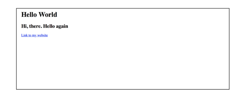
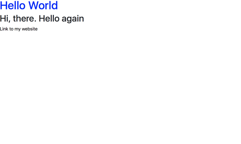
<h1>Hello World</h1><h2>Hi, there. Hello again</h2><a href="example.com">Link to my website</a>The markup has two header elements and an anchor tag. Below is the result when viewed in a browser.
This is exactly what you may have hoped for, but the result goes on to show a fundamental truth. Let’s dig into why this is important.
Take a look at the result above. The h1 element is displayed larger than the h2 element, and the a tag is blue — by default.
Did you notice that we get these styles without writing any CSS?
Why?
This is a result of the Browser’s default styles.
The takeaway is, browsers have default stylesheets that affect the appearance of webpages.
How can we prevent this default behavior?
The solution is pretty simple. You can override the default browser styles with your own styles through CSS.
For example:
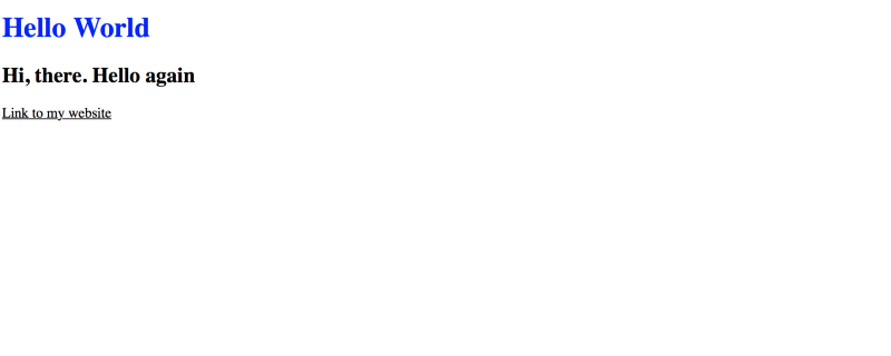
h1 { color: blue}a { color: black}This time, I have swapped the colors. The link, black and the h1 blue.
black and the h1 is blue.
That was easy.
Where does Bootstrap fit into all of this?
The browser affected the display of the page without your intervention. Using frameworks like Bootstrap can significantly alter the display of your webpages — with little or no intervention from you.
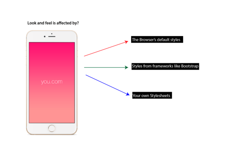
So, it works like this:
Every webpage’s overall style is influenced by the browser’s default styles, styles from frameworks such as Bootstrap and your own written CSS.
Don’t worry if you don’t get it now, I will explain with an example.
Assume I wrote a CSS library called, cowbell. Cowbell does only one thing. I included the library, perhaps through a cdn link. It gave my page a background color that looks “cowbell” like.
Somewhere within the cowbell library, I would have gone ahead to write this:
.cowbell { background-color: cowbell}Note that all I have done is include a .cowbell class with an equivalent background-color.
For the records, there’s no color like “cowbell”.
When you include the cowbell library in your page, how do use it?
Simple.
You just add the class of .cowbell to any element you want to give a cowbell color.
Something like this:
<!--- this is my awesome HTML document --><body class="cowbell"> This is my awesome site</body>Since I have already defined the cowbell class within the library, you don’t have to concern yourself with writing the functionality.
As in the example above, the addition of the cowbell class to body will give the entire document a cowbell color.
Now you’ve used a CSS library!
Under the hood, this is the same way Bootstrap works. In the same manner, there exists a set of Bootstrap CSS classes that have been styled within the library.
All you need to do is learn the class names and apply them to your html markup. They’ll do what they are designed to do.
In the case of the cowbell library, the class name required is .cowbell.
What does it do? It gives the element a “cowbell” color.
How does it work? You just go ahead and add the class name, .cowbell to any element.
Likewise, the Bootstrap library has a giant CSS file with lots of utility classes, responsive modules, and general CSS goodies.
Let’s begin to peel the layers off Bootstrap in the next section.
Installing Bootstrap
You can’t get Bootstrap to do anything if it is not installed or included within your webpage.
There are a couple ways to do this and more advanced users can explore the available options.
For the sake of simplicity, I will be using a cdn.
Sorry about the jargon. A CDN is short for Content Delivery Network.
A simple way to describe what is CDN is to imagine placing an order for a pair of shorts from a fictitious website called Anazon. Your order was received and successfully processed by Anazon. Unfortunately, Anazon noticed you live in the Antartica — somewhere really far from their main warehouse.
Bad news.
Fortunately, Anazon has a wide network of distributed warehouses all across the globe. Amazing.
Now, Anazon decides which warehouse is closest to your house in Antartica, and delivers your pair of shorts from that warehouse. Also, the next time you place an order, Anazon will check the same warehouse and deliver your goods in under 24hours.
How sweet.
This is kinda how a Content Delivery Network works. A CDN is like a warehouse that hosts common libraries like Bootstrap.
If you visit a website that has a link to a CDN resource, the Browser will load a cached version of the library. This is a version ‘stored’ in your Browser’s memory. If it finds none, it will make a request to fetch the requested resource.
Loading a resource from a CDN has the advantage of the resource being received faster. Like those pair of shorts!
Below is the link to the Bootstrap CDN.
https://maxcdn.bootstrapcdn.com/bootstrap/4.0.0-beta/css/bootstrap.min.css" integrity="sha384-/Y6pD6FV/Vv2HJnA6t+vslU6fwYXjCFtcEpHbNJ0lyAFsXTsjBbfaDjzALeQsN6M" crossorigin="anonymous"Include that in your page, and you are good to go.
For example, add this to any HTML markup:
<link rel="stylesheet" href="https://maxcdn.bootstrapcdn.com/bootstrap/4.0.0-beta/css/bootstrap.min.css" integrity="sha384-/Y6pD6FV/Vv2HJnA6t+vslU6fwYXjCFtcEpHbNJ0lyAFsXTsjBbfaDjzALeQsN6M" crossorigin="anonymous">What Difference Does Bootstrap Make?
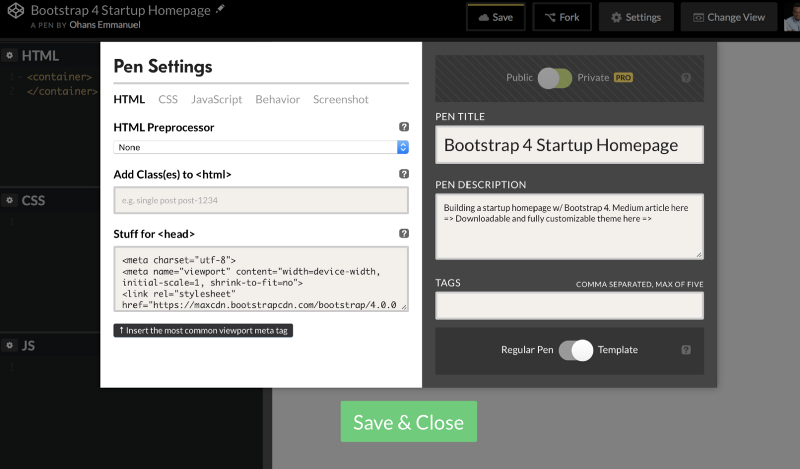
In this section we will go on to set up a basic demo page with Bootstrap. For these demos, I will be using codepen.io.
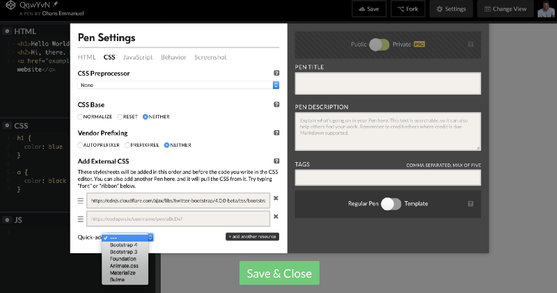
Adding Bootstrap v4 to a project is simple. Click the CSS pen setting, and include Bootstrap from the options.
Once that is done. we are all set up for the demos that come in the following sections.
So, what difference does Bootstrap make?
I have continued with the “Hello World” example we discussed earlier. Take a look at the results above.
The difference is very subtle. From the images you can see that some of Bootstrap’s default page styles have overridden those of the browser.
The font is now different, the spacing between each text block is altered, and the link has a different style.
Bootstrap at work!
Now that I’m sure you understand how CSS libraries work in general, let’s learn some of the basic Bootstrap Styles or class names that you should know.
The Basic Bootstrap Styles Everyone Should Know
Some very smart guys have put in a lot of work into building the Bootstrap library. They have done a lot of the “dirty” work for you. All you have to do is plug into what they’ve done and reap the fruits!
I will be using a question and answer method to explain the use of these Bootstrap styles.
Let’s get started.
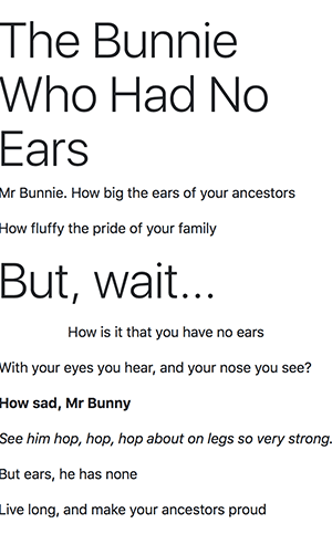
To practice the concepts in this section, we will begin with the following markup. It’s an unintelligent poem about rabbits.
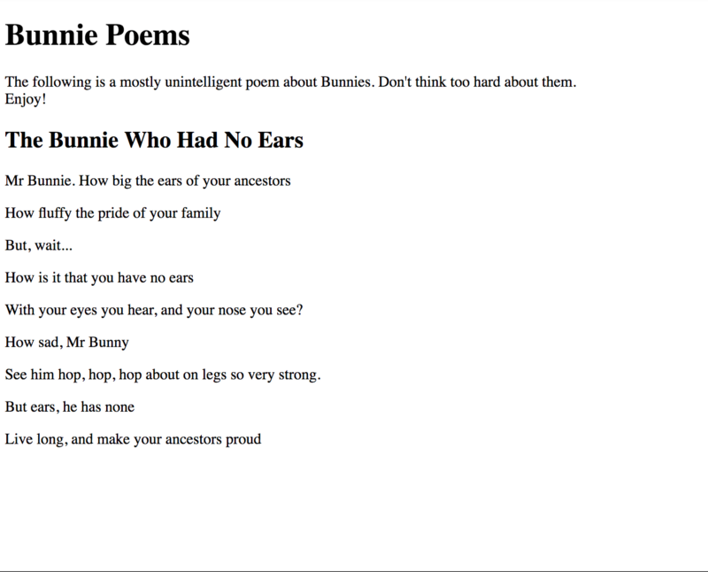
<h1> Bunnie Poems </h1><p> The following is a mostly unintelligent poem about Bunnies. Don't think too hard about them. <br /> Enjoy!</p><h2> The Bunnie Who Had No Ears </h2><p> Mr Bunnie. How big the ears of your ancestors </p><p> How fluffy the pride of your family </p><p> But, wait... </p><p> How is it that you have no ears </p><p> With your eyes you hear, and your nose you see? </p><p> How sad, Mr Bunny </p><p> See him hop, hop, hop about on legs so very strong.</p><p> But ears, he has none <p><p> Live long, and make your ancestors proud </p>The result of the markup is seen below:
The result is largely influenced by the Browser’s style. This is called the user agent stylesheet.
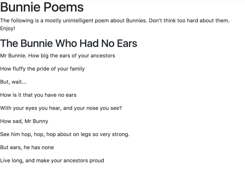
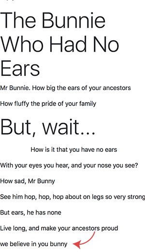
The first step is to go ahead and include Bootstrap. Please include Bootstrap as discussed in an earlier section, and you should have this:
With no styles written yet, we have a decent looking page. It is well spaced, and the font family has changed. See the changes?
The Bootstrap default styles have overridden those of the Browser. Without any efforts, we have a decent looking page.
Why Did the Font Family Change when I added Bootstrap?
You may have noticed that the text is now displayed in a completely different font.
Bootstrap 4 embraces the idea of native font stacks. It’s pretty simple. Different Operating systems — including Android, MacOS, Windows and Linux — all have default fonts installed on them.
This version of Bootstrap sets up a font stack that uses the default sans-serif font available on the current device.
This is a much smarter thing to do, and without taking away the flexibility of change. You can override this behavior and use your own fonts.
I was planning to explain in great detail how setting native font stacks work in CSS, but Marcin Wichary beat me to it. In this article, he did a great job of explaining it better than I ever could.
So, by adding Bootstrap we have good looking fonts on all platforms — regardless of the device’s operating system.
Sometimes you need headers that are really big. For instance, at the top of a website.
Take a look at the basic example we set up earlier. There exists an h1 and h2 in their default sizes. If for some reason you need these headers to be bigger, Bootstrap 4 has you covered.
Add the any of the classes, display-1 display-2 display-3 or display-4.
For example:
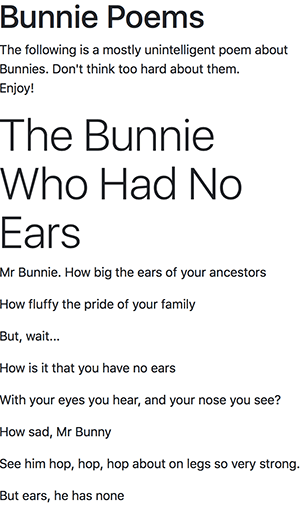
<h2 class="display-4"> The Bunnie Who Had No Ears </h2>I have added the class display-4 to the h2 element. As seen below, it looks a lot bigger now. Bigger than the h1 element!
The display classes are not restricted to just header elements, h1 to h6. In fact, they can be added to any element.
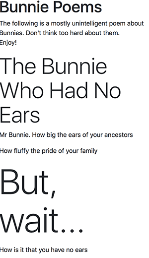
In the example below, I have gone added to add display-3 to one of the paragraph elements.
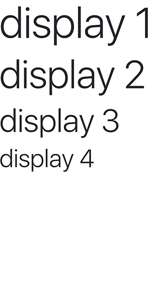
<p class="display-2"> But, wait... </p>What is the difference between the class names, display-1 and display-4 ?
The difference comes from the resulting size of the elements. display-1 will yield bigger sizes than display-4 . You may see the difference in the sizes in the image below:
How do I center and justify text with Bootstrap?
Pretty simple. Add the text-center class to the desired element to center the text block.
<p class="text-center">How is it that you have no ears </p>To justify text, and style the text to fit along the left and right, use the text-justify class like so:
<p class="text-justify">How is it that you have no ears </p>How do I capitalize texts in Bootstrap 4?
There are three classes specifically tailored to this cause: .text-lowercase , .text-uppercase and .text-capitalize.
If you apply the class text-lowercase on an already capitalized text, it will appear lower-cased.
<p class="text-lowercase">WE BELIEVE IN YOU BUNNY</p>This will yield a lowercased text in spite of the text, “WE BELIEVE IN YOU BUNNY” written in caps.
text-capitalize will capitalize the first letter of every word, and text-uppercase will capitalize every letter in a word.
How do I move texts to left or right?
As in the other text utility classes, add any of the classestext-left and text-right for the desired effect.
How do I make a bold, normal or italic text with Bootstrap 4?
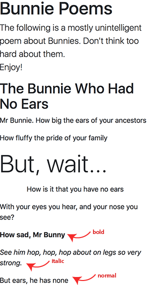
Adding the classes,.font-weight-bold,.font-weight-normal and.font-italic will make the text bold, normal or italic. If you’re coming from Bootstrap 3, you’ll notice that these class names are different.
Here’s an example:
<p class="font-weight-bold"> How sad, Mr Bunny </p><p class="font-italic">See him hop, hop, hop about on legs so very strong.</p><strong class="font-weight-normal"> But ears, he has none </strong>font-weight-bold,font-weight-normal and font-italic in action.
Note that the example uses font-weight-normal on a strong tag. By default, <strong><;/strong> should yield texts that are bold. This behaviour is “normalized” when you add the font-weight-normal class.
Note that the class name to make an italic text does NOT say font-weight-italic BUT font-italic
How can I style block quotes with Bootstrap?
Boostrap has the class name blockquote available for styling the block quote tag, <blockquote> or any other text block such as the paragraph element.
For example:
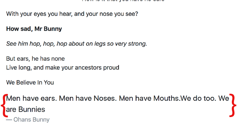
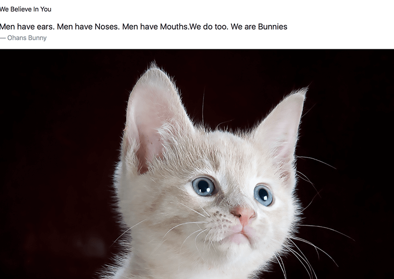
<blockquote class="blockquote"> Men have ears. Men have Noses. Men have Mouths.We do too. We are Bunnies</blockquote>This will give the text, “Men have ears. Men have Noses. Men have Mouths.We do too. We are Bunnies”, a unique Bootstrap style for quotes.
How can I style the author of a quote differently in Bootstrap?
It is pretty common to include an author after a quote. The same goes for citing the source of any text block. To do this, use the blockquote-footer class like so:
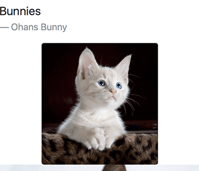
<blockquote class="blockquote"> Men have ears. Men have Noses. Men have Mouths.We do too. We are Bunnies <div class="blockquote-footer">Ohans Bunny </div></blockquote>For this example, I have used blockquote-footer within a blockquote tag. This is not compulsory. You can use the blockquote-footer class name on any text block such as the paragraph element, p.
Below is the result of this:
How do I remove the default padding, margin and style on an unordered list?
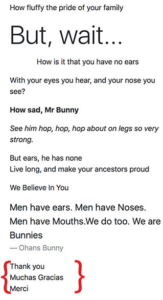
It seems that I always need to do this when I create any sort of html list. Again, this is trivially simple with Bootstrap. Use the list-unstyled class name, like so:
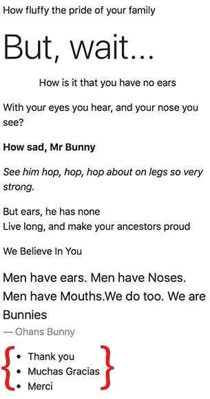
<ul class="list-unstyled"> <li>Thank you</li> <li>Muchas Gracias</li> <li>Merci</li></ul>How do I create list items that are arranged side by side?
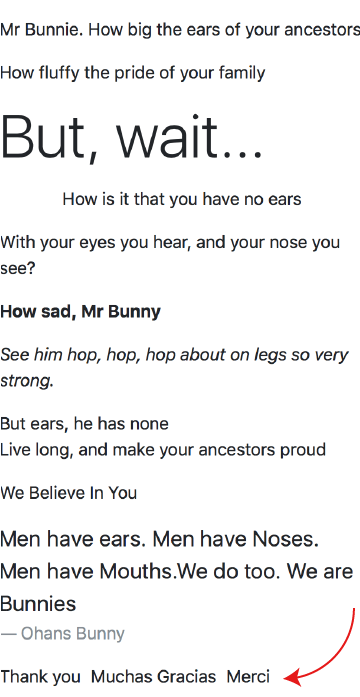
Sometimes you may need your list items to be arranged horizontally,or side by side as opposed to the default vertical view. Use the class name list-inline on the unordered list, and list-inline-item on the list items.
For example:
<ul class="list-inline"> <li class="list-inline-item">Thank you</li> <li class="list-inline-item">Muchas Gracias</li> <li class="list-inline-item">Merci</li></ul>This will created list items that are aligned side by side, horizontally.
What color options are available in Bootstrap?
Colors are the visual language most people process before they even become aware of it.
In design and Bootstrap generally, colors may be applied to a wide range of elements. Texts, backgrounds, borders, and more.
Ask a 5 year old to name colors and they are off with, “red, blue, green…”
There are well over 100 color names in CSS, which makes it difficult to represent all of these with class names. It’d be weird to have class names, color-blue color-red, on and on for over a 100 colors.
Hence, colors are treated a little differently in Bootstrap. There are certain keywords or special color names that are mapped to certain colors.
For example, the keyword primary is often associated with a blue color. success with a green color, and danger with a red color, and so on.
How do I display a colored text in Bootstrap?
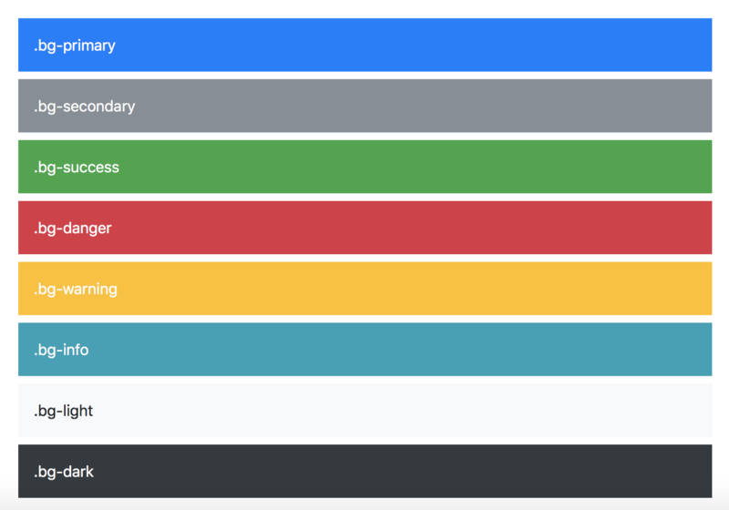
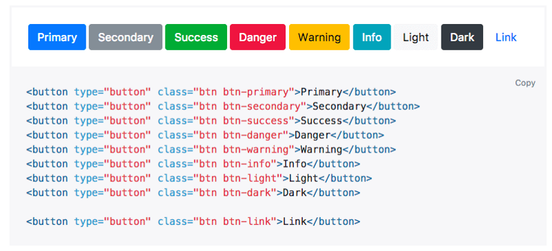
To display a text in a certain color, you should use the .text-* class names. where ‘*’ can be any of primary secondary success danger warning info light or dark.
For example:
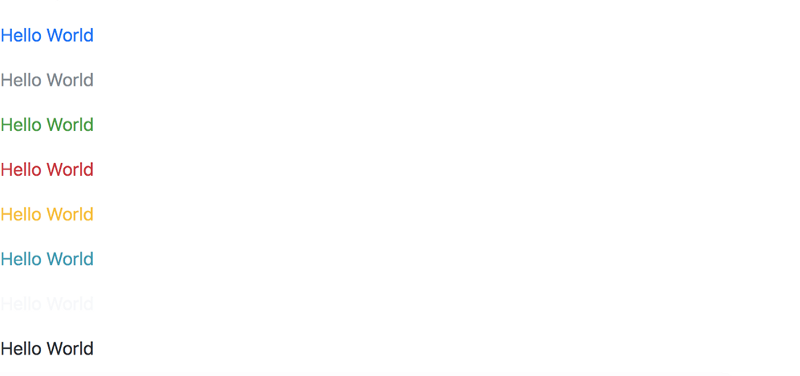
<p class="text-primary">Hello World</p><p class="text-secondary">Hello World</p><p class="text-success">Hello World</p><p class="text-danger">Hello World</p><p class="text-warning">Hello World</p><p class="text-info">Hello World</p><p class="text-light">Hello World</p><p class="text-dark">Hello World</p>The code block above will yield the result shown below:
It is important to note that the applying the text-light class results in a text with a light color. It is mostly appropriate that you apply this class to texts on a dark background.
For example, I have gone ahead to use the text-light class on a text within a blue background. It displays nicely.
How do I create Responsive Images in Bootstrap?
Everyone loves images. If you don’t, then you’re a part of the very few different ones. From experience, you must know that styling images can get out of hand very quickly.
To create images that are responsive regardless of the device being used, add the class .img-fluid to the image element.
For example:
In the bunny poem example, I have added the image of a cute kitten:
<img src="https://static.pexels.com/photos/45201/kitty-cat-kitten-pet-45201.jpeg"/>By default, the image extents arent seen because of the size of the image. Add the .img-fluid class for a fully responsive image.
<img src="https://static.pexels.com/photos/45201/kitty-cat-kitten-pet-45201.jpeg" class="img-fluid"/>How do I create subtle rounded images in Bootstrap?
Sometimes you want something different. So, Bootstrap allows for having images with subtle rounded borders. Just add the class rounded like so:
<img src="https://static.pexels.com/photos/45201/kitty-cat-kitten-pet-45201.jpeg" class="img-fluid rounded"/>Note that the markup above has more than one class name applied to it. This is a good example of how to use multiple class names on a single element.
Look closely at the result below. You’ll find the image having slightly round borders. Many times I find this more aesthetically pleasing than having square edges.
Can I create images with just one side having a round border?
In the previous example, the rounded corners were applied to all sides of the image. It is also possible to have rounded borders on just one direction. For example, applying the class rounded-top will create an image with only the top corners being rounded. .rounded-bottom does the exact opposite.
<img src="https://static.pexels.com/photos/45201/kitty-cat-kitten-pet-45201.jpeg" class="img-fluid rounded-top"/>Incase you were wondering, you can also use the rounded-left and rounded-right classes for left and right borders respectively.
Are there options for making images with a full circular background?
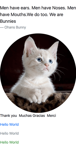
Yeah. Bootstrap allows for making a circular image by using the class name, rounded-circle.
For example:
<img src="https://static.pexels.com/photos/45201/kitty-cat-kitten-pet-45201.jpeg" class="img-fluid rounded-circle"/>This will result in a cute rounded kitten.
Can I manipulate the rounded edges bootstrap gives?
As much as possible, Bootstrap 4 tries not to take away your freedom. So yes, the rounded edges Bootstrap gives can be tweaked with your own styles. Let me show you an example.
If for some reason you have styled an image to have rounded borders, you can remove the rounded borders with Bootstrap by adding the rounded-0 class.
For example:
I have added a border radius of 50px to the cat image:
img { border-radius: 50px}Here’s the result:
That’s a weird shaped cat image. Let’s see what is happening under the hood.
In the html markup, we have this:
<img src="https://static.pexels.com/photos/45201/kitty-cat-kitten-pet-45201.jpeg" class="img-fluid rounded-bottom"/>As you can see from the markup, there’s already a rounded-bottom class applied to the image. Thus, bootstrap will have full control over the bottom edges. The edges you add using the border-radius property will affect only the top borders, or the borders you haven’t styled using Bootstrap.
Does that make sense? I guess it does.
If you took away the rounded-bottom class or any other rounded class on the image, your style will now take effect accross all sides of the border. See the result below:
In the example above, the rounded-bottom class has been removed from the markup, leaving the borders to do your bidding.
Depending on your specific needs, you may take out all .rounded classes provided by Bootstrap away from your markup and style the image yourself using the border-radius property.
If you’d like some of the edges to retain the default Bootstrap behavior, you may leave the specific rounded side class within your markup, such as.rounded-top, while styling the images using border-radius too.
How do I align images to the right or left?
Alignment is a vital part of design. Most times you’ll keep moving stuff around until it feels right.
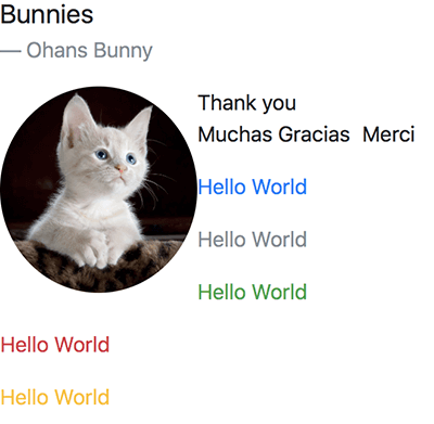
To align images to the left or right, use any of the classes, float-right or float-left.
For example:
<img src="https://static.pexels.com/photos/45201/kitty-cat-kitten-pet-45201.jpeg" class="rounded-circle float-left"/>In order for the image to float to the desired direction, you need to remove the img-fluid class on the image, and give the image a fixed width like so:
img { width: 150px}The reason for that is img-fluid makes the image fill the available width of the device. It can’t move to the left or right of the screen as it already occupies all the space. You have to reduce the width of the image in your own CSS style sheet as I have done in the example above.
What’s the best way to style Images with text descriptions?
It is not impossible to have images with text descriptions. This is useful in galleries and other instances where you’re trying to pass more information about the image by using a text block.
The correct way to do this is to contain the images within a figure tag and have the text block within a figcaption block.
Below is an example:
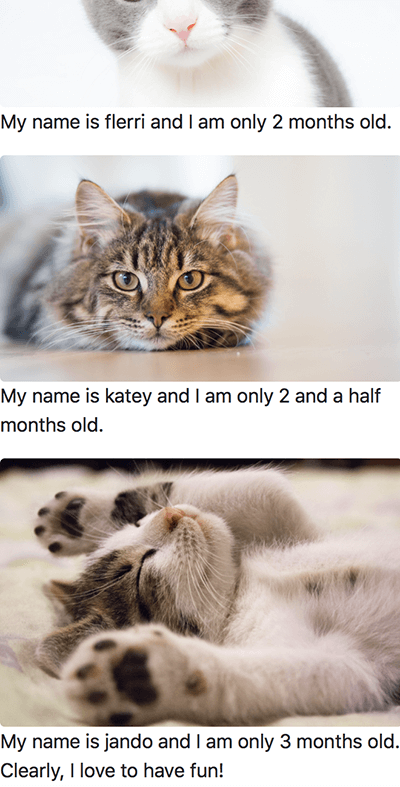
<figure> <img src="https://static.pexels.com/photos/126407/pexels-photo-126407.jpeg" class="img-fluid rounded"/> <figurecaption> My name is katey and I am only 2 and a half months old. </figurecaption></figure><figure> <img src="https://static.pexels.com/photos/416160/pexels-photo-416160.jpeg" class="img-fluid rounded"/> <figurecaption> My name is jando and I am only 3 months old. Clearly, I love to have fun! </figurecaption></figure>And here’s the result of that:
Nothing magical yet. Now let’s style this.
Bootstrap allows for the use of two class names, figure-img and figure-caption As you may guessed, they are both used on the image and text block respectively.
Let me show you an example.
Go ahead and add the class names, figure-img and figure-captionlike so:
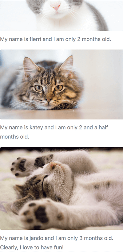
<figure> <img src="https://static.pexels.com/photos/126407/pexels-photo-126407.jpeg" class="img-fluid figure-img"/> <figurecaption class="figure-caption"> My name is katey and I am only 2 and a half months old. </figurecaption></figure><figure> <img src="https://static.pexels.com/photos/416160/pexels-photo-416160.jpeg" class="img-fluid figure-img"/> <figurecaption class="figure-caption"> My name is jando and I am only 3 months old. Clearly, I love to have fun! </figurecaption></figure>This will create some spacing between the image and the caption, and the text caption will be given a slightly calm color.
See the result below:
Note that to create the effect shown in the result above, I have added the class names img-fluid and rounded to the figure images. This will ensure that the images are responsive and have slightly rounded edges.
How do I center Images with Bootstrap?
Centering images can get a little tricky with Bootstrap. The first thing is to make sure that the image you’re trying to center hasn’t been styled to fit the available width or 100%. You should remove the img-fluid class on the image if it exists.
Let’s see an example.
Below is a markup from an earlier example:
<img src="https://static.pexels.com/photos/45201/kitty-cat-kitten-pet-45201.jpeg" class="rounded img-fluid"/>I’ll take away the img-fluid class:
<img src="https://static.pexels.com/photos/45201/kitty-cat-kitten-pet-45201.jpeg" class="rounded"/>And go ahead to style the image with my own class which will restrict the width of the image to perhaps, 200px:
.img-restricted { width: 200px}This will yield the fixed width image you see below:
Now, to center the image.
There are two different ways to center images in Bootstrap.
- use the
text-centerclass name - use the
mx-autoclass name
These options work a little differently.
For the text-center class, the image to be centered must retain it’s default display value of inline-block or inline. Also, the class name must be added to the image parent block such as a div and NOT the image itself.
Sorry if that feels confusing. Let’s see an example.
<div class="text-center"> <img src="https://static.pexels.com/photos/45201/kitty-cat-kitten-pet-45201.jpeg" class="rounded img-restricted"/></div>Note that the class name, text-center has been added to the parent div and NOT the img element.
And so, we have a centered image!
Just so you see what a wrong markup would look like, this is wrong:
<div> <img src="https://static.pexels.com/photos/45201/kitty-cat-kitten-pet-45201.jpeg" class="text-center rounded img-restricted"/></div>The markup is wrong because text-center has been applied to the img element. This will NOT center the image element.
Why does the text-center class work? Images are inline-block elements by default, so they will honor the text-center style applied on a parent element.
Let’s see the second way to center images using the mx-auto class.
If for some reason you changed the default display property of the image and made it block , the text-center class will no longer work.
For example:
.img-restricted { display: block}Once you set the display property to block , the image no longer honors the text-center style — as it is no longer an inline element.
In this case, you have to center the image like every other block element. Apply the mx-auto class name to the img element like so:
<img src="https://static.pexels.com/photos/45201/kitty-cat-kitten-pet-45201.jpeg" class="mx-auto rounded img-restricted"/>And the image comes back to being centered
Now you can go ahead and center whatever image you desire.
How do I add spacing on all sides of an element?
This is new in Bootstrap 4, and I have found it to be super helpful. Many times you need to add extra padding or margin to an element. In previous versions, you’d have to do this by writing your own styles. Sometimes it wouldn’t work owing to specificity issues. All that has been taken care of in the latest version of Bootstrap.
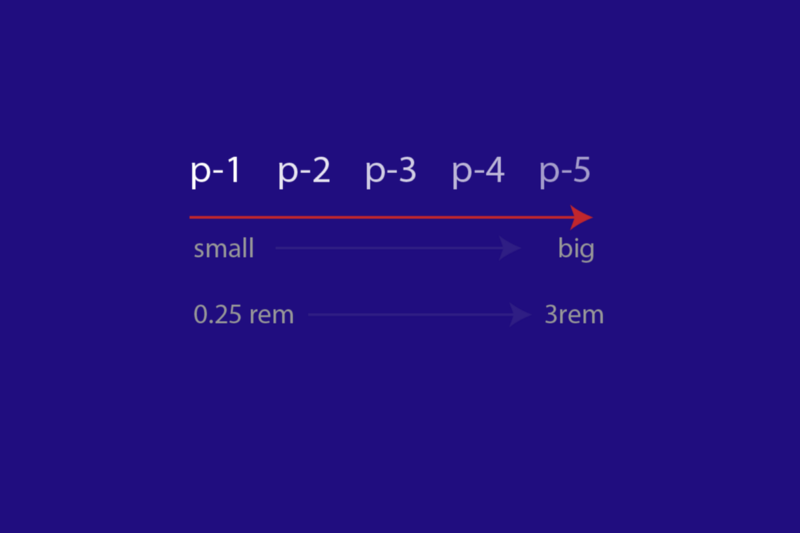
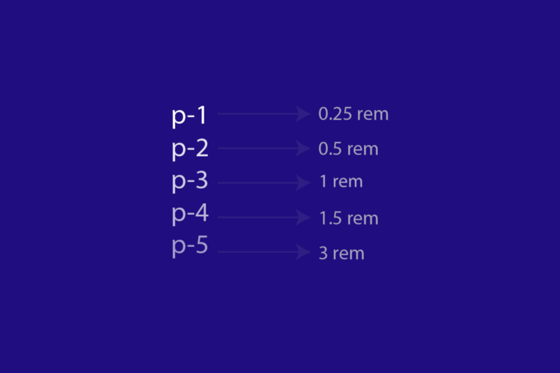
The spacing Bootstrap gives ranges from .25rem to 3rem. For most use cases, this should be enough.
Assume margins are represented by the letter m and padding by the letter p . Also, let the the different ranges be represented from 0 to 5.
With that out of the way, you can add spacing on all sides of an element by using any of the m-* classes for margins and p-* for padding.
For example m-0, m-1, m-2, m-3, m-4 and m-5 are all valid class names for adding margins. The same may be said for adding padding using any of the following class names p-0, p-1, p-2, p-3, p-4 and p-5.
Let’s see a practical example using an earlier example. Let’s add some spacing to the figure images and text caption we created earlier.
I will apply some padding to the figure element, like so:
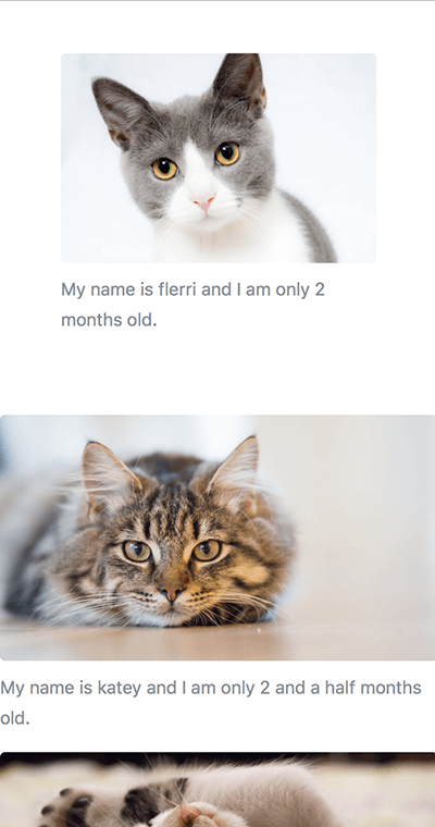
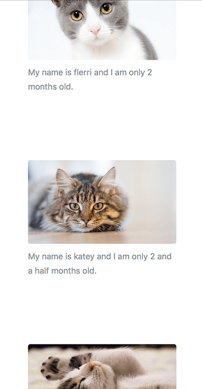
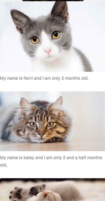
<figure class="p-5"> <img src="https://static.pexels.com/photos/104827/cat-pet-animal-domestic-104827.jpeg" class="img-fluid rounded figure-img"/> <figurecaption class="figure-caption"> My name is flerri and I am only 2 months old. </figurecaption></figure>What’s changed?
I haved added the class p-5 that’s all that has changed. And the result?
See below:
As opposed to the other figures, you can see the first one has some padding as inner spacing added around all sides. Pretty cool!
Let’s go a step further and add the padding class p-5 to all the figures:
<figure class="p-5"> <img src="https://static.pexels.com/photos/104827/cat-pet-animal-domestic-104827.jpeg" class="img-fluid rounded figure-img"/> <figurecaption class="figure-caption"> My name is flerri and I am only 2 months old. </figurecaption></figure><figure class="p-5"> <img src="https://static.pexels.com/photos/126407/pexels-photo-126407.jpeg" class="img-fluid rounded figure-img"/> <figurecaption class="figure-caption"> My name is katey and I am only 2 and a half months old. </figurecaption></figure><figure class="p-5"> <img src="https://static.pexels.com/photos/416160/pexels-photo-416160.jpeg" class="img-fluid rounded figure-img"/> <figurecaption class="figure-caption"> My name is jando and I am only 3 months old. Clearly, I love to have fun! </figurecaption></figure>Now we have all the figures having some extra spacing.
Pretty impressive result for little extra code.
How do I reduce or increase the spacing added on all sides of an element?
In the previous example, I discussed that the class ranges were represented from 0 to 5.
Zero, 0 will remove any spacing on an element, while the spacing increases as you go on from 1 to 5.
For example, the margin created by m-2 will be smaller than that created by m-5 Likewise, the padding created by p-1 will be smaller than that created by p-3.
For the curious mind, 1 adds a spacing of 0.25rem , 2 adds a spacing of 0.5rem , 3 adds a spacing of 1rem , 4 adds a spacing of 1.5rem and 5 adds a spacing of 3rem .
To illustrate this , I’ll go ahead and add different spacing class names on the different figures like so:
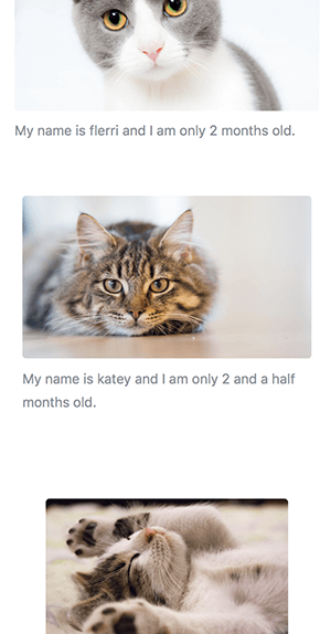
<figure class="p-3"> <img src="https://static.pexels.com/photos/104827/cat-pet-animal-domestic-104827.jpeg" class="img-fluid rounded figure-img"/> <figurecaption class="figure-caption"> My name is flerri and I am only 2 months old. </figurecaption></figure><figure class="p-4"> <img src="https://static.pexels.com/photos/126407/pexels-photo-126407.jpeg" class="img-fluid rounded figure-img"/> <figurecaption class="figure-caption"> My name is katey and I am only 2 and a half months old. </figurecaption></figure><figure class="p-5"> <img src="https://static.pexels.com/photos/416160/pexels-photo-416160.jpeg" class="img-fluid rounded figure-img"/> <figurecaption class="figure-caption"> My name is jando and I am only 3 months old. Clearly, I love to have fun! </figurecaption></figure>Here’s the result of that.
In the result above, you can see the padding increase from the first figure to the third.
How do I add spacing to just ONE side of an element?
There are times when you don’t want spacing on all sides of an element. You may only need some spacing at the top, bottom, left or right of the element.
Bootstrap has all the options! That excites me. You’d be surprised how helpful this is when you begin to build stuff.
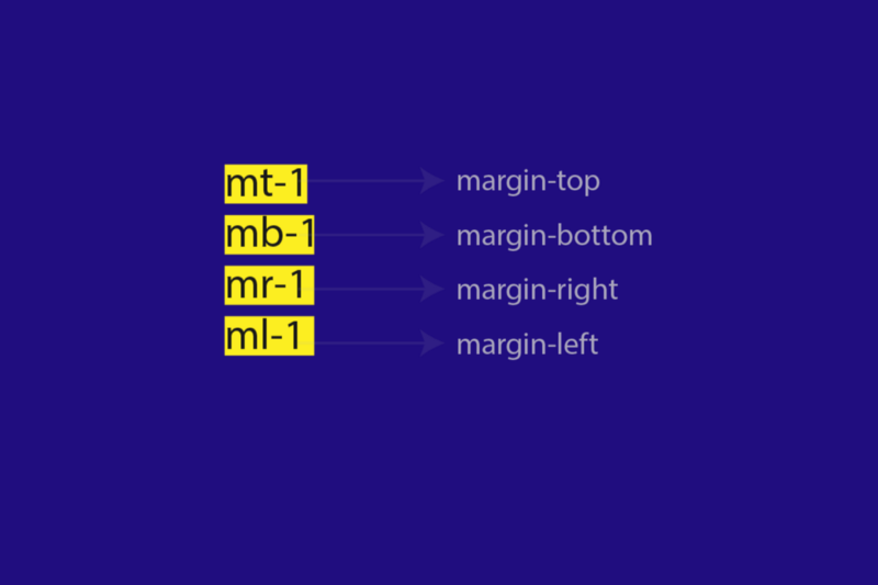
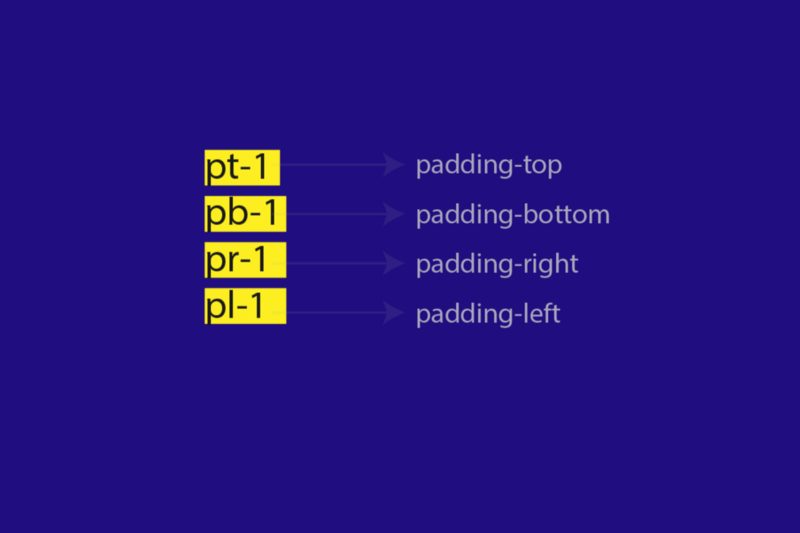
Instead of using the m-* class names, add a t , b , l , or r for a top, bottom, left or right margin.
For example, mt-1 , mb-1 , ml-1 and mr-1 are all valid class names. The range 0 to 5 still remains the same as before.
The t , b , r and l convention is also the same for padding.
I’ll go ahead to change the spacing we have on all the figures to represent bottom padding only.
<figure class="pb-3"> <img src="https://static.pexels.com/photos/104827/cat-pet-animal-domestic-104827.jpeg" class="img-fluid rounded figure-img"/> <figurecaption class="figure-caption"> My name is flerri and I am only 2 months old. </figurecaption></figure><figure class="pb-3"> <img src="https://static.pexels.com/photos/126407/pexels-photo-126407.jpeg" class="img-fluid rounded figure-img"/> <figurecaption class="figure-caption"> My name is katey and I am only 2 and a half months old. </figurecaption></figure><figure class="pb-3"> <img src="https://static.pexels.com/photos/416160/pexels-photo-416160.jpeg" class="img-fluid rounded figure-img"/> <figurecaption class="figure-caption"> My name is jando and I am only 3 months old. Clearly, I love to have fun! </figurecaption></figure>As you can see, I have used the pb-3 class name. This will add bottom paddings of 1rem each.
How do I add the same spacing to opposite sides of an element?
So much for spacing. This is the last example —I promise.
It is also possible to add the spacing to say top and bottom sides of an element. In the same manner you may add the same spacing to the left and right of an element too.
So, how is this done?
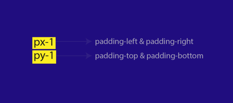
Let x represent left and right values, while y represents top and bottom values.
To add the same spacing to both left and right sides of an element, use the mx-* class, and my-* class for both top and bottom values.
For example, mx-1 will add a margin of 0.25rem along the left and right sides of the element. my-1 will add 0.25rem along the top and bottom sides of the element.
And that is all for spacing! Trust me, it is important stuff.
How do I Style a Lead Paragraph?
The lead paragraph is usually the first paragraph in an essay or article. The aim is to hook the reader’s attention.
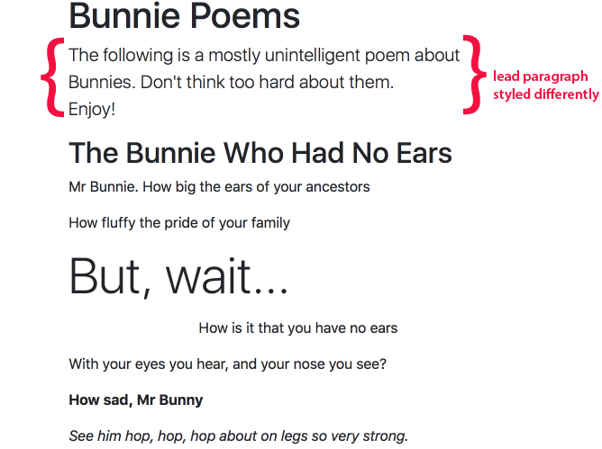
To style a lead paragraph, add the class .lead to the paragraph. For example, I’ll go ahead to add the class .lead to the first paragraph of the Bunny Poem like so:
<p class="lead"> The following is a mostly unintelligent poem about Bunnies. Don't think too hard about them. <br /> Enjoy!</p>And the result is a slightly bigger paragraph as seen below:
For the techies out there, the .lead class bumps up the size of the font by 25% and sets the font-weight to 300 , resulting in a bigger and much lighter text tone.
The Foundations of Responsive Design with Bootstrap
Have you used Flexbox before? If the answer to that is a yes, that’s great. With Flexbox, the flexbox formatting context is NOT initiated until a flex-container is created.
Whether you have some experience with Flexbox or not, with Bootstrap a container element has to be defined to reap the benefits of responsive design offered by Bootstrap.
So, what is a Bootstrap container ?
A container is simply an element with the .container class applied to it. For example:
<div class="container"></div>Pretty simple, huh?
For a simple markup, it is likely that you wrap every element in a bootstrap container.
For example, I’ll refactor the Bunny Poem to use the Bootstrap container.
<div class="container"> <h1> Bunnie Poems </h1> <p class="lead"> The following is a mostly unintelligent poem about Bunnies. Don't think too hard about them. <br /> Enjoy! </p><h2 class="display-5"> The Bunnie Who Had No Ears </h2> <p> Mr Bunnie. How big the ears of your ancestors </p> <p> How fluffy the pride of your family </p> <p class="display-4"> But, wait... </p> <p class="text-center">How is it that you have no ears </p> <p> With your eyes you hear, and your nose you see? </p> <p class="font-weight-bold"> How sad, Mr Bunny </p> <p class="font-italic">See him hop, hop, hop about on legs so very strong.</p> <strong class="font-weight-normal"> But ears, he has none </strong> <p> Live long, and make your ancestors proud </p> <p class="text-capitalize">We believe in you</p> <blockquote class="blockquote"> Men have ears. Men have Noses. Men have Mouths.We do too. We are Bunnies <div class="blockquote-footer">Ohans Bunny </div> </blockquote> ...</div>As you can see from the code sample above, I have now wrapped EVERY element in a div with the class of container.
<div class="container"> <!--every other element goes here --></div>What is the difference between container and container-fluid?
In the example above, I did this:
<div class="container"> <!--every other element goes here --></div>While that is correct, there’s one more container class that Bootstrap makes available, and that is, .container-fluid.
The usage is the same, like this:
<div class="container-fluid"> <!--every other element goes here --></div>So what’s the difference?
Let’s see visual examples.
I always wondered why I didn’t understand the difference between these when I started out learning the Bootstrap framework, years back. You’re in luck since I get it now. Let me explain it to you 
For visual feedback, I will go ahead and give the body a red background color. I will also give container and container-fluid background colors of white. Just so they don’t inherit the red background color from body.
Here’s the code:
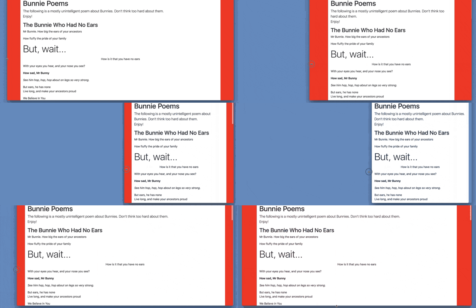
body { background: red}.container,.container-fluid { background: white}Now, let’s see what difference it makes when you wrap all the content of the bunny poem in a .container div.
With all the content of bunny poem wrapped within a .container div, try to resize your browser.
What do you notice?
You will notice that the .container width changes at different viewports. It leaves some breathing space between the itself and the body element — this explains why you see see the red background in the gif above. Don’t forget the body element has a red background.
Simple as it may seem, this is a very important behavior to note.
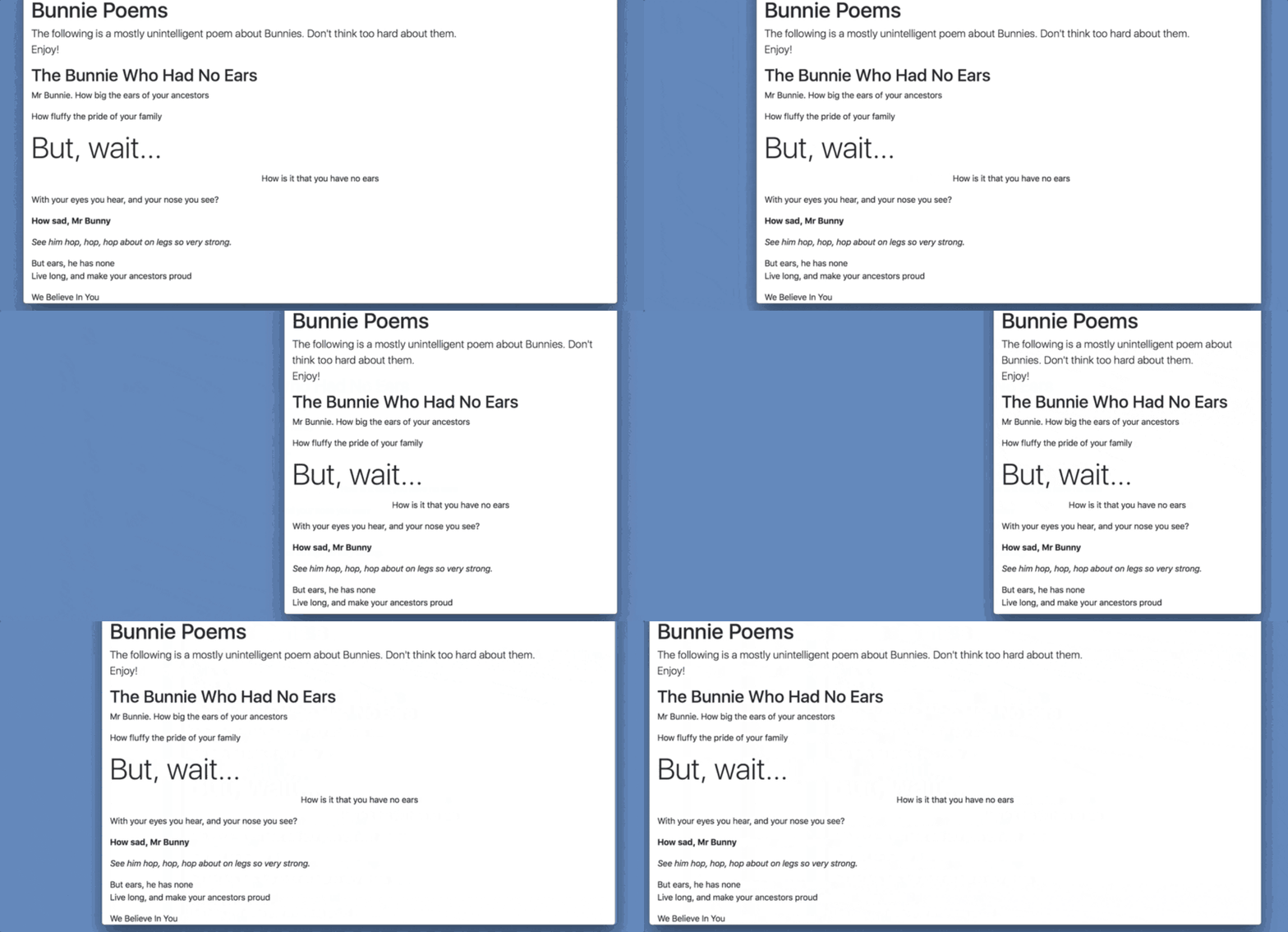
On the contrary, if you used .container-fluid , the div fills up the available viewport. You don’t see the red background as there is no breathing space between the container-fluid element and the body. All the available space has been occupied.
As you can see, with the .container-fluid class you don’t have the luxury of space. The container takes up 100% of the available width. There’s still a small padding applied to the .container-fluid element, but the width doesn’t grow bigger or change with the user’s viewport. This is the difference between the .container and .container-fluid class names.
What are Media Queries?
Since this section is focused on responsive design, I think it is important to have a refresher on what media queries are — especially for beginners. The section is also vital to understanding how the responsive modules in Bootstrap works.
Consider the code block below:
@media screen and (min-width: 768px) { .bg { background-color: blue }}If you’re familiar with writing responsive modules by hand, then the code block above should be familiar.
The code block represents the use of CSS media queries. If you have no idea how that works, please read on.
Media queries are at the heart of responsive design. They let you target specific screen sizes and specify codes to be run on the specified devices alone.
The most popular form in which media queries are used is something called the @media rule.
It looks like this:
@media screen and (min-width: 300px) { /*write your css in this code block*/}Looking at it, you can almost guess what that does.
“For a screen device with a minimum width of 300px … do this and that ”
Any styles within the code block will only apply to devices that match the expression, “ screen and (min-width: 300px).” In the example above, the device width 300px is known as a breakpoint.
I guess that helped clear up some confusion.
What is the Bootstrap Grid System?
With Bootstrap or any well-thought-out design, nothing just sits on the page. Every element sits on a well defined grid structure.
In this context, a grid is a series of intersecting vertical and horizontal guide lines used to structure content on a web page.
Nobody just slap content haphazardly on a page.
See the example above. Ever seen a content on a website arranged like that? I bet “no”.
Most of the time, you will have a grid that contains well structured content. Something like this:
Bootstrap has a way to define grids and rightly place content on it too. This is what is called the Bootstrap grid system.
For more advanced users, It is important to note that you don’t need horizontal or vertical grid lines. With the CSS Grid sprinkled with some CSS magic, you can easily build a non-conventional layout.
How do I use the Bootstrap Grid?
The Bootstrap 4 grid is built with Flexbox — which makes it even more powerful than ever before.
Fair warning: this part of Bootstrap tends to suck when you first learn it. But, if you take the time to master the Bootstrap grid system, you’ll find it to be one of the most important Bootstrap knowledge you have.
Let me explain how it works.
So, your friend Chloe calls you at midnight and says, “I’m gonna get married!..haha”
You both get excited about the news and chat for longer than you expected. Just when you were going to end the call, you decide to act like a cool heaven-sent developer. “Hey, Chloe. I’m going to build your wedding website for you!” And you guys chatter for another 30 minutes…
Well, sweet story.
Good news is, you just made Chloe’s night. She’ll be super excited. Bad news, or (not so bad news) is you’re going to spend the time and energy, (and some coffee) to build the wedding site.
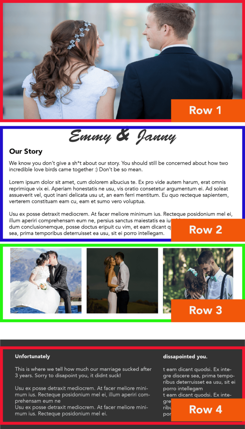
So, you get a mockup like this one:

You don’t have a lot of time to build this site, so you resort to using Bootstrap. What’s the first thing to do? Set up the Bootstrap grid.
There are some pretty strict rules to follow while using the Bootstrap grid system.
First, in your mind’s eye scroll back up to the mockup above and try to break out each line of content into separate rows. This line of content should run from the horizontal to the vertical.
Can you do that?
I have gone ahead to do the same, and here’s the result:
What I have done is to draw horizontal boxes extending from left to right around grouped content along a line. Even for more involved layouts, this sort of breakdown is very important.
These horizontal boxes are called rows. Denoted by the class .row
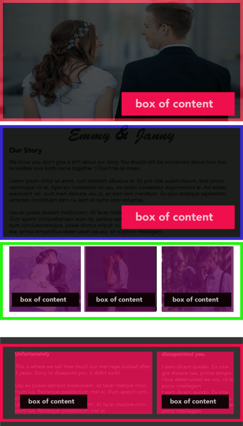
It doesn’t end here. Within each row there are individual boxes of content. See the previous image and try to identify these individual boxes of content.
Again, I have done the same. See the results below:
These individual boxes of content that live within rows are called columns.
Makes sense?
Columns are denoted by the class .col
Since rows and columns are great buddies, a column should not exist outside a row. That’s an important rule to remember.
Also, every row must be placed within a container. Either .container or .container-fluid will do. A row cannot exist outside a container. It must live within a container.
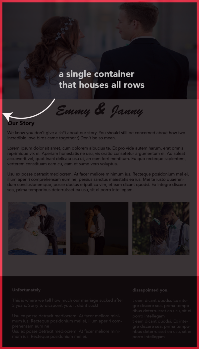
In practice, you may have an overall container that houses the entire group of rows, like so:
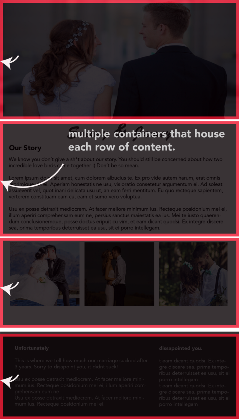
Or you may have a container that wraps around each individual row, like this:
I seem to favor the latter. I find it more flexible — in certain use cases.
A quick summary: Every row must be placed within a container. Rows are specified with the class name .row , columns with .col and containers with either .container or .container-fluid.
This is the foundation of how the Bootstap grid system works. I’ll be discussing some more practical use cases in the coming sections.
What About Columns of Different Sizes?
As you build web apps, it is very likely that you will need columns of different widths. Almost every time, there’ll be columns of varying widths within rows.
Below is an example:
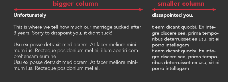
A column may take up 60% width of the row, and the other 40%. How do you deal with this using the Bootstrap grid?
The Bootstrap grid assumes a 12 column grid. It assumes that within every row, there exists 12 columns available. With these 12 columns, it becomes your duty to distribute the width of the columns whichever way you deem fit.
Let me explain.
As shown earlier, consider the row of content below:
The row contains two columns of different sizes.
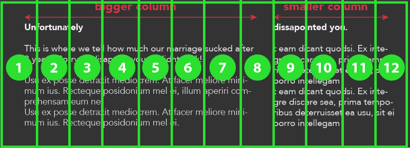
Within this row, the bootstrap grid assumes 12 columns within this row, like so:
According to Bootstrap, there are 12 columns within every row. How you distribute the space is up to you.
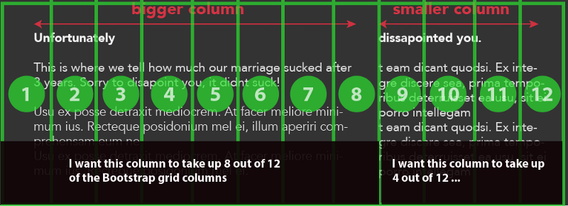
Since you have only 2 user-defined columns (the bigger and smaller column) within the row, you’ve got to distribute the column space, like so:
It’s pretty simple, and in no time you’ll get used to this. You assign 8 of the columns to the bigger column, and the remaining 4 to the smaller column. Note that the sum of this equals 12.
The sum of the width of distributed columns within a row must not be greater than 12. In the example above, we used col-8 and col-4. The col-8 represents the bigger column that takes up 8 bootstrap grid columns, and col-4 represents the smaller column with 4 bootstrap grid columns.
In this case, you will have two columns with one being 2x the width of the other. Remember, 8 / 4 = 2 .
If you wanted columns of equal width, you’d use col-6 and col-6 . This will create equal columns which take up half of the 12 Bootstrap grid columns.
If you wanted a bigger ratio between the two columns, you may use col-10 and col-2 .
I’m pretty sure you get it now.
What if I exceed 12 columns?
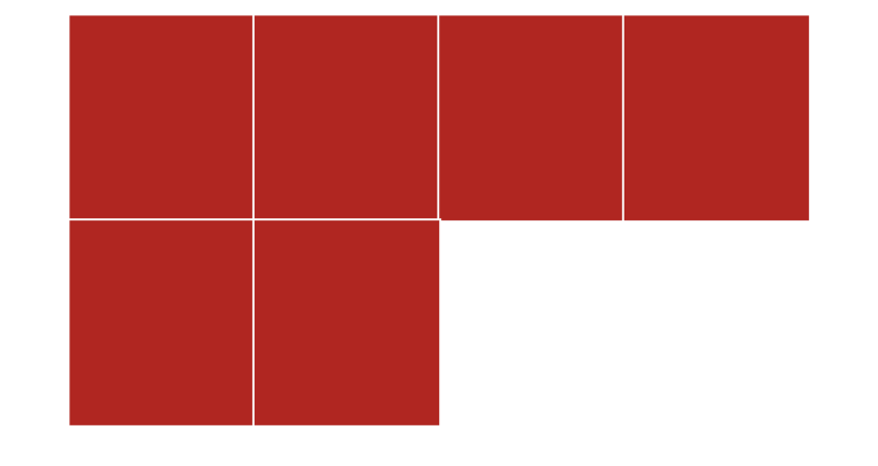
In the event that you have a total number of columns that exceed 12, they’ll wrap unto the next line. Just like using flex-wrap
For example:
<section> <div class="container"> <div class="row"> <div class="col-3"> </div> <div class="col-3"> </div> <div class="col-3"> </div> <div class="col-3"> </div> </div> </div></section>With the markup above, the total number is 12. You get the expected result below:
If within the same row you add 2 more columns, what happens?
<section> <div class="container"> <div class="row"> <div class="col-3"> </div> <div class="col-3"> </div> <div class="col-3"> </div> <div class="col-3"> </div> <div class="col-3"> </div> <div class="col-3"> </div> </div> </div></section>The next set of columns after 12 is wrapped unto the next line, like so:
This is good, but what about Responsive Grids?
In the examples above, the column sizes defined will remain the same regardless of the user’s device.
For example, col-8 and col-4 will create 2 columns within the row. This will be the case on mobile devices, and larger devices.
For the sake of responsive design, this will rarely be the case. If you have a 2 column grid on tablet devices, you may want the columns to stack up on mobile.
You may also have a 3 column grid on desktop devices, but 2 on tablet devices or only 1 column on mobile devices. In this case, there’s got to be a way to hide the extra columns we do not want on smaller devices.
Luckily, bootstrap has these use cases covered!
The Bootstrap columns may be modified using certain modifiers.
For instance:
col-sm refers to a column on small devices (phones) and above
col-md refers to a column on medium devices (tablets) and above
col-lg refers to a column on large devices (desktops) and above
col-xl refers to a column on extra large (wide screen) devices
Let’s go back to the example of a 2 column width. We need the columns to appear as 2 columns on medium devices (and larger), but stack horizontally on smaller devices (phones).
How do you do this?
Begin with a markup like so:
<div class="row"> <div></div> <div></div></div>I have assumed that this row will be placed within a container. Remember, every row must be placed within a container.
Bootstrap employs a mobile first philosophy. By default you should build the design for mobile devices, then move up to bigger devices from there.
In that case, we’ll deal with the display on mobile devices first.
<div class="row"> <div class="col-12"></div> <div class="col-12"></div></div>The markup above will create columns that take up all the available width within the row. The columns will stack vertically with a 100% width.
This isn’t the behaviour we want for medium devices, so we add the modifier classes, like so:
<div class="row"> <div class="col-12 col-md-6"></div> <div class="col-12 col-md-6"></div></div>You see that?
Note that for the smallet of devices, there’s no need for a modifier class.
Now, for medium devices and larger the row will assume a 2 column width. One taking up 6 columns and the other takes 6 columns, with the Bootstrap 12 column grid.
In the practical section, I’ll discuss how to hide columns on smaller devices.
How did that work?
Bootstrap has implemented media queries with certain breakpoints to meet every responsive need. Ranging from extra small phones to small phones, tablets, laptops and even bigger desktops — Bootstrap has you covered.
Like the margin and padding classes we studied earlier, there is a specific naming convention to applying styles based on the specific screen size of the user.
As seen in the image above, xs refers to extra small phones, sm refers to small phones, md refers to medium devices such as tablets, lg refers to large devices such as laptops, and xl refers to extra large screens such as large desktop screens.
For the curious mind, here’s what the Bootstrap media queries look like:
// Extra small devices (portrait phones, less than 576px)// No media query since this is the default in Bootstrap// Small devices (landscape phones, 576px and up)@media (min-width: 576px) { ... }// Medium devices (tablets, 768px and up)@media (min-width: 768px) { ... }// Large devices (desktops, 992px and up)@media (min-width: 992px) { ... }// Extra large devices (large desktops, 1200px and up)@media (min-width: 1200px) { ... }If you’re an advanced user, take a look at the docs for version4 and version3. Note the difference in the grid breakpoints. I spent some time figuring this out myself. So, go do the same.
What’s the deal with min-width?
You’ll notice that the Bootstrap media queries use min-width . You’d also notice that in previous examples I kept saying, “medium devices and larger”
For example, col-md targets medium devices and larger. So, if you specify a column to take up 8 columns on medium devices, col-md-8 other devices larger than medium will also take up the same width definition. There’s no need to write col-lg-8 or col-xl-8
This behavior is owing to the use of min-width within the Bootstrap media queries.
// Medium devices (tablets, 768px and up)@media (min-width: 768px) { ... }The code block above says, “for devices that have a minimum width of 768px …”. This embodies every device larger than 768px too.
Can I customize the Bootstrap classes based on specific screen sizes?
Yes, this can be done, but not for every Bootstrap class. Let’s take styling texts for example. If you wanted a bit of text to appear to the center only on mobile phones, how would you do that?
Use the class, text-sm-center on the text block:
<p class="text-sm-center">How is it that you have no ears </p>The text, “How is that you have no ears” will appear normal in the document flow, except when viewed by a small phone. At this point, it will be centered across the screen.
Summary
This has been a pretty enlightening section. If you’re new to Bootstrap, you should be a lot more comfortable with how the framework works now. If you’re an old hat, then you’ve probably seen new ways this version of Bootstrap differs from the former.
In the coming section, we will go practical. We will display every other technique, trick and new goodies in the framework with practical examples.
As discussed in the “What You’ll Learn” section, we will go ahead and start building the Startup Home Page.
Getting Practical with Bootstrap 4
Haha! This is the part of the article that gets me really excited. In the earlier sections, I tried to get you comfortable with the Bootstrap 4 framework, now let’s build some really cool projects.
When we are finished with this project, you should have successfully built the a single page Startup Page.
What you will learn
As well as being the first real world application of the concepts taught in this article, building this project has some advantages.
If you’re new to Bootstrap, I made sure to touch up on the fundamental concepts you need. For more experienced developers, this example highlights some of the new features of Bootstrap 4.
The example also shows how Flexbox is used in Bootstrap 4. Also, some seemingly simple things such as offsetting columns and aligning block elements to the center are handled differently in this version of the framework.
These are a few of the things we will be looking at in this example.
What you need to follow along
For the sake of a rapid development set up, I’ll be using CodePen for this demo. That’s all you need to follow along.
To start we will focus on the initial viewport of the Startup Home Page. It fills up the screen with a decent background image, a text block and a CTA (Call To Action) button.
Also, since we will be focusing on a mobile first approach, it is important to see how the design views on mobile devices.
Below is the mobile mockup:
As seen in the image above, everything is pretty much the same.The CTA and opening paragraph stay horizontally aligned to the start of the page.
Now that we understand the design requirements, let’s get started with the initial markup required.
The initial markup
If working locally, the initial markup you need for a decent bootstrap project is this:
<!DOCTYPE html><html lang="en"> <head> <!-- Required meta tags --> <meta charset="utf-8"> <meta name="viewport" content="width=device-width, initial-scale=1, shrink-to-fit=no"> <!-- Bootstrap CSS --> <link rel="stylesheet" href="https://maxcdn.bootstrapcdn.com/bootstrap/4.0.0-beta/css/bootstrap.min.css" integrity="sha384-/Y6pD6FV/Vv2HJnA6t+vslU6fwYXjCFtcEpHbNJ0lyAFsXTsjBbfaDjzALeQsN6M" crossorigin="anonymous"> </head> <body> <div class="container"></div> </body></html>Don’t let the seemingly complex code turn you off. The markup is quite basic.
First, consider the meta tag:
<meta name="viewport" content="width=device-width, initial-scale=1, shrink-to-fit=no">The meta tag exists to ensure that the pages developed are displayed correctly on mobile devices. If you define media queries without this meta tag, you may not get the look you were hoping for on mobile devices. It is important you have it included. The tag also ensures that touch zooming is accounted for on mobile devices.
Curous what the content and initial-scale attributes do? See this well explained stackoverflow answer.
Secondly, consider the link tag:
<link rel="stylesheet" href="https://maxcdn.bootstrapcdn.com/bootstrap/4.0.0-beta/css/bootstrap.min.css" integrity="sha384-/Y6pD6FV/Vv2HJnA6t+vslU6fwYXjCFtcEpHbNJ0lyAFsXTsjBbfaDjzALeQsN6M" crossorigin="anonymous">The link tag above is the same as any other link tags you’ve used in the past. It includes the href attribute that points to the bootstrap cdn.
Okay, I know what you’re thinking. What are theintegrity and crossorgin html attributes?
The integrity attribute checks the source from which the cdn is loaded and ensures that the file hasn’t been manipulated. It is a security measure to ensure you’re getting what you “ordered”. This may seem trivial, but for a long time a prevalent disadvantage to using a CDN was that you had no direct control over what was in the content provided. This could lead to having unreliable or tampered imported code.
The crossorigin attribute is present when a request is loaded using ‘CORS’.
Do not think too hard about what these attributes are. Let’s keep going.
At this point it is safe to assume that you have the basic markup setup. Also, note that the markup above doesn’t contain any links to a JavaScript file. This is intentional. Further down this article, we may take a look at adding interactivity using JavaScript much later.
Codepen Setup
I’ll be using codepen for an easier setup. In the codepen,you can add the meta tags in the html settings pop up. Please refer to the screenshot below.
In your html go ahead and kick things off with this:
<h1>Hello World</h1>If you have “Hello World” displayed on the screen then you’re ready to follow along without any glitches.
Initial Document Structure
One of the perks of a new API is that there are really no best practices in its early stages of coverage. The same may be said for Bootstrap 4.
If you’ve worked with Bootstrap in the past then you know that your project markup can get difficult to manage in no time. For this reason, I have some patterns that work well for me. You do not need to adopt them, but they can certainly make your work easier. Try them.
When you take a look at the final design, you will realize that there are categorized sections of content.
There’s an initial section with a call to action, a section with the app mockup, a section that highlights some of the features of the business, a testimonial section, and more. You get the gist. In all you should have 8 sections.
The first rule of thumb is to have separate layers of content using a section tag or any other semantic html5 tag. Why? By design, using Bootstrap means you’ll have a lot of divs in your markup. Using the section tag makes the markup a little more manageable.
<section></section><section></section><section></section><section></section><section></section><section></section><section></section><section></section>You should start with 8 tags as shown above.
Now, give each tag a unique id .
The reason I choose id over classes has to do with specificity and having a unique identifier. You’ll come to see why this is important later.
I’ll go ahead and name the section elements with relevant IDs
<section id="introduction"></section><section id="info--1"></section><section id="info--2"></section><section id="info--3"></section>;<section id="featured-on"></section><section id="feature-rundown"></section><section id="pricing"></section><section id="footer"></section>Now we have 8 section tags ready to be put to good use.
Building the Initial viewport
Let’s analyze and build the initial section section#introduction
What we have is a section that fills the initial viewport of the user, with a message and call to action (CTA) vertically centered and horizontally aligned to the start of the section.
Now let’s apply the knowledge of grids to the project being built.
The initial viewport will have its internal markup structured like this:
<section id="introduction"> <div class="container"> <;div class="row"> <div class="col-12"></div> </div> </div></section>Now, we have a basic structure in place.
Note the use of the column class, .col-12 This ensures that the div fills the entire available 12 columns. Adding the class, .col-12 means that at every screen size, big or small, the div will always fill the entire 12 column grid. It will be full width across the grid.
The markup needed within the div.col-12 is this:
<h1>Coding on steroids</h1><p>Stop hiring engineers to write your code. Just use the 1kb script that magically solves all your problems and algorithms.</p><a href="#" role="button">Try it yesterday</a>What you should have now is a bare page that doesn’t look any good.
Let’s make this pretty
There are a couple of things we need to make this UI great.
(i) Style the section#introductionsection#introduction needs a background image and is required to fill the user’s viewport
(ii) Rightly position the content block
The content block, the text blocks, h1 and p containing “Coding on Steroids…” must be perfectly aligned vertically to the center
(iii) Style the Header and Lead paragraph
The h1 and p elements need some styling — no matter how basic
(iv) Style the CTA
Call to actions should be legible and distinct.
The button element should also be styled too
(iv) Extend beyond mobile view
Finally, on bigger screens, the content block should NOT fill the available width but take up 50% of the available width
With these in mind, we will solve these problems with the least amount of custom styles, taking advantage of the default Bootstrap styles where possible.
Let’s get started.
Solutions
To style section#introduction with a background image, you need to write some custom style, like this:
#introduction { background: linear-gradient(rgba(100,181,246 ,1), rgba(0,0,0,0.8)), url('http://bit.ly/2fBj6OJ') 0% 0%/cover }This will give the section#introduction a subtle background image topped with a mild linear gradient.
If you’re not sure what the code above does, the following illustration may help:
It is required that the section#introduction fills the user’s viewport. Bootstrap does not have a utility class for this purpose, so we need to write ours. Here it is:
.fill-viewport { min-height: 100vh }Now, add this class to section#introduction like so:
<section id="introduction"> <div class="container"> <div class="row fill-viewport"> ... </div> </div></section>What have I done here?
You’ll notice that I have added the .fill-viewport to the div.row NOT the overall container, div.container or the section#introduction.
This is very intentional. As a rule of thumb, every utility class you need on a containing content body should go in the .row except in certain special occasions. This is how I like to work. One other reason I follow this rule is that it makes the markup neat, without having class names jumping around everywhere. You need a bit of structure to write good code.
With that you should have a section that looks pretty good.
You must have noticed that the content block isn’t well positioned. Let’s have it in the vertical center of the page.
Here’s the perfect place to point this out. Every Bootstrap 4 .row is by default a flex-container.
I cannot overemphasise how important this is.
Every Bootstrap 4 .row is by default a flex-container.
This opens up opportunities that weren’t available in previous versions of the framework.
Since.row is a flex-container we can go ahead to add the Bootstrap utility class align-items-center This will align the content of every flex-container to the center.
Apply it like this:
<section id="introduction"> <div class="container"> <div class="row fill-viewport align-items-center"> ... </div> </div></section>Again, I have added this class to the .row .
Below is the result of that:
At this point, we are making decent progress.
Bootstrap 4 has many other Flexbox utility classes. They barely need a lot of explanations. The class names are very descriptive.
Let’s style the h1 and p elements.
I had taken the time the discuss text utility classes early in this article. To style these text elements, do this:
<h1 class="text-white">Coding on steroids<;/h1><;p class="lead">Stop hiring engineers to write your code. Just use the 1kb script that magically solves all your problems and algorithms.</p>As you already know, text-white will give the h1 a white color, .lead will style the paragraph a little differently from other paragraphs.
This looks good, but I want the paragraph to have a slighly faintier color. For this purpose, we will write another utility class:
.text-white-70 { color: rgba(255,255,255,0.7)}This will give the text a slightly transparent white color.
Go ahead and use this class on the lead paragraph like this:
<p class="lead text-white-70">Stop hiring engineers to write your code. Just use the 1kb script that magically solves all your problems and algorithms.</p>And now you should have this:
Note how we are abstracting tiny functionalities into reusable CSS classes. This is really important for reusability.
The button is still unstyled. We need to fix that.
Buttons in Bootstrap are styled using the .btn class. There are a few variations with respect to color. For example.btn-primary and .btn-secondary will give a blue and gray button respectively.
To style the link , do this:
<a class="btn btn-primary" href="#" role="button">Try it yesterday</a>At this point, we have a section that looks good on mobile, but not so great on larger devices. Let’s fix that.
Bootstrap follows the widely accepted mobile first approach to development. This means you build for mobile devices first, then you adapt the design to even larger screen sizes. This is what we will now do.
When defining the containing grid within the section#introduction we did just that.
<div class="col-12"> ....</div>By writing this, we said “Oh Bootstrap, let this div fill up the entire 12 column width on all screen sizes.” This is good — in the spirit of designing from a mobile first perspective.
Now let’s have the column take up half of the width on larger devices. You do this like so:
<div class="col-12 col-md-6"> ...</div>Now what we’ve said is this: “Oh Bootstrap, by default, let this div fill up the entire 12 column width, BUT let the div take up 6 columns on larger devices.”
12 halved, equals 6. Hence, the column will take up half of the available space on larger devices.
That wraps up the development of the initial viewport.
Let’s move on to the next section.
Building the startup details section
The next section is quite interesting. Below is how it views on big, medium and small devices:
On mobile devices, the user is shown a full width column with important bit of texts. On tablet devices, more text is shown, and an app preview by the side. This makes for 2 equal width columns.
On larger devices, even more text is displayed, and the mobile app preview remains too.
Now, let’s build this.
By convention, we will take a mobile first design. Design for mobile devices first.
Fill the section#info--1 with the following markup:
<section id="info--1"> <div class="container"> <;div class="row pt-5 align-items-center"> <div class="col-12"> <h6 class="text-uppercase text-black-40"> million dollar info </h6> <h2>We do what our competitors do, but with 500% more</h2> <p>Sed ut perspiciatis unde omnis iste natus error sit voluptatem accusantium doloremque laudantium, totam rem aperiam..</p> </div> </div> </div></section>You’d notice that I snugged in a lot more here. Let me explain
Consider the .row:
<div class="row pt-5 align-items-center"></div>Within the row there is a column represented by:
<div class="col-12">...</div>col-12 ensures that the div spans the full width, 12 columns by default.
There are two additional classes within the .row you should be familiar with. pt-5 adds a padding top to the div and align-items-center ensures that the flex-items are centered vertically.
Do not forget that in Bootstrap 4, every row is a flex-container.
The following code block represent the text blocks:
<h6 class="text-uppercase text-black-40">million dollar info</h6><h2>We do what our competitors do, but with 500% more</h2> <p>Sed ut perspiciatis unde omnis iste natus error sit voluptatem accusantium doloremque laudantium,totam rem aperiam..</p>text-uppercase is a bootstrap utility class for making the text appear capitalized.
text-black-40 is another tiny class that gives the text a color of black with a 40% opacity.
.text-black-40 { color: rgba(0,0,0,0.4)}And with that you should have this:
Looks good on mobile. Now let’s fix the display on bigger devices.
For medium devices, we need two columns. One to house the app mockup, and the other the text block.
The code block below highlights the solution. Go ahead and add the image in a new column just within the .row but above the text block.
<section id="info--1"> <div class="container"> <div class="row pt-5 align-items-center"> <div class="col d-none d-md-block align-self-end"> <img src="http://bit.ly/2fyUtlS" class="img-fluid"/> </div> <div class="col"> <h6 class="text-uppercase text-black-40"> million dollar info </h6> <h2>We do what our competitors do, but with 500% more</h2> <p>Sed ut perspiciatis unde omnis iste natus error sit voluptatem accusantium doloremque laudantium, totam rem aperiam..</p> </div> </div> </div></section>The new code block that includes the image is this:
<div class="col d-none d-md-block align-self-end"> <img src="http://bit.ly/2fyUtlS" class="img-fluid"/></div>There are a couple new Bootstrap utility classes in there. Let’s have a look.
Class names begining with a d- represent display classes.
d-none will hide any element to which it is applied, while d-block will show the element by giving it a display: block Thus, applying the classes d-none and d-md-block says, “Hey Bootstrap, hide this element by default, but display the element on medium md devices.”
Also, align-self-end will make sure that the element is aligned to the bottom of the flex container vertically. Some Flexbox goodies there!
There’s one more change you may not have noticed.
We now have 2 columns each with the class name .col Instead of having the two columns have the class name, col-12 change this to just .col
<section id="info--1"> <div class="container"> <div class="row pt-5 align-items-center"> <div class="col d-none d-md-block align-self-end"> <img src="http://bit.ly/2fyUtlS" class="img-fluid"/> </div> <div class="col"> <h6 class="text-uppercase text-black-40"> million dollar info </h6> <h2>We do what our competitors do, but with 500% more</h2> <p>Sed ut perspiciatis unde omnis iste natus error sit voluptatem accusantium doloremque laudantium, totam rem aperiam..</p> </div> </div> </div></section>When you have any number of elements having the .col class, they will occupy the available width in equal dimensions.
In this case, the image block and the content area will occupy 50% of the available width. If you had three elements within a .row with each having the class .col , they will each take up 30% of the available width. Pretty sure you understand it now.
Here’s the result you should have at this point:
We’re almost done with this section apart from the additional text blocks on larger devices. Let’s fix that.
Since columns can be nested, we can include another column to house the side by side text block on large devices.
This should go inside the second column, and beneath the last text block:
<!-- columns can be nested --> <div class="row"> <div class="d-none d-md-block col"> <h5>killer feature</h5> <p>veritatis et quasi architecto beatae vitae dicta sunt explicabo.</p> <a href="#" class="d-block">learn more</a> </div> <div class="d-none d-lg-block col"> <h5>second killer feature</h5> <p>veritatis et quasi architecto beatae vitae dicta sunt explicabo.</p> <a href="#" class="d-block">learn more</a> </div> </div>You’ll notice the use of the display utility classes again. By default, both div within the row are hidden with d-none Hence they wont display on mobile devices. The class name col ensures they both take equal spaces. However, the second text block will only be shown on larger devices with .d-lg-block.
Since Bootstrap employs a mobile first approach by design, the first text block with the class of d-md-block will also be visible on large devices.
“show on mobile” is synonymous to “show on all devices”.
“show on medium devices” also means “show on medium devices and everything else larger”.
I really hope you understood this.
Here’s the result so far:
Let’s move on to the next section!
Building the about section
The third section has pretty much the same vibe as the second section I discussed above. There are a few subtle differences:
- The use of
pretags - A change in the order of the columns when displayed on mobile devices.
Here is the entire code that makes up the section:
<section id="info-2" class="bg-dark"> <div class="container"> <div class="row align-items-center fill-80-viewport"> <div class="col-12 col-md-6 my-5 order-2 order-md-1"> <p class="text-uppercase text-white-40"><strong>faster development</strong></p> <h2 class="text-white">Coding has never been this fast. It's almost magical</h2> <p class="lead text-white-70">Stop hiring engineers to write your code. Just install one script that magically solves all your problems.</p> <a class="btn btn-light d-block d-md-inline-block py-3" href="#" role="button">Read the docs</a> </div> <pre class="col-12 col-md-6 my-5 order-1 order-md-2 py-4 border border-info rounded text-info"> <span>1</span> <span> //codingSteroids.js</span> <span>2</span> <span>3</span> const data = { <span>4</span> "purpose": { <span>5</span> "getId": "#element", <span>6</span> "companyName": "coolStartup", <span>7</span> } <span>8</span> } <span>9</span> <span>10</span> function codingSteroids( <span>11</span> data, <span>12</span> getSteroidsType <span>13</span> ) <span>14</span> <span>15</span> function getSteroidsType() { <span>16</span> return "codeHellish!" <span>17</span> } </pre> </div> </div></section>You may be tempted to think the code block represented above is complex stuff. Yet on close investigation, it really isn’t.
As always, the section begins with a familiar markup:
<section id="info-2" class="bg-dark"> <div class="container"> <;div class="row align-items-center fill-80-viewport"> ... </div> </div></section>I always give the sections an Id Also, within the row exists two columns:
<section id="info-2" class="bg-dark"> <div class="container"> <div class="row align-items-center fill-80-viewport"> <div class="col-12" <;/div> <pre class="col-12" </pre> </div> </div></section>By default, both columns have been set up to take up all 12 available columns. Hence, they will stack against each other vertically.
On medium devices and larger, the columns take up equal column width:
<section id="info-2" class="bg-dark"> <div class="container"> <div class="row align-items-center fill-80-viewport"> <div class="col-12 col-md-6" <;/div> <pre class="col-12 col-md-6" </pre> </div> </div></section>You should be used to this by now 
.bg-dark gives the section a dark background. Contained within the section is a container and a nested row.
align-items-center is a Flexbox utility class that aligns the content of the row to the vertical center. Do not forget that every row is by default a flex-container.
fill-80-viewport is a tiny class I have written like so:
.fill-80-viewport { min-height: 80vh}The class .fill-80-viewport ensures that the section takes up 80% of the user’s viewport height.
So, here’s the new stuff we haven’t discussed:
<section id="info-2" class="bg-dark"> <div class="container"> <div class="row align-items-center fill-80-viewport"> <div class="col-12 order-2 order-md-1" </div> <pre class="col-12 order-1 order-md-2" </pre> </div> </div></section>Assuming you’re familiar with how Flexbox works, the order property determines the visual order in which flex-items are displayed. The item with the lowest order value is displayed first and the highest last. Essentially, the items are displayed in terms of increasing order values — from lowest to highest.
The order- class names are an attempt to recreate this same behavior. They are Bootstrap Flexbox utility classes that allow for any integer values such as order-5 and order-10.
An element with the class order-2 has an higher order value than one with order-1 You guessed right. The higher the integer value, the higher the order value.
The order class names also have responsive variations. Thus order-md-1 will have an order value of 1 when viewed on medium sized device or larger. Consequently, order-md-2 will have an order value of 2 when viewed on a medium sized device or larger.
In the light of these, you should be able to make sense of this:
<div class="col-12 order-2 order-md-1"</div><pre class="col-12 order-1 order-md-2"</pre>By default, the pre tag will be displayed first, then the div . This is because order-1 is displayed first, then order-2 in terms of increasing order values. When viewed on larger devices, the content within the div will be displayed first, followed by the content within the pre tags.
div will be displayed first, followed by the content within the pre tags.
The rest of the markup that makes up the section isn’t much to figure out. It is largely based on text and spacing utility classes we’ve already spent so much time looking at.
Let’s move on the the next content section.
Building the testimonial section
If you’ve been following along, it should be obvious that this one is very similar to the first content section.
It is made up of one column. The column seats on the right hand on larger devices, but stays aligned to the start on smaller devices. Here’s the markup that powers this section:
<section id="info-3"> <div class="container"> <div class="row fill-80-viewport align-items-center justify-content-end text-white"> <div class="col-12 basis-md-50"> <h6 class="text-white-40"> what others think </h6> <h3>"Coding on Steroids is breath taking. I focus less on writing codes while taking model shots around the world."</h3> <p class="text-uppercase text-white-70">Founder, The Ocumpious Startup</p> </div> </div> </div></section>Pretty simple, huh?
align-items-center and justify-content-end do exactly as they read. The single column which represents the flex-item will be aligned to the vertical center and horizontal end.
By default, this column fills up the available space with.col-12. However, on medium devices and larger, it takes up just 50% of the available width.
basis-md-50 is a tiny class I have written like so:
@media screen and (min-width: 768px ){ .basis-md-50 { flex-basis: 50% } }When the column takes up 100% of the available width, it really can’t be forced to the end. You don’t get to see any visual feedback with respect to this. However, when the width of the column is reduced to 50% it becomes evident.
That’s the trick to move the column to the right — on larger devices.
Let’s move on to the next section.
Building the featured section
This one feels like child’s play. It’s really simple.
The markup consists of a list of font-awesome icons.
<section id="featured-on" class="bg-primary"> <div class="container"> <div class="row py-5 text-center text-white"> <div class="col-12"> <i class="fa fa-3x fa-free-code-camp my-3 mx-5" aria-hidden="true"></i> <i class="fa fa-3x fa-twitter my-3 mx-4" aria-hidden="true"></i> <i class="fa fa-3x fa-facebook my-3 mx-4" aria-hidden="true"></i> <i class="fa fa-3x fa-quora my-3 mx-4" aria-hidden="true"></i> <i class="fa fa-3x fa-reddit my-3 mx-4" aria-hidden="true"></i> <i class="fa fa-3x fa-pied-piper my-3 mx-4" aria-hidden="true"></i> <i class="fa fa-3x fa-paypal my-3 mx-4" aria-hidden="true"></i> <i class="fa fa-3x fa-product-hunt my-3 mx-4" aria-hidden="true"></i> </div> </div> </div></section>The class .text-center ensures that these icons are always horizontally centered. This section utilizes a great deal of spacing classes. Do you seemy-3, mx-4 and py-5 in the markup above?
Those are class names you’re already conversant with, right?
Yes!
Let’s move on to the next content section.
Building the product features section
The complete markup for this section can be seen below:
<section id="feature-rundown"> <div class="container"> <div class="row mt-5"> <div class="col-12 col-md-6 mx-auto mt-5 text-center"> <h6 class="text-black-40 text-uppercase"> The bitter truth </h6> <h3 class="text-black-70">On a scale of 1 to 10, we make your life easier 10/10, period.</h3> </div> </div> <div class="row mb-5"> <div class="col-12 col-md-4 text-center"> <img src="http://bit.ly/2yE6Z8h" class="mt-4"/> <p> <strong class="text-info">24/7 support</strong> For your sake, we do not sleep. </p> </div> <div class="col-12 col-md-4 text-center"> <img src="http://bit.ly/2yE6Z8h" class="mt-4"/> <p> <strong class="text-info">Fast</strong> Like flash. </p> </div> <div class="col-12 col-md-4 text-center"> <img src="http://bit.ly/2yE6Z8h" class="mt-4"/> <p> <strong class="text-info">;Reliable</strong> We never have a server downtime. </p> </div> <div class="col-12 col-md-4 text-center"> <img src="http://bit.ly/2yE6Z8h" class="mt-4"/> <p> <strong class="text-info">Computational Analysis</strong> like no other. </p> </div> <div class="col-12 col-md-4 text-center"> <img src="http://bit.ly/2yE6Z8h" class="mt-4"/> <p> <strong class="text-info">Analytics</strong> like no other. </p> </div> <div class="col-12 col-md-4 text-center mb-5"> <img src="http://bit.ly/2yE6Z8h" class="mt-4"/> <p> <strong class="text-info">Affordable</strong> as coffee. </p> </div> </div> </div></section>While it may look complex, it is really simple when you closely examine it.
Like other sections, this one begins with giving the section an id and nesting a container within it.
<section id="feature-rundown"> <div class="container"> ... </div></section>Unlike other sections, this one contains 2 nested rows.
<section id="feature-rundown"> <div class="container"> <div class="row"> </div> <div class="row"> </div> </div></section>The first row contains the section headline:
The second row contains the list of image icons:
Below is the content of the first row:
<div class="col-12 col-md-6 mx-auto mt-5 text-center"> <h6 class="text-black-40 text-uppercase"> The bitter truth </h6> <h3 class="text-black-70">On a scale of 1 to 10, we make your life easier 10/10, period.</h3></div>By default it takes up the available width of the row col-12.On medium devices. It takes up half the width col-md-6 and it is horizontally centered mx-auto.
The other class names are stuff you’re already familiar with.
For clarity, text-black-40 and text-black-70 are tiny classes I have written like so:
.text-black-70 { color: rgba(0,0,0,0.7) } .text-black-40 { color: rgba(0,0,0,0.4) }On the other hand, the second row contains a list of images and associated text:
<div class="col-12 col-md-4 text-center"> <img src="http://bit.ly/2yE6Z8h" class="mt-4"/> <p> <strong class="text-info">24/7 support</strong> For your sake, we do not sleep. </p> </div> <div class="col-12 col-md-4 text-center"> <img src="http://bit.ly/2yE6Z8h" class="mt-4"/> <p> <strong class="text-info">Fast</strong> Like flash. </p> </div> <div class="col-12 col-md-4 text-center"> <img src="http://bit.ly/2yE6Z8h" class="mt-4"/> <p> <strong class="text-info">Reliable</strong> We never have a server downtime. </p> </div> <div class="col-12 col-md-4 text-center"> <img src="http://bit.ly/2yE6Z8h" class="mt-4"/> <p> <strong class="text-info">Computational Analysis</strong> like no other. </p> </div> <div class="col-12 col-md-4 text-center"> <img src="http://bit.ly/2yE6Z8h" class="mt-4"/> <p> <strong class="text-info">Analytics</strong> like no other. </p> </div> <div class="col-12 col-md-4 text-center mb-5"> <img src="http://bit.ly/2yE6Z8h" class="mt-4"/> <p> <strong class="text-info">Affordable</strong> as coffee. </p> </div>By default, the columns fill the available space, take up a third of the available space in medium devices or larger, and the text and images are aligned to the center, col-12 col-md-4 text-center.
The text-info class on the <strong> tag gives the text a teal-like color.
That’s pretty much all there is to this section.
Let’s move on to the next.
Building the pricing section
Pricing tables are very important — if you want your business to make money. Let’s have a look at how to build one.
The complete markup for this section is below:
<section id="pricing" class="bg-light"> <div class="container fill-80-viewport"> <div class="row"> <div class="col-12 col-md-6 mx-auto text-center my-5"> <h6 class="text-black-40 text-uppercase"> pricing </h6> <h3 class="text-black-70">we are very affordable</h3> </div> </div> <div class="row pb-5"> <div class="col-12 col-md-4 px-2 my-4 text-center"> <h6 class="text-black-40 text-uppercase"> Personal </h6> <img src="http://bit.ly/2y9EpP2" alt="$9 per month" class="my-4"/> <p>Good enough power</p> <ul class="list-unstyled list-border-black-20 list-border-y text-left text-black-70"> <li class="py-2"><strong>10k</strong> monthly requests</li> <li class="py-2"><strong>9am-5pm</strong> technical support</li> <li class="py-2"><strong>Public</strong> API access</li> </ul> <a class="btn btn-block btn-primary border-0 text-white py-3" href="#">Start</a> </div> <div class="col-12 col-md-4 px-2 my-4 text-center"> <h6 class="text-black-40 text-uppercase"> Business </h6> <img src="http://bit.ly/2xKjVeS" alt="$49 per month" class="my-4"> <p>Perfect for small businesses.</p> <ul class="list-unstyled list-border-black-20 list-border-y text-left text-black-70"> <li class="py-2"><strong>100k</strong> monthly requests</li> <li class="py-2"><strong>9am-5pm</strong> technical support</li> <li class="py-2"><strong>Public and Private</strong> API access</li> </ul> <a class="btn btn-block btn-primary border-0 text-white py-3" href="#">Start</a> </div> <div class="col-12 col-md-4 px-2 my-4 text-center"> <h6 class="text-black-40 text-uppercase"> Corporate </h6> <img src="http://bit.ly/2wjsVEl" alt="$119 per month" class="my-4"/> <p>Unlimited super powers</p> <ul class="list-unstyled list-border-black-20 list-border-y text-left text-black-70"> <li class="py-2"><strong>10,000k</strong> monthly requests</li> <li class="py-2"><strong>9am-5pm</strong> technical support</li> <li class="py-2"><strong>Public and Private</strong> API access</li> </ul> <a class="btn btn-block btn-primary border-0 text-white py-3" href="#">Start</a> </div> </div> </div> </section>Looks complex?
Don’t worry. Let me explain it.
The section begins with a nested container and two rows:
<section id="pricing" class="bg-light"> <div class="container fill-80-viewport"> <div class="row"> </div> <div class="row"> </div> </div></section> As always, the section has an id. The bg-light class gives the section a light background color.
The container has been set up to fill at least 80% of the available viewport height. I have done this a couple times, it shouldn’t be strange:
.fill-80-viewport { min-height: 80vh}Within the first row lies the section’s headline:
<div class="col-12 col-md-6 mx-auto text-center my-5"> <h6 class="text-black-40 text-uppercase"> pricing </h6> <h3 class="text-black-70">we are very affordable</h3></div>The headers are nested within a column that fills the available space on mobile devices while taking up half of the available width for medium devices or more col-12 col-md-6. The column is also styled to center its text content text-center and it sits in the center of the available width mx-auto.
The class names text-black-40 and text-black-70 are tiny classes I have written like so:
.text-white-40 { color: rgba(255,255,255,0.4)}.text-white-70 { color: rgba(255,255,255,0.7)}Within the second row lies the pricing tables.
Each pricing table is made up of this:
<div class="col-12 col-md-4 px-2 my-4 text-center"> <h6 class="text-black-40 text-uppercase"> Personal <;/h6> <img src="http://bit.ly/2y9EpP2" class="my-4"/> <p>Good enough power</p> <ul class="list-unstyled list-border-black-20 list-border-y text-left text-black-70"> <li class="py-2"><strong>10k</strong> monthly requests</li> <li class="py-2"><strong>9am-5pm</strong> technical support</li>; <li class="py-2"><strong>Public</strong> API access</li> </ul> <a class="btn btn-block btn-primary border-0 text-white py-3" href="#">Start</a></div>It’s basically an header, one image, an unordered list of features with a CTA button.
Duplicate this in three places and you have the 3-column pricing grid. You see how manageable the markup has become?
Most of the class names should be familiar with you. But look at this:
...<;ul class="list-unstyled list-border-black-20 list-border-y text-left text-black-70"> ... </ul>list-unstyled is a bootstrap class that removes the padding and list style that comes by default with unordered lists ul.
And these:
list-border-black-20, list-border-ylist-border-y is a tiny class I have written to add borders only to the top and bottom of a list element.
.list-border-y li { border-top: 1px solid}.list-border-y li:last-child { border-bottom: 1px solid}This is what gives the lists within the pricing table the 1px borders.
list-border-black-20 is another tiny class that gives the borders a black transparent color.
These classes dont come with bootstrap, so we have to write ours.
.list-border-black-20 li,.list-border-black-20 li:last-child{ border-color: rgba(0,0,0,0.2)}Now, this makes the color of the borders appear as subtle transparent black.
That’s pretty much all there is to this content section. Let’s see the next.
This is the last content section for this page, and it represents the page’s footer.
The complete code for this section is shown below:
<section id="footer" class="bg-dark"> <div class="container"> <div class="row fill-40-viewport py-5 text-white-70 align-items-center"> <div class="col-12 col-md-6"> <ul class="list-unstyled"> <li><h6 class="text-white">ABOUT</h6></li> <li>We’ve been working on Coding on Steroids for the all our lives. A groundbreaking tech deserves such dedication, huh? If you’d like to learn more, or are interested in a job, contact us anytime at <a class="text-white" href="https://twitter.com/OhansEmmanuel" target="_blank">@ohansemmanuel</a></li> </ul> </div> <div class="col-12 col-md-2"> <ul class="list-unstyled"> <li><h6 class="text-white">PRODUCT</h6></li> <li>Features</li> <li>Examples</li> <li>Tour</li> <li>Gallery</li> </ul> </div> <div class="col-12 col-md-2"> <ul class="list-unstyled"> <li><h6 class="text-white">APIS</h6></li> <li>Rich data</li> <li>Simple</li> <li>Real time</li> <li>Social</li> </ul> </div> <div class="col-12 col-md-2"> <ul class="list-unstyled"> <li><h6 class="text-white">LEGAL</h6></li> <li>Terms</li> <li>Legal</li> <li>Privacy</li> <li>License</li> </ul> </div> </div> </div> </section>Now, let’s analyze it.
Everything is simple when broken down into smaller bits.
The section begins with a nested container and row.
<section id="footer" class="bg-dark"> <div class="container"> <;div class="row"> </div> </div></section>As always, I gave the section an id . The bg-dark class will give the footer a dark background.
Within this column there are four columns.
<div class="col-12 col-md-6"></div><div class="col-12 col-md-2"></div><;div class="col-12 col-md-2"></div><div class="col-12 col-md-2"></div>Each column will take up the available space when viewed on mobile devices col-12
The first column takes up half the available width on medium and larger devices col-md-6, while the other columns take up a third of the remaining halved space available col-md-2. The grid sums up to 12 eventually. 6 + 2 + 2 + 2 = 12
Within the first column is an unordered list and a bunch of list items. list-unstyled ensures the default spacing and list style is removed from the ul.
<ul class="list-unstyled"> <li>;<h6 class="text-white">ABOUT</h6></li> <li>We’ve been working on Coding on Steroids for the all our lives. A groundbreaking tech deserves such dedication, huh? If you’d like to learn more, or are interested in a job, contact us anytime at <a class="text-white"href="https://twitter.com/OhansEmmanuel" target="_blank">@ohansemmanuel</a></li></ul>The other columns contain an unordered list with a bunch of list items too:
<ul class="list-unstyled"> <li>;<h6 class="text-white">PRODUCT</h6></li> <li>Features</li> <li>Examples</li> <li>Tour</li> <li>Gallery</li> </ul>And that’s all of it!
Pretty cool, huh?
Thanks a lot for following along!
Conclusion and More Information
A few months back when I started writing this article, I planned on writing everything I knew about Bootstrap. However, that turned out to be a lot ?.
The medium article would have been so long, I was worried no one would bother to read it ?.
The topics I have skipped include:
- Introduction to Sass/SCSS
- How to Customize Bootstrap using Sass
- How to use the Bootstrap CLI tool for quicker set up
- How to Create your own Build Process using Gulp and Webpack
- How to build Professional Bootstrap themes eg. Admin dashboard themes
- How to use Bootstrap 4 with ReactJS
- More Practical Examples, such as How to Build a Twitter and Medium clone with Bootstrap. These examples utilize JavaScript and more Bootstrap components
There’s good news!
I’m writing these, but I have distilled them into a comprehensive book. You may want to stay in touch, and get notified about the book release.
If you look to become a senior developer, you shouldn’t shy away from having a wide range of experience with various technologies.
Cheers,
Ohans Emmanuel
Learn to code for free. freeCodeCamp’s open source curriculum has helped more than 40,000 people get jobs as developers. Get started


